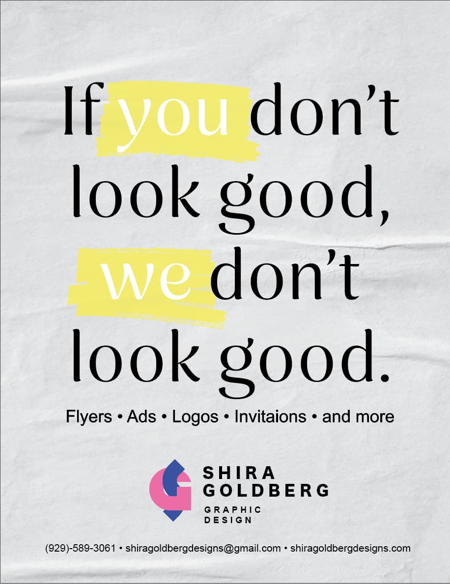
The first one
like the first one better
not sure if it’s just me but I feel like the “you” and “we” are a bit harder to read with that yellow against the grey background?
Maybe play with the contrast a bit?
i like the first one better, not sure about the colours and choice of fonts.
why is the logo pink and blue?
what font do you suggest?
Look on envato elements, I can download for you.
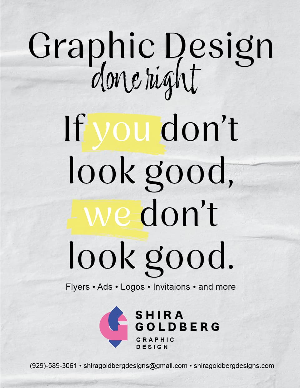
i’ts just that the logo and info is all in san serif and then text is serif…
this font might work for you, it is serif, but not very…
I also like the first one better, and I like logos, flyer,…on bottom how you did it originally
Just pointing out- invitations is missing a “t”
I also like the first one better. I am not sure though about the messaging, there is a negative sound to it. Also a client only cares for his interest and not about you.
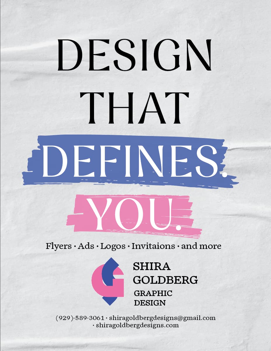
I agree - maybe write something straightforward like Your brand’s vision done right and you can highlight the word “your” and right" - something along those lines
Also I agree that the yellow is hard to read on the grey background - I think it would be great repetition if you use the pink or blue from your logo initials…
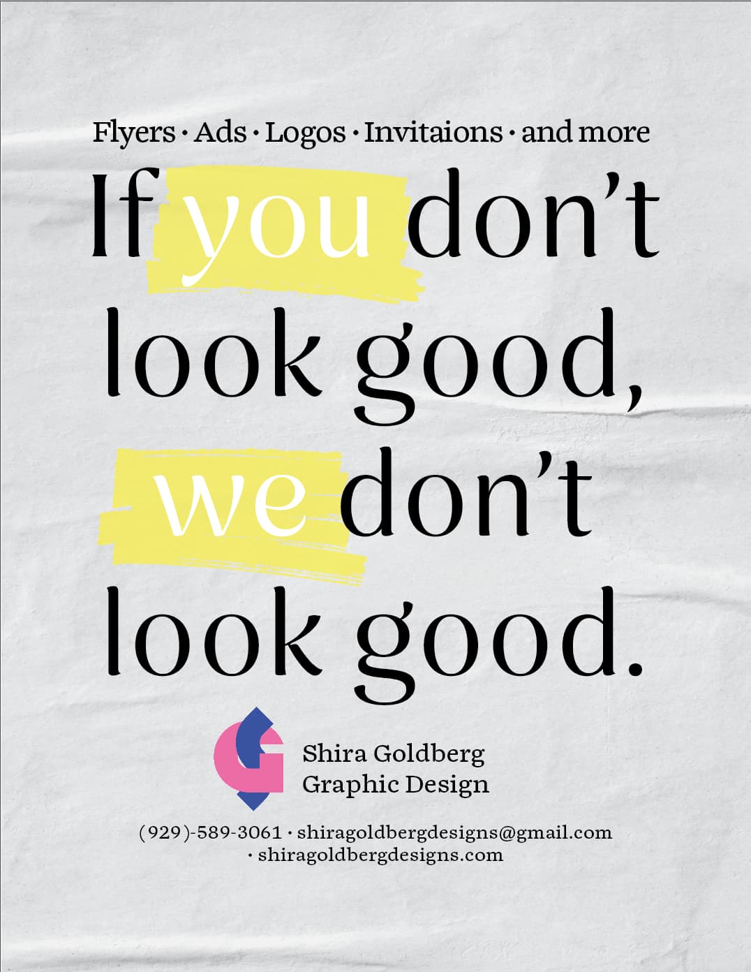
and what you do looks better on bottom of your slogan…
1 Like
I hear
so much better!
Can you make the large text a drop smaller or decrease the line spacing, so you can space out all your elements a little more?
I agree with spacing it more
Maybe make to logo and info at the bottom a little smaller
Nice! Just check spelling of ‘invitations’
defines you - is much better. even better would be something that increases your $… because that is what people really want
This messaging is much better!
And I like how you incorporated your logo colors into the design.
Is there a period after ‘defines’?