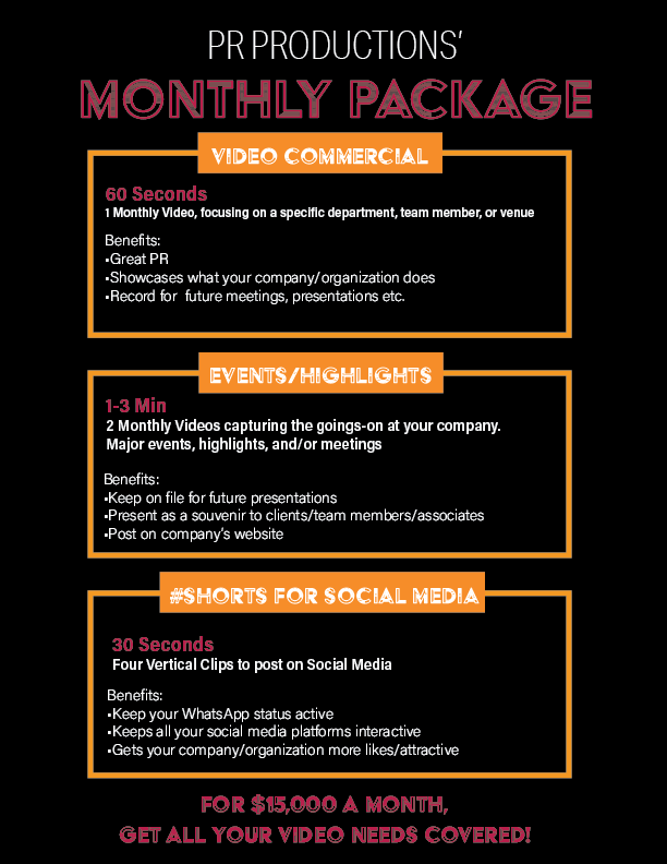
did this flier for a client, but obviously, it’s very blah, need to make it more exciting but not sure how…client ddin’t give me any images or anything to work with…it’s not going to be a major ad, just something to post on social media…this is a rush job, so any response would be appreciated!
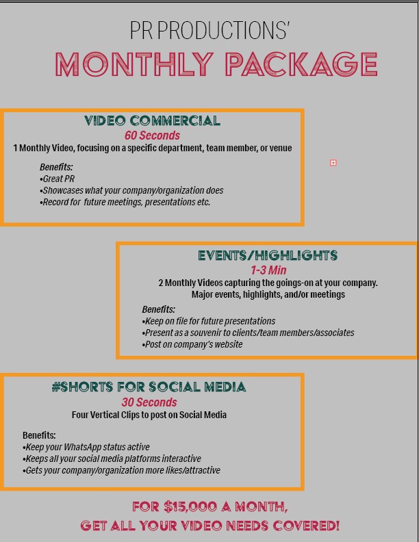
I think it would look better if all the boxes are centered on the page.
Does the company have a logo? If yes I would add that, and match the colors to that
Maybe a dark background with negative text can give it more life
Maybe the package titles (video commercial, events/highlights…) should be in a colored box overlapping the edge of the info box, just to break it up
I think the bullets dont have to be italicized, and maybe a even more basic font (not so condensed) would look nicer
Not sure how detailed it has to be, but might be nice to add a clock icon or something near the time
Also I would have all the text left aligned, maybe just the titles centered
Thanks @goldie-mezei
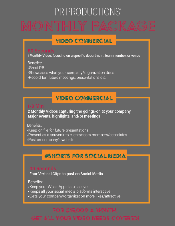
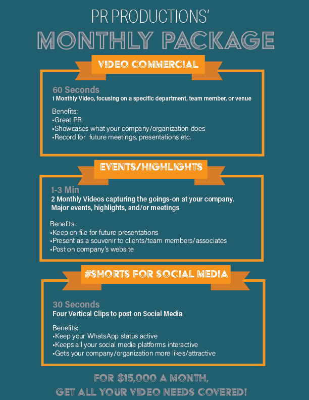
Here’s an updated version, the client did not mention anything about a logo, but I did email them to ask…
Much better than the first design. It looks so neat!
The only thing that is bothering me is the grey background - it looks too dull…
I’m thinking maybe black can make it look really sharp / the blue you used in the headlines -maybe will give it some vibrancy.
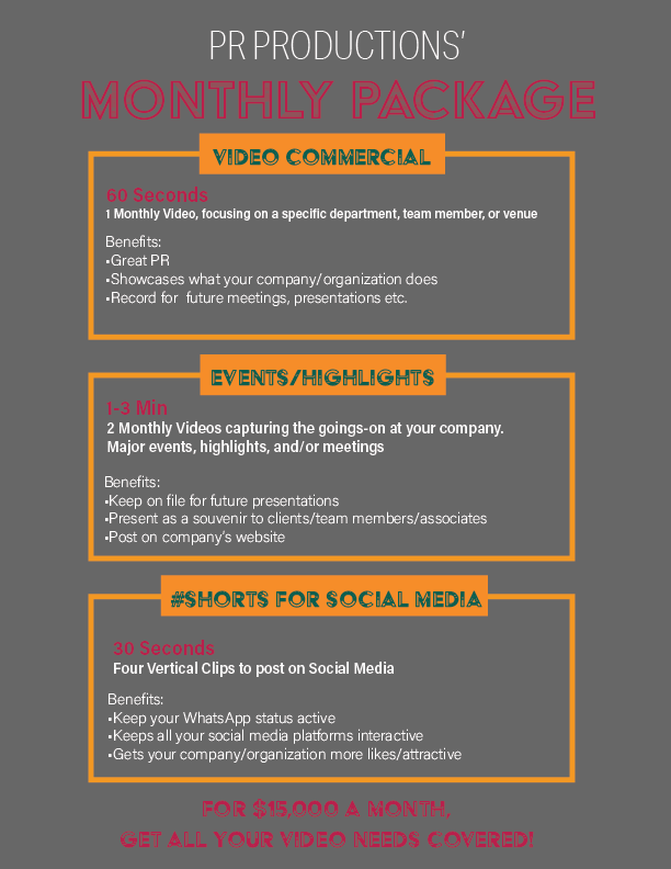
maskim - Im not either loving the black one as much as I thought I would - I think it may be because there is a lot of orange on it…
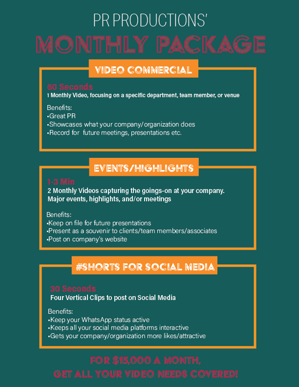
Do you like the green / blue one? I know I am driving you crazy but I would change the color to be less green and more blue like torquoise or teal…
Much much better!
I like the teal color better, maybe make it a bit brighter
Though not a fan of the color combo. The maroon for sure doesn’t work on that color, and the yellow somehow doesn’t pull me
Move all the “body” text a bit in, it’s very close to the left edge of the box
And just make sure to center the titles in their boxes vertically 
btw, instead of the orange / yellow - maybe you can use grey (on the green blue flyer…)
also was thinking maybe you can make those boxes where the text is on into a “banner”
@BatshevaS how about such coloring/title design?
@goldie-mezei I’m not loving the black and white, I feel like it’s too boring…How about this?
Much better!!
Just center the events/highlights
sent to client! will let you know what she says!! thanks @goldie-mezei and @Breindy-S for your advice!
Much much better!
the coloring looks good now!
Sure! Good luck!
Can I ask you, the company name is PR productions? I wonder if I know them
Though I’m sure there are a few companies with that name
I just work in an office with someone that works for PR Productions
There’s a double space here
Assuming your client will have at least 1 correction, fix this along the way as well
![]()
and I also noticed that the bottom info (For $15,000) is too close to the edge of that paper - bring it up just a bit more…