Thoughts on ad?

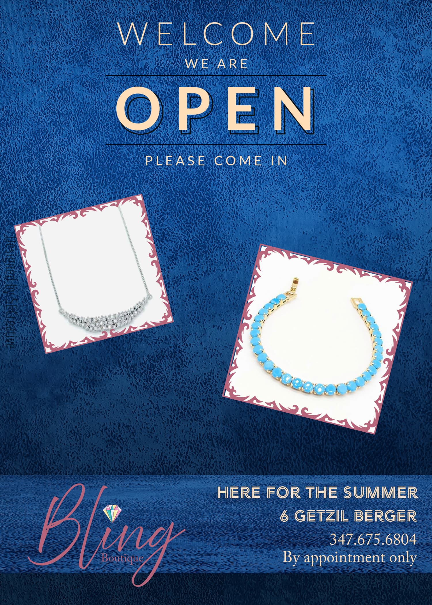
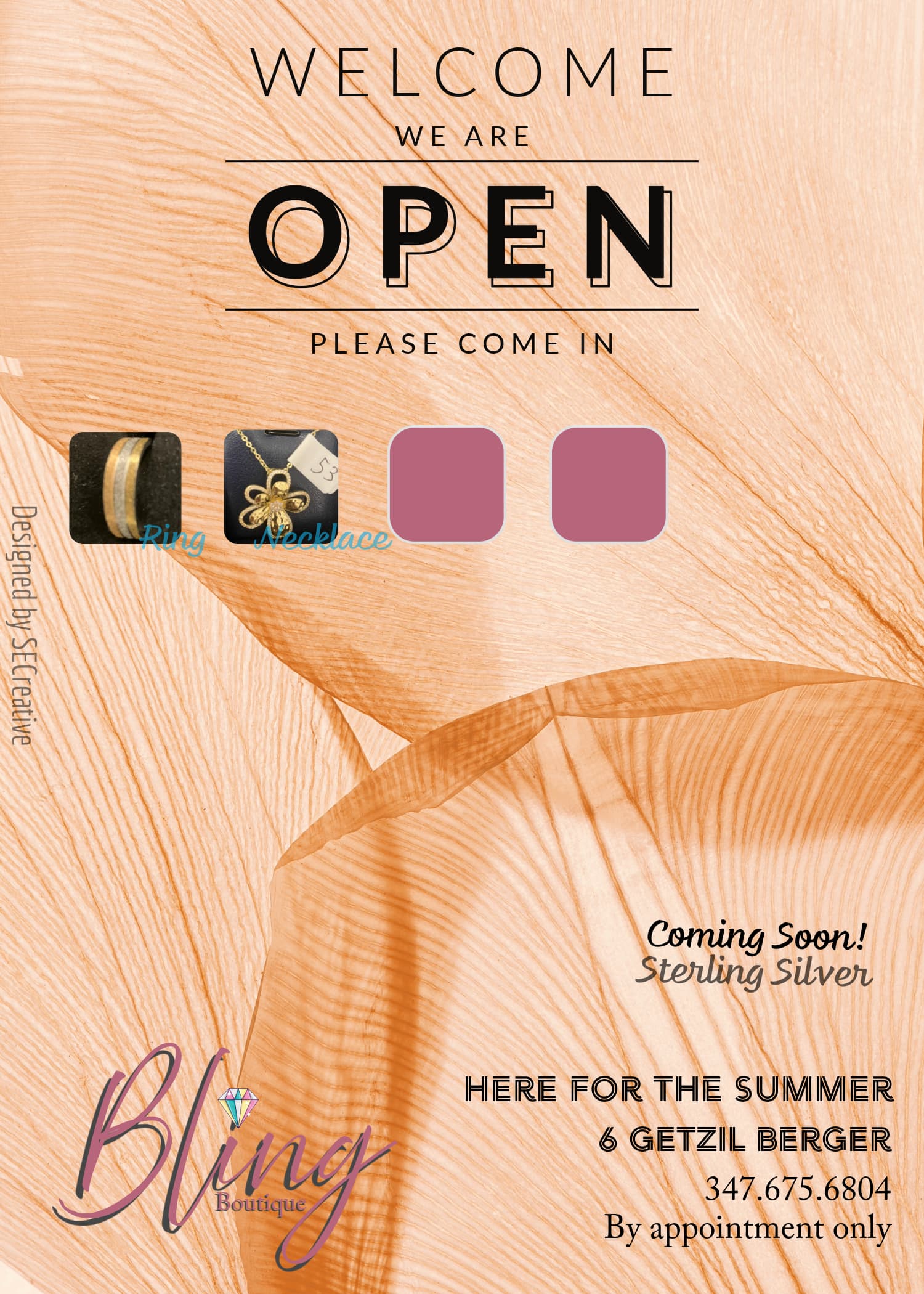
I am not yet done with the ad. Still need to get the pictures of the jewelry on the ad and finish the overall feel. But what’s your impression of this so far? Open to any input.

Don’t typically like putting in shadow but bling wasn’t blinging without it (wasn’t legible). The person I am making this ad for went and bought some stuff with the logo already, so I can’t change the logo too much. that’s why I added a shadow there.

I would recommend using a more elegant color palette, and sticking to very minimal patterns if any. The background here is busy and competing for attention with the heading and images.
Whatever you do, keep it subtle. Let the jewelry and typography do the job of telling everyone that you have beautiful jewelry to sell.

The fonts should be more feminine and can flow more.
As well as what Chanamiriam said, change the background its to busy. You can always add a bar to the bottom with the contact info and logo so the logo will pop more.
Look at publications for inspo. bp weekly has lots of jewelry ads.

Yes, I love looking at the weekly publications for inspo! I feel like I find a lot of things there that I wouldn’t find in a regular google search.
You can check out thebpview.com, themonseyview.com, bpweekly.com, thevoiceoflakewood.com, balebusta.com these are my go-to’s.
I’d say to use one image as a focal point in big, more elegant fonts, and a subtle background.

1 Like


I did these recently if it helps…

3 Likes

The logo can’t be changed. So what colors would you suggest, re elegance? Red, gold, for example?

a nice light colour like beige, or another neutral-looking shade of any colour.
Or you can go for a dark background like a rich navy, which will contrast with the jewellery

@Shevy_Friedman these are beautiful!

I think it’s quite important to have at least one high-quality image for a professional look, which will still be clear when enlarged.

Yes, agree.

side point, your name on the side should be really small

Yes, was thinking that too. But opacity is good?

i guess it depends which colour background you end up going with

Right. That makes sense.

Can I share your ad with this friend of mine so she’d know what kind of pictures to send my way?

Of course! My client got it from the person she buys her products from. She first sent pictures that she took on her own but they weren’t sharp, so i asked her to get something more professional… :slightly_smiling_face:

Perfect! I’ll show her. This ad that I posted here isn’t meant for upscale but we still want to keep it looking pretty. Hope my end result will keep to that.

I want to add in one more. Does this make sense to add in? Or are two jewelry pieces enough?:

Screenshot 2024-07-28 025815

Would replace the necklace with the blue one, so the colouring matches.

It’s looking better. I think it would look so sharp if you only use one picture. I would take the diamond necklace out of the box and have it hang straight from the lines… Also would look cool if you enlarge it… hope I’m being clear…