
Good idea!
I meant like something like this: obviously it doesn’t look good because I dont have the high quality pics…
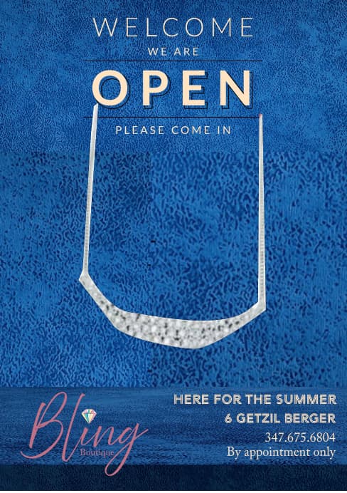
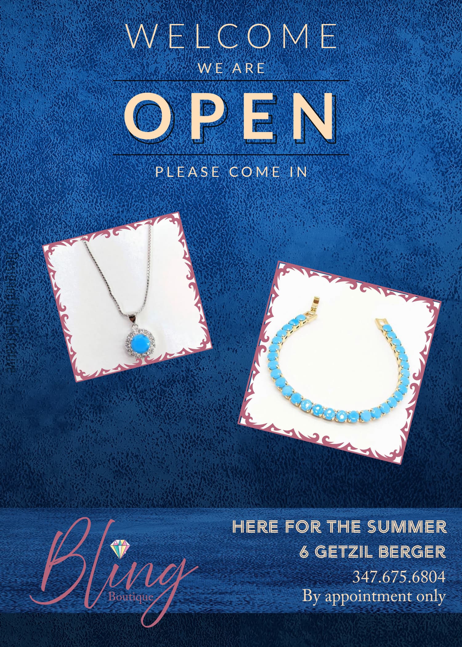
The problem here is that is shows just one item…
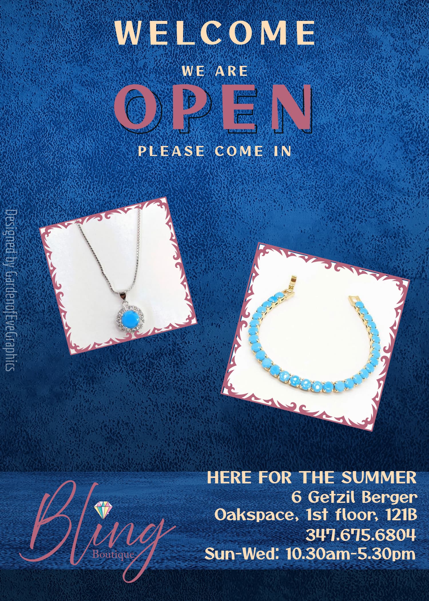
I would stick with max 2 fonts, I see more than 3 now…
Maybe I would do the OPEN in pink to bring the logo color out more.
Could you make the background of the white necklace the same bright white as the background of the bracelet?
The white necklace won’t work
Ok. Will do. Anything else, re fonts, that I should take into consideration?
Could you try making the size of the squares with pix more similar in sizing?
How do you mean? Sort of like it was in the beginning but bigger?

Looks really nice!
The words ‘Welcome we are’ look like one sentence, and then ‘open’ is separate. Maybe put the line between welcome and we are, or a bigger space?
How do you mean?
The line ‘we are’ should be a bit lower. Or maybe the word welcome be in a script font or something. Do you specifically want the word open as your focus? If not I would have the word welcome bigger and in that color maybe…
I went based off of a critique. Anything works
how about putting the jewelery straight on the dark blue background- without the whole white box- would give a more elegant look…?
The white box makes it crisp and clear and it isn’t an added box; it’s the picture of the jewelry.
The name on the side looks a bit big
1 Like