
Hi,
I made this flyer as the first in a series of 2.
I’d appreciate any and all feedback on the design!
(The concept and wording are not my own)
TIA!
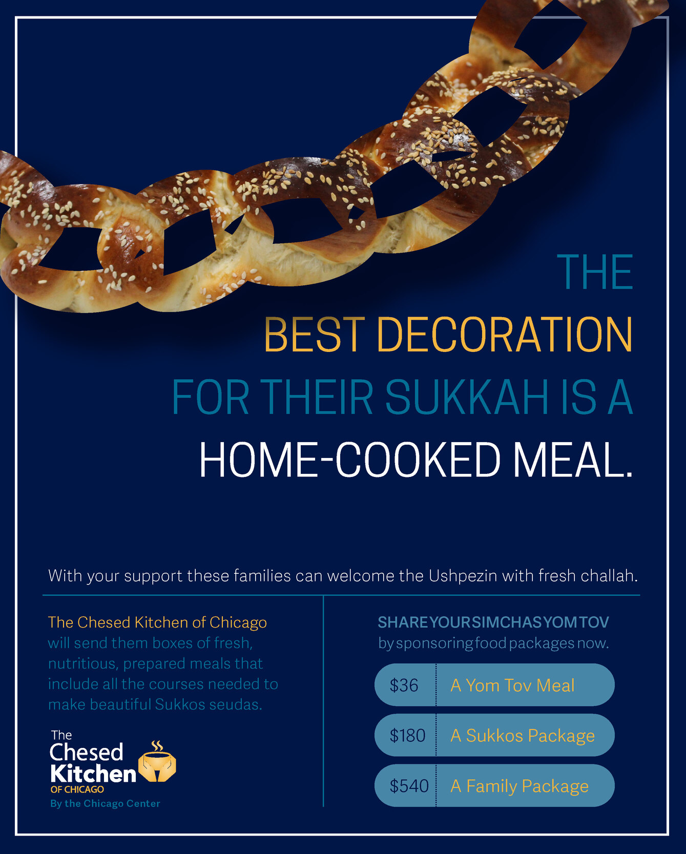
I like the concept. The challah chain is too overwhelming. What is your focus here? I would emphasize more on the main title in the middle.
Nice idea and clean layout. Coloring feels a little bland, especially for a Yom Tov/Sukkos flier. Would add an accent of one more brighter color, yellow-orange, magenta.
Some of your small text may be hard to read, in general when you reverse light text on a dark bg it needs to be somewhat heavier.
Thanks for the tip!
Any other suggestions?
Any ideas for breaking up the text at the bottom more?
Thanks!
on the left all one color not two. you can try to bold parts of it.
above the buttons on the right use yellow font
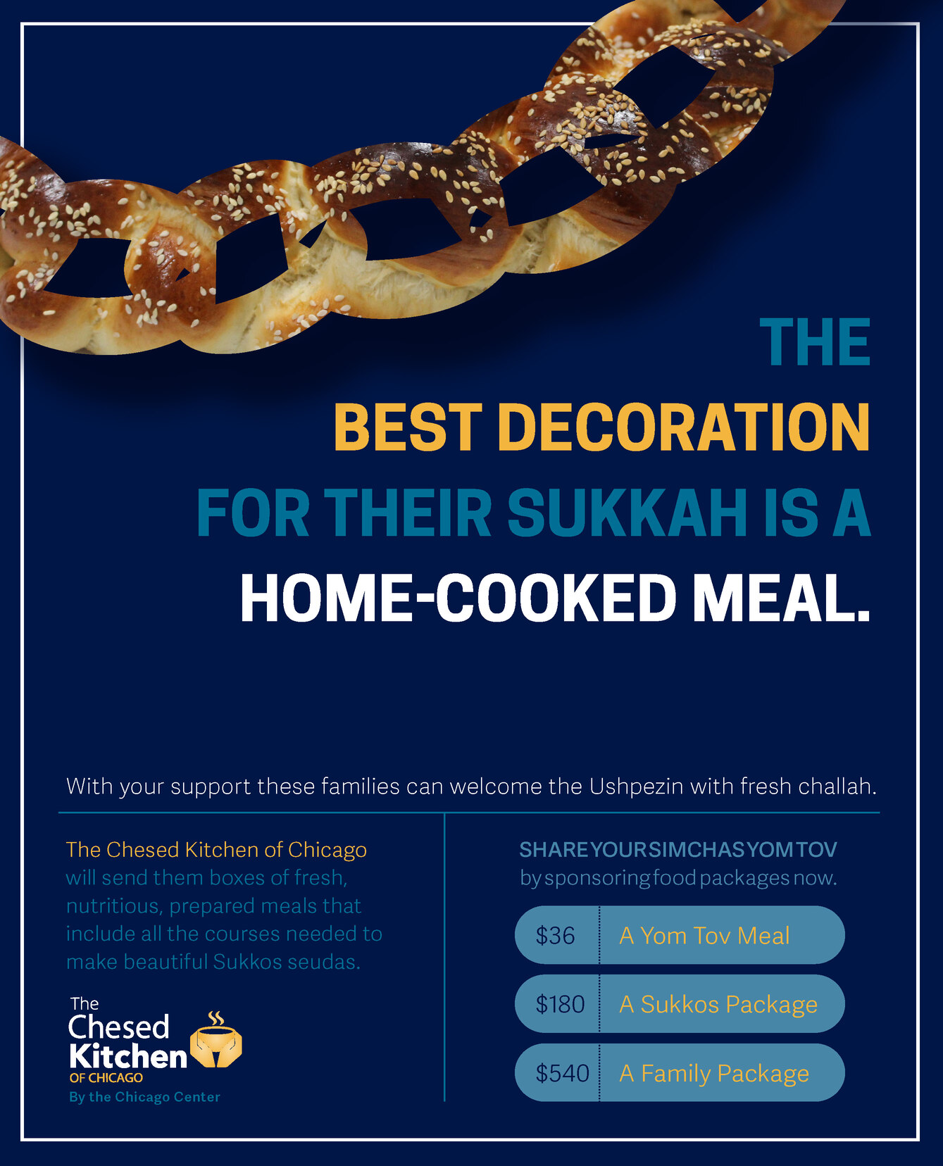
Here is an update.
I’d love to hear more critique!
Thank you so much @Alyse-Bayles & @schlomithsassoon for your really helpful feedback!!!

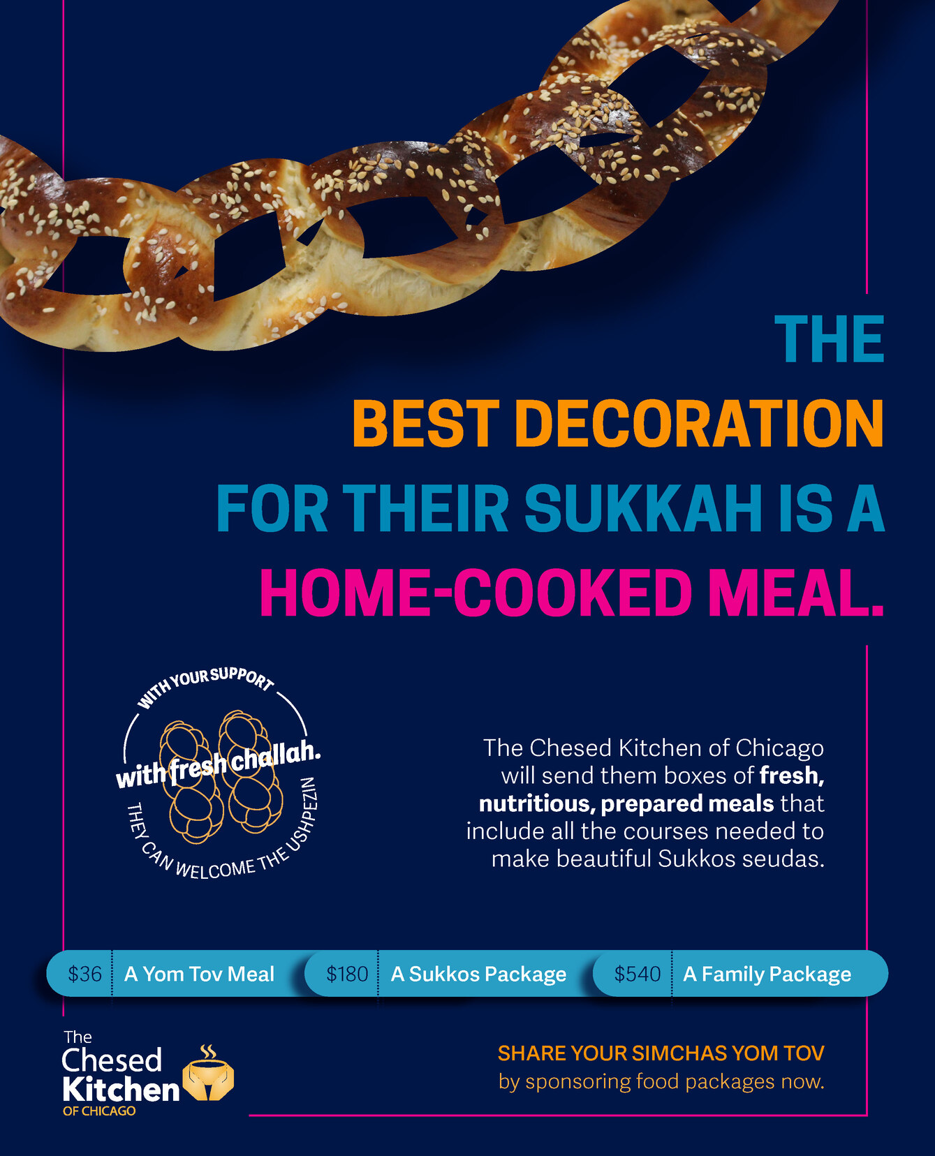
Much better! The main text really comes out nicely now. I dont like though the bottom part. The buttons are no good. Can you try to keep the bottom of the first version but with the pink lines?
What don’t you like about these buttons?
they are stuck to each other. each one has to be separate. no?
Ok, I hear that.
Wondering what everyone else thinks about that…
Maybe I’ll try playing around with that.
Would anyone know why the edges of the challah frame seem a bit pixelated and not smooth?
I made that chain shape by drawing it in Illustrator, pasting it into Indd and then pasting an image into the shape.
Thank you!
I just realized that the version I posted (jpeg) actually looks a little better than the pdf I was looking at.
Do the edges look pixelated to anyone else?
Why would it look better as a jpeg? Should I give the client a jpeg version, too?
It doesn’t look pixelated to me…
I really like that you added that bright color - It makes a difference! How would it look if you made the words “best decoration” in a decorative or script font? I think it might add to the flyer but not sure…
I’m not loving the bubbles either. If you’d make them smaller, fitting just around the info - it might look better… or you can make one big bubble and keep all the information as is… I happen to have liked your first bottom layout but I see you took the line “with your support…” and made it into a little graphic which is nice but looking a little squishy. The white text above the bubbles is also looking squished…
I actually started by using a script font, but somehow couldn’t get it to look right with script.
Would love to do something else with the text there, though to make it a bit more original.
Is the white text looking squishy as far as kerning/leading/size or space around it?
I changed the original bottom layout because I felt like it was too much text and boring to read.
In this updated version I separated the buttons more and made that icon bigger:
I think you should try to play around with some different fonts and see what looks nice… If you don’t change it, it’s not that bad, I’m just picturing it with some “flair” to the text…
The white text that says “The chesed kitchen…” needs a drop more leading.
The text by the icon looks like it’s on a curvy line. I’m assuming you drew it… Can you smooth it out more?
The buttons look better than before though I still don’t love it - can you just make the buttons a drop smaller and fit them well around the text so the buttons will not be on top of each other and you’ll be able to make some space between them…
Nice job! I would vary the text size of the title-make the blue text smaller than the orange and pink.
I would play with font sizes like @mrosen mentioned. By making the important text bigger and other parts smaller it’ll give the whole design more interest. Maybe the decoration can have less of a drop shadow? Doesn’t look pixelated to me at all! Agree about the “badge” text not flowing nicely on it’s path, you can make a rounded rectangle and type on the path. Use the same shape for the text and the small area of stroke you have in it so it all flows nicely.
Think it would look nice if you add some schach leaves on top to give it the sukkah feel?
I like the latest bottom area best by the way  The white text can be made a drop smaller and more leading to make it more airy
Hhhmm… not sure what to do about that badge, it actually is a rounded rectangle type on path.
Not sure why the letters are bumpy like that.
Maybe I should ask if I can take out some of the words?
Try making it rounded all the way like the other “buttons” are. Also it’s just important that all the parts of this shape is consistent and forming 1 solid shape like I mention before. I don’t think I’m being to clear though… 
thnks i’ll try that