
I agree that the new coloring looks much better, but I also prefer the original bottom layout. Can you add an accent of pink on the bottom for unity and also to help give a focus among that bottom text which runs together a bit. For the badge, I think it might be better as a perfect circle. I don’t think that it will look inconsistent with the other shapes, and will look less like a “mistake”.
This group is the best - thanks everyone for your amazing help!
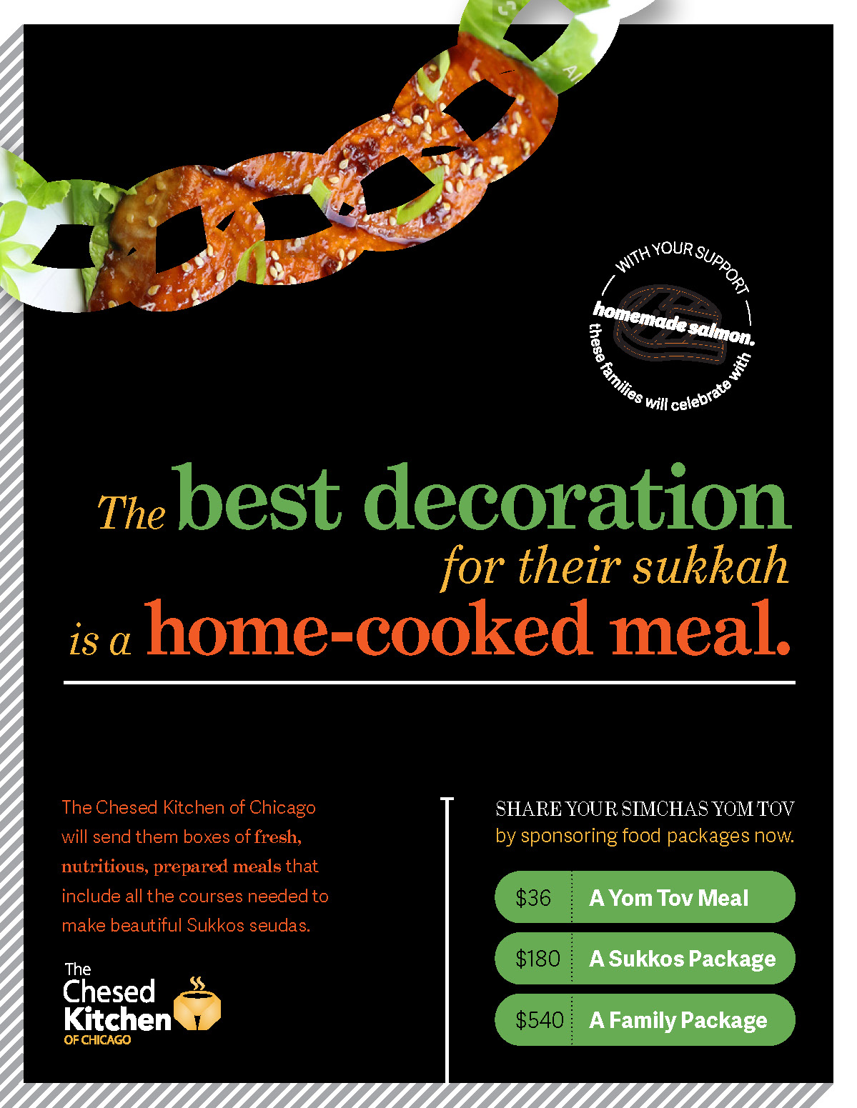
The client changed her mind about the challah so I redesigned a bit.
She wanted images of food that the org. will actually distribute, so I put salmon instead.
Not sure if the chain idea still looks good with this type of image inside?
I’ll love everyone’s feedback on this updated version.
Thank you and have a gut voch!
Its looking good still…even though I liked the challah better…
but not sure about the black background… maybe try to go back to a navy? this just looks to strong…

Not sure that it is recognizable as salmon, if that matters. Once it isn’t challah, and is really just a food image masked into the chain rather than something that could really form the chain like the bread, maybe you could find a better food image, one that looks more like a bunch of food on a table, or that includes some vegetables…might add some color, too.
Ok, thanks!
Thanks so much for all of your help!
I love the new font you used for the main text and liked that you switched back to the original bottom layout. The brown background looks better than the black but I feel like it’s still a drop too dark… can you try to either lighten it a drop or try a gray background? I’m not either loving the salmon picture… I like the new circle icon but the picture behind the words “homemade salmon” is too light…
Also, I think you should change the font of “Share your Simchas Yom Tov” to the bold font you have in the green buttons…
It’s looking really nice!!
A gut yahr!
Thanks everyone for your amazing feedback so far!
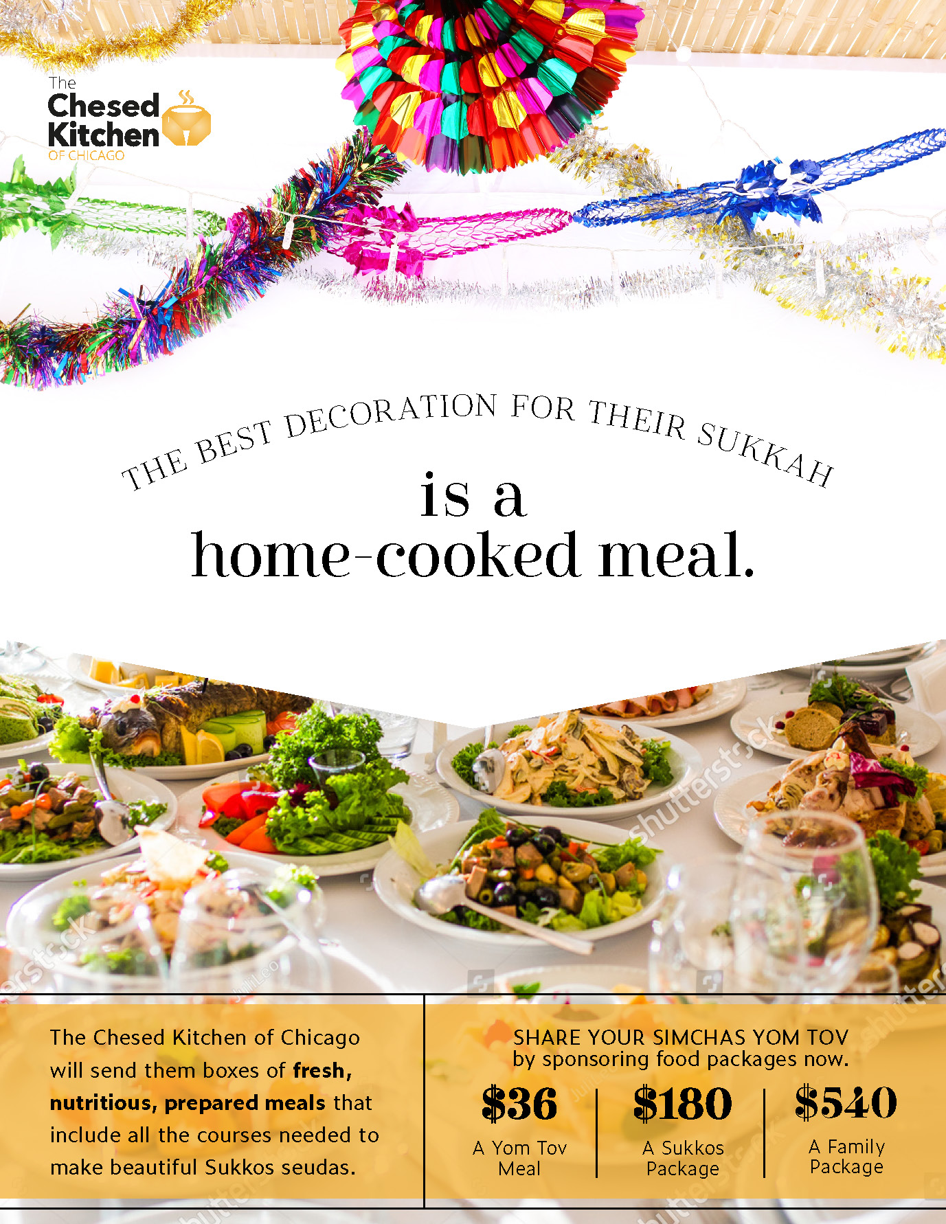
I hope you all have patience for… a totally new version of this ad!
This client changed her mind about the style that she wants, and chose a half-baked second option that I showed her.
I’m wondering if that’s normal or not, but I am now working on a completely new design…
It’s still quite raw and I’d greatly appreciate more critique and suggestions:

Wow! Chani I actually think this is great!!
Once you moved away from the challah, the chain didnt have the same effect!
I like this alot-very fresh and eye catching!!
On the bottom, by the packages it looks squished like the yom tov meal, sukkos package kind of flow into each other maybe try making a separation over there…
Also maybe the words in the middle should go straight? not sure… just a suggestion…
hatzlacha!

YES!!!
Its looking really good! The updates make it look clearer! I think it looks great!!
The only thing i noticing is the of chicago part of the logo is getting a drop lost? maybe move to the right a drop?
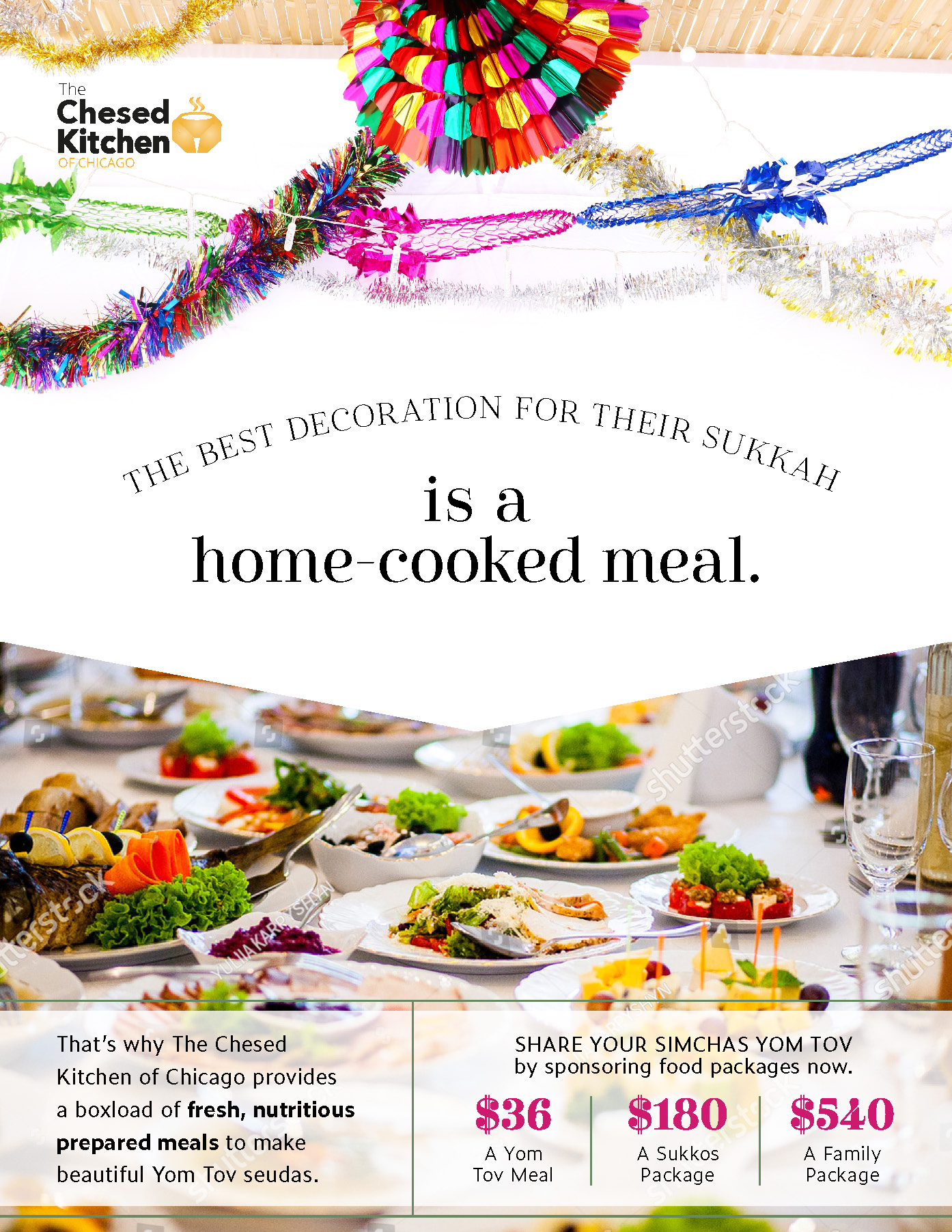
Very nice, feel more cheerful and festive than the original. I would suggest tying together the top and bottom halves a little more, they feel a bit separate, almost like separate fliers. Largely because the colorization is much different on the top and the bottom, would probably help just to bring some of the obvious bright colors from the top somewhere on the bottom, maybe in some of the text or in the bottom screen.
Thanks so much!
Would giving the page some sort of border down the sides connect the top and bottom?
Wow! I love this new ad!
I think you can bring some of the colors from the top into the bottom box. There is two lines (one on top and one on bottom) I think you could change those the blue from the top chain. You can also take the gold (or if it doesn’t look good - really any color) from the “chandelier” decoration and change the prices to that color… Just an idea… I don’t think a border will look nice here because it is pretty busy already.
Thanks for your help!
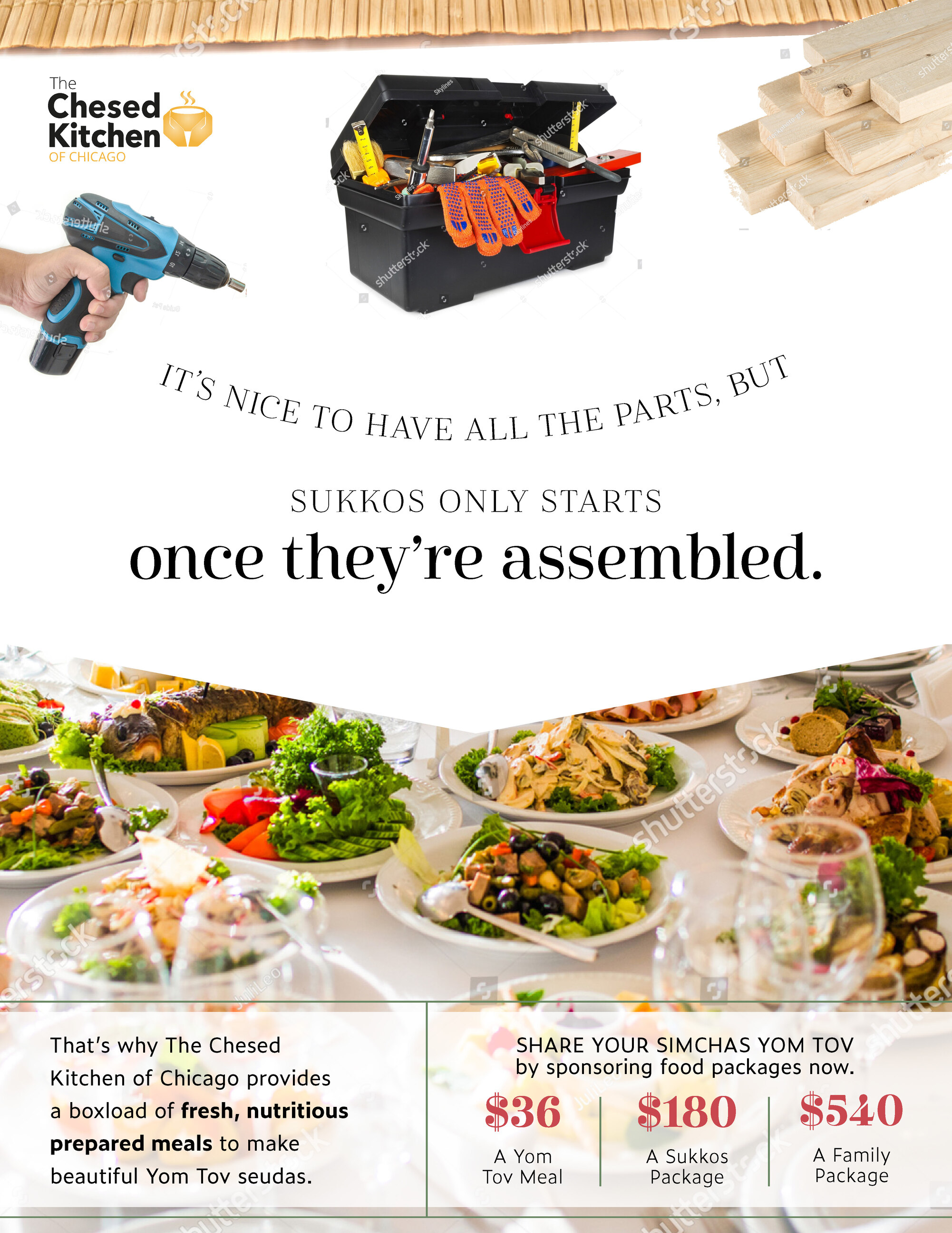
Along with this updated ad, you’re all invited to critique the other ad for this series as well 
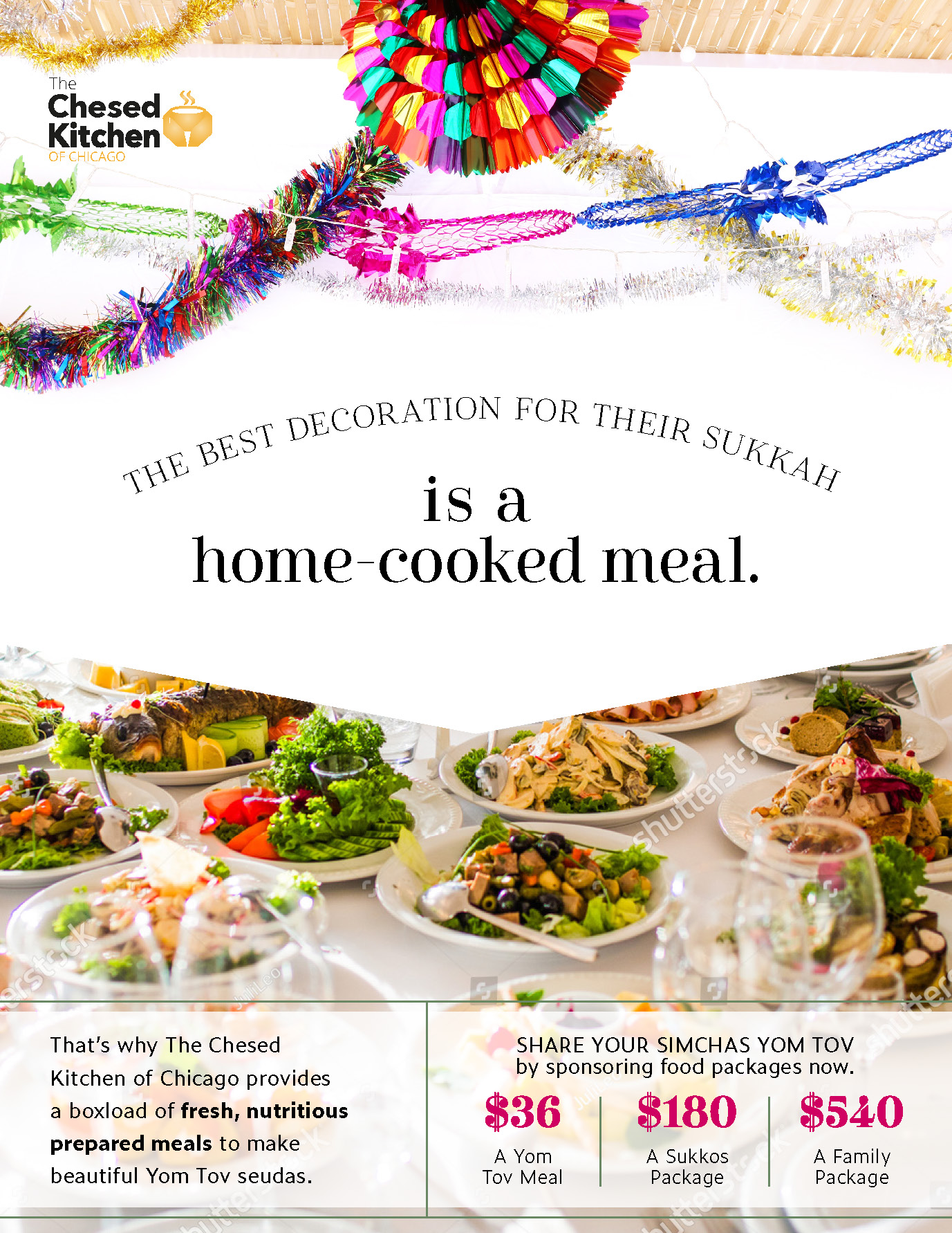
I like the updated ad - I think the white looks better than the yellow that was there…
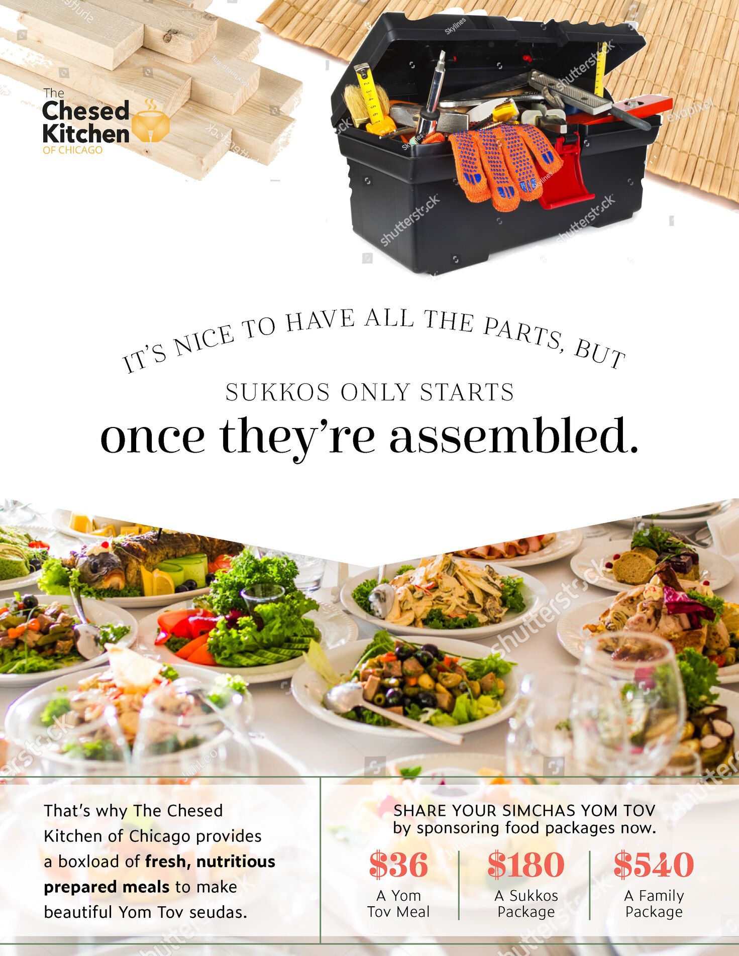
For the new ad:
I would do the same semi circle like in the first ad…
I think you should enlarge each piece and overlap a drop and bring the drill up and the logo down…
I also think, maybe you should switch the food pic (to something similar) - the ads should have some variation but the same style cuz part of a series of ads…
Also, maybe change the color on the prices to the orange from the gloves in the toolbox…
It looks much better now!
Is it an optical illusion or is the semi circle slanting more to the left (in the tool ad)?
Yes, it tis an optical illusion 
happens to be straight, i checked with guides, seems to always look crooked…
Yes, the pink on the bottom helps to tie the two halves together.