Hi!
I’m working on a logo for a property management company. Here’s what I came up with.
I want to narrow it down to 3 options to send to the client. Would love some help deciding which ones to send, thanks!
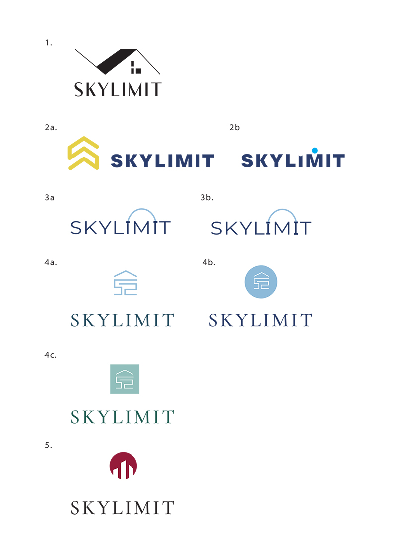
So creative!! I love 2a!
I like 4a and 4b and 5
I like 5 but circle should be a bit bigger
I like 3b,4b and 5
I like 2a, 4a, and 4b. Great job!
2 and 4 are nice, modern and unique to them
2A and 5
2a and 4a
Thanks everyone!
I’m about to send the options to my client, can anyone just quickly let me know which of the two they prefer for 2a? the rounded edge or the one with sharp edges?
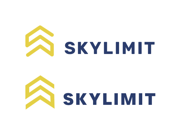
i like rounded
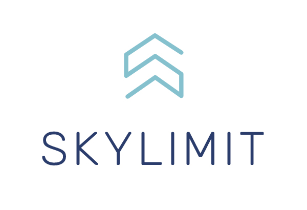
Wow this is amazing! to be honest i would only send this to the client as i think it is by far the best option!! i think the rounded one maybe is more pleasing, but i don’t love how it is in relation to the words - i would centre the icon to the word…
Thanks!
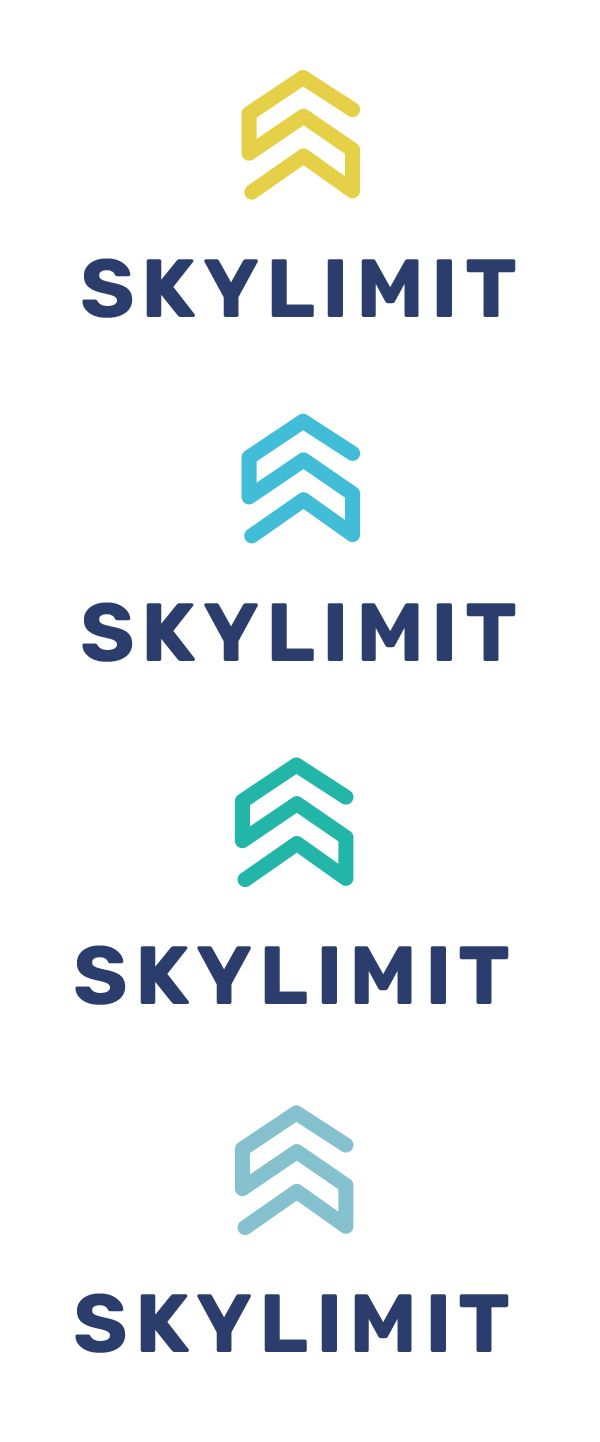
Is this better? also, what do you think of the other colour options? or any other ideas?
TBH, this is my first logo, and I’m a bit nervous to send just one option to the client. Especially, because the words he used to describe the logo he wants is “calm & professional” to me this logo does not come across especially as calm, I think number 4 fits that bill better.
I’m not sure about number 4, for some reason it looks like ‘ss’ to me and not a very pleasing modern shape… i think this one is very professional! (i wish my first logo would have looked so good ![]()
![]()
![]() ) And the calm that you said he asked for is really dependant on the colouring so from these 4 options you put her i would say the last one gives off the calmest vibe due to the sky blue colour (the same colour you used for logo 4).
) And the calm that you said he asked for is really dependant on the colouring so from these 4 options you put her i would say the last one gives off the calmest vibe due to the sky blue colour (the same colour you used for logo 4).
Regarding only sending one option to the client, i was also really nervous to do that but bh iv found it somehow works! don’t say like here this is the logo and done. My clients know im willing to do up to 3 options but if i am so confident in one option that that is the best fit for the business the confidence comes accross and the client can see that… worst case he says he doesnt like it and you start working on option 2… or do some edits with this one. Another very important thing to get the client to approve right away is to present the logo really well - im not the best yet i still hope to get my presentations even better but here is the last presentation i’v done and even though i wasnt even fully convinced on the logo the client loved it with zero changes…
Wow, that logo is great and really well presented!
Have my work cut out for me now if I’m going to present just one…
Thanks for all your great advice, I think I will try that, and send just one logo first. Just wondering, what do you tell the client, like how do they know that you’ll give them a completely different option if they are not happy with this one? I don’t want to tell him if you don’t like this one I’ll create a diff one etc, so how do you say it?
thanks! even if you were to present 2 or 3 i would say you should also do a presentation as the chances the client will like it are then way higher… so yes it takes time but you are saving yourself much more time in changes and revisisons… I just send an email ‘please see the proposed branding for ‘skylimit’ attached’…
Ok will try that!
“Please see proposed branding…” is that clear enough to say that you’re happy to create a complete new proposal?
Looks really nice!!
I do agree about giving 2-3 options. As soon as the client gets to choose, they feel more involved and they got the one they like best. Whereas 1 option, as amazing as it is can make them think “maybe there are better options out there!”
Not saying that you should go and add options now. You can give it a try and hopefully they’ll love on the first try!
That makes sense
So what do you guys think? are any of the other ones worth sending as a second option, or should i go back and create another one?