
Something about the thin is really nice! That could also be considered 2 options, thin and thick.
I always tell my clients, " here are your 3 options" This way they kind of need to choose between what I made and not ask me to start over. I never really do a presentation for lack of time. However I do get the feel that if i would pull it together more clients would have an easier time deciding. Im working on it, How can I do an easy presentation without doing a lot of mockups, as I really really dont have any extra time.
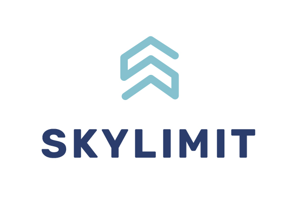
The thin doesn’t have as much of a powerful look - property management company is the type that needs something that shows they mean business and are in control
so in the end I took Malky’s advice and just sent a presentation of that one logo, he just replied with a lot of revisions! HE wants wants me to embed the icon in the word any ideas how i can do that???
this is the logo i sent him

2 Likes
wow it looks amazing! iv msged you privately
Thanks!