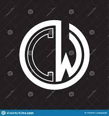
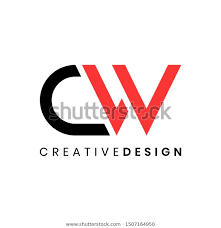
Hi!
I’m a current Design Alive graduate designing a logo for myself.
Please share your votes, thoughts and suggestions based on the following sketches:
Thanks in advance:)
Hi!
I’m a current Design Alive graduate designing a logo for myself.
Please share your votes, thoughts and suggestions based on the following sketches:
Thanks in advance:)
Hi,
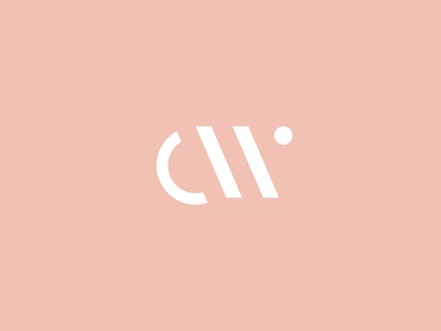
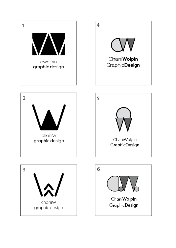
From these choices I like #5 best, but I think all these logos give off a little bit of a whimpy feel - maybe because it is missing color right now… I would think that a graphic designer should have either a very sophisticated logo or something that is bold and eye catching. (I guess depending on your main style.) I think you should google some more inspiration and find something either that has nice negative space or is clever in some way.
I did a quick search for you and these are some things I found interesting…
Thanks so much for your feedback, Breindy!
Thanks for also attaching that inspiration - getting more ideas from it!
You mentioned negative space… #1 did have that, wondering why u didn’t think that was a good choice?
Hope to hear more opinions from all!
And about color-
I actually left everything black and white now on purpose to leave the focus on the actual designs…
But yes, I’m sure when they’re in color they’ll pop more.
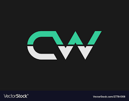
1 is a negative image but there is nothing significant about the figure ground combination- meaning that the negative space isn’t adding an extra feature or hidden shape or message to the foreground shape- its just negative shape as opposed to a positive shape
Exactly - #1 does have negative space but it isn’t anything special… The best negative space you can have is where you don’t know what’s the foreground and what’s the background… It should look like an optical illusion somewhat. With #1, it looks like you had a black box and put a white w in it to give it some sort of negative space but it isn’t adding to the meaning of the logo… (lol - I actually had a hard time getting this concept downpat:)
Send more variations of the logo when you have!
Actually out of all of those I think #1 looks the nicest!
That’s funny, Goldie, I actually also like #1…
I’ll make more versions of that & see if it looks any better.
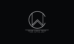
I also love this idea that Goldie uploaded - where is that from?
Would love to see your other versions! That logo I found on google… obviously don’t duplicate it exactly but just an idea that looked nice…
Just jumping here. I agree with the previous posts, that the original designs don’t specifically add meaning or tell much about the “company”, they don’t have a specific mood or feel to them. Do you want your business to feel contemporary? efficient? hi-tech? Upscale and expensive? Try to communicate that in the logo. If you are adding negative space or combining your initials into one form, try to do it in such a way that the negative space, or the combined form adds meaning and visual interest, another dimension to the logo that you wouldn’t have without it. I think some of the inspirations shared has good potential; remember, when searching for inspiration any logo can inspire you-you should looks at TONS of inspiration starting with related types or companies-art, design, interior design, architecture, but then as you see things that may have potential, expand your search to other types of logos. If you are basically going with your initials then any professional style logo could be inspiration, looks for ones that convey the same mood that you are going for. For example, if you want your company to feel upscale and expensive, look for other such inspiration logos, not necessarily design related ones, like upscale urban planning or landscape design etc. This helps expand your inspiration, and then keep a folder of anything that inspires you-whether because of a color, layout, font, proportion, negative space treatment, style, illustrative style, etc., and then see what you can come up with based on that.
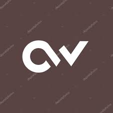
That said, of the ones that you have the one that looks most interesting visually to me is #3, but not sure it works to just include the W, and the arrows that are created add meaning and interest but not so clear how the meaning and interest relate to your company. And the name is too small relative to the graphic.
Hope that helps.
Thanks everyone for your guidance!!!
The different points you mentioned are getting me thinking and ideating again!
Working on updates…
Can’t wait to see updated versions 
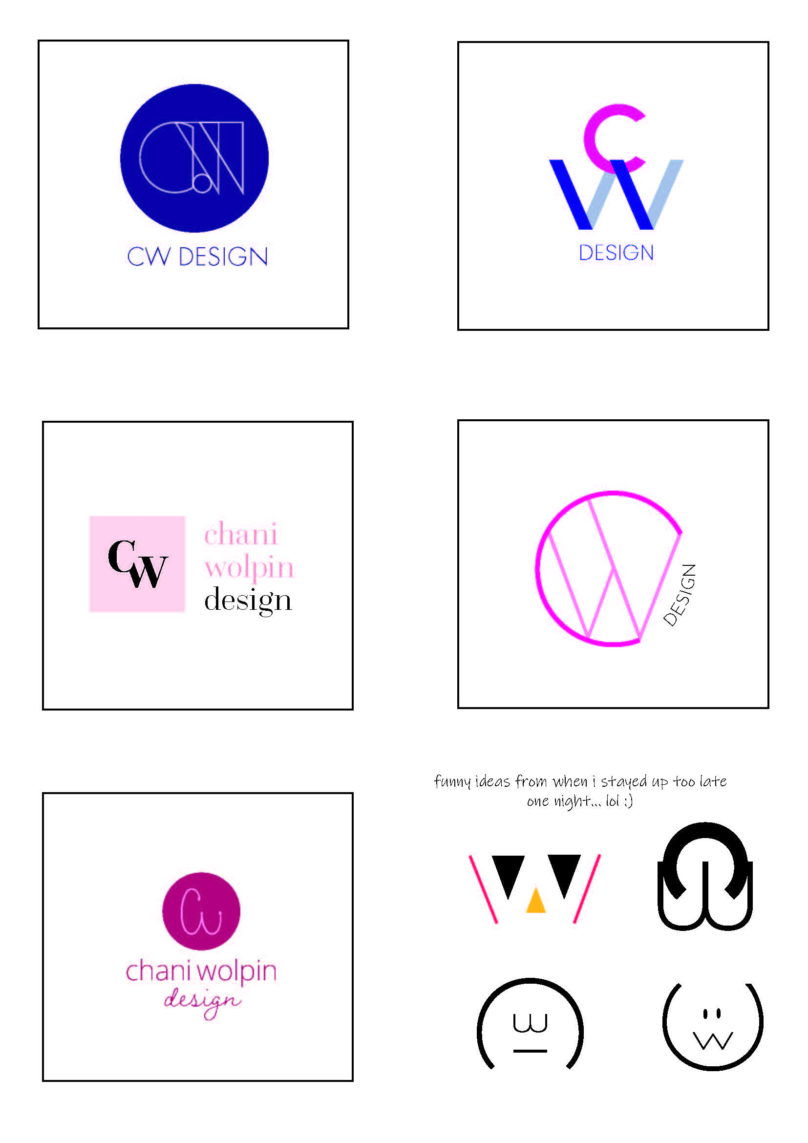
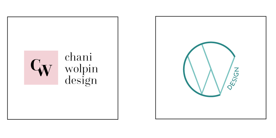
Wow! What a transformation from the initial thumbnails! I really like most of them!! (basically just not the ones you made up late at night! lol, I could totally sympathise with you for that one  ) I think my favorite one is the second one in row 1 - it’s a mauve box with the initials inside - I think you should make all the text black to give it good contrast against the pink box and to repeat the color that’s inside the box… Also, maybe consider bringing the text under the box - would have to see if it looked better that way or maybe it’s good as is…
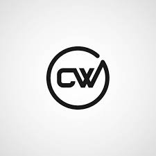
The other one I was considering was the top right one with the CW but the graphic is way too big compared to the text - You should scale it down a little… and maybe write “Chani Wolpin Design” so people associate this logo with your name… and btw, this logo has nice negative space as mentioned earlier
Anyways, I really like all of them - just needed to narrow it down a drop…
What’s your favorite one?
I like the initials in the box too! And agree about all the text being black and trying the words beneath the icon.
I also love the square box with the initials!
I like n umber 5 - just personal taste
#5 has nice potental. just not in purple / pink, rather choose a more professional looking color