Hi!
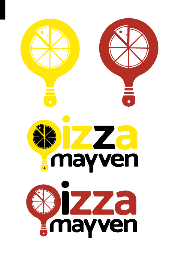
I am working on a pizza store logo- my idea was to create a joint pizza board and lightbulb to reference the name Pizza “Mayven”.
Any thoughts on this? Is it too “deep”?

This logo looks very cool. I would change the lightbulb/pizza board a little because it looks a little more like a q especially with the pizza slice cut out. Also I don’t get the reference of the light bulb to mayven so that might mean it is too “deep”, but it could just be I am not familiar with it. Overall it is a really cool logo and i like the font and colors! 
Woah! nice logo, Shani!
Agree with @shaniporetsky that the P looks like a Q and I also sort of chap the use of the lightbulb Bec of the name but not sure its super clear and to me it also looks more like a pizza board than a lightbulb… which is fine…
Adorable!!!
Is it staying yellow? cuz I think its making me think of electricity with such a pure yellow.
Maybe in order for it not to look like a q, rotate the pizza boardto the left a little, or move the handle to the left.
I do not think the concept is too deep, whoever gets it gets it and whoever doesnt just sees a nice clever logo.
Keep us posted!
thats true Blimi - sometimes nobody chaps the concept of the logo or even the name of the company and it just flys over peoples heads… as long as there is good marketing (and it makes sense to at least some people), I think anything can really work. This logo is really well done so I think it is good even if it takes people some time to go OHHHH… (like me!)
Nice concept! Everyone has their own opinions and you’ll choose what you want to listen to… but to me it looks a bit like a tennis racket 
I agree about the colors. Doesn’t give off a pizza store feel. Maybe do red & black… but then lightbulb concept will even be harder to chap
Also, is there a reason why one Z is black? I would keep it the color of the rest but
Ya, i think i would change the angle of the yellow slice so that it doesn’t look like a q. I’m ok with the lightbulb being more of a hidden meaning, I’d rather the pizza board take center stage. The question is whether to keep it in or take it out altogether.
The client chose black and yellow so going along with that- but maybe I can make it more of a mustard yellow?
Hehe thanks:) Now I gotta convince my client the same thing!
Cool logo! Agree with @blimi and @goldie-mezei - looks like a combo of electricity and tennis racket to me! Orange/ red and black/ brown coloring would probably be better…
Ya, I am starting to see the tennis racket/paddleball there too- I might change the handle to straighten it out and make it less curvy. technically i can change the top of the board to be the traditional shape of the pizza board too but i thought the circle was much sleeker. And again, the client chose black and yellow so gotta go with that, although I can show them another color option i guess. I thought changing the color of one of the letters in “pizza” would add some more visual interest. I was thinking maybe to make the letter “i” in black instead of the Z.
issue is client chose these colors, so maybe I should change the board to a more traditional shape? less round, but less sleek…
It might just go nicely with the font, maybe give it a shot!
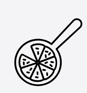
Another thing the could help it look more like pizza is dividing the entire pie into slices. Don’t know if that’ll be too busy. Something like this but in the same style you have it, filled not a stroke…
Good luck!

great idea, thanks!
any chance you remember what you searched to find this image?
I just tried Good Pizza logo right now and I got that picture also…
I saw it on https://depositphotos.com/