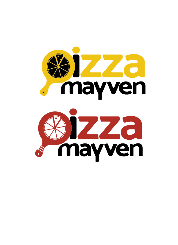
nice! I like #2 better…
color-wise?
I like #2 Bec of the color - I go more for the typical look… red is used in a lot of pizza logos… but doesn’t mean that yellow can’t work - I think it’s also cool since its different and unique…
I also like the red version, and the pizza slices makes a big difference!
I’m still not a fan of 1 letter a different color and I would make the i red, but do what you like : )
I’m thinking of rotating the “P” which would overlap the letter i, so it would need to be a different color. What do you think, straight or slanted?
Also, I think i’m giving up on the lightbulb idea
Nice logo!
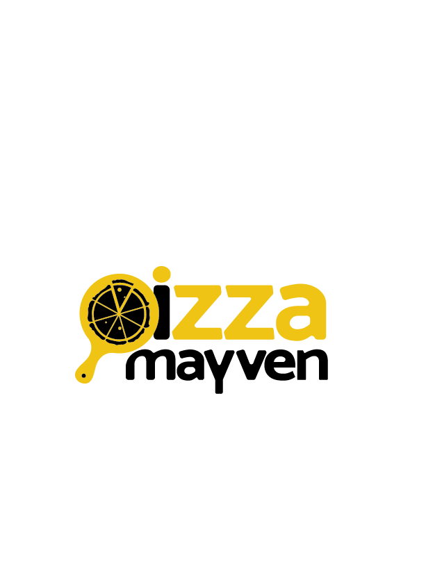
the yellow is much better now.
I’m not sure if the P is as visible slanted. And it looked nice straight because it fit into the M in mayven well. On that note, what do you say about making it fit better by raising the first hump in the M…
I’m not sure why the pizza gives me the impression of the wheel of a chariot…!
I liked the P straight… I also think I would like it better with pizza all in red and mayven in black… but its not bothering me that much - it has good visual pathway and repetition…
I actually think I might like the rotated version! It’s not as straight and has more character
Just to confuse you some more 
Just giving my 2 cents now…
Nice font choice!!
I love the way it looks now, since I do think it looks like a pizza wheel. I wonder if filling in the holes in the actual pizza pie will make it look a little less busy. And I agree about the colors but you have to do what the client says at the end of the day…
Can you straighten the P/pizza cutter a bit so it looks like a P more? Something in between what you had originally and what you have now.
Really nice!
I think the pizza pie should be a bit bigger and maybe now the i could be yellow 
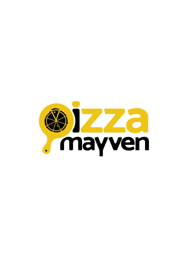
I was thinking pie should be smaller so looks more like a p versus a shape with the pie
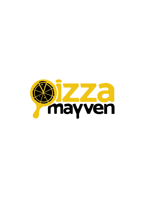
I like the m how it looked before - now it looks like you’re trying to make it fit - it looks too forced…
I think the pie looked better a drop smaller (but not as small as you had it before) - I also like it much better with pizza being all the same color…
Yeah somewhere in between would be perfect! More to the small size you did but a bit bigger
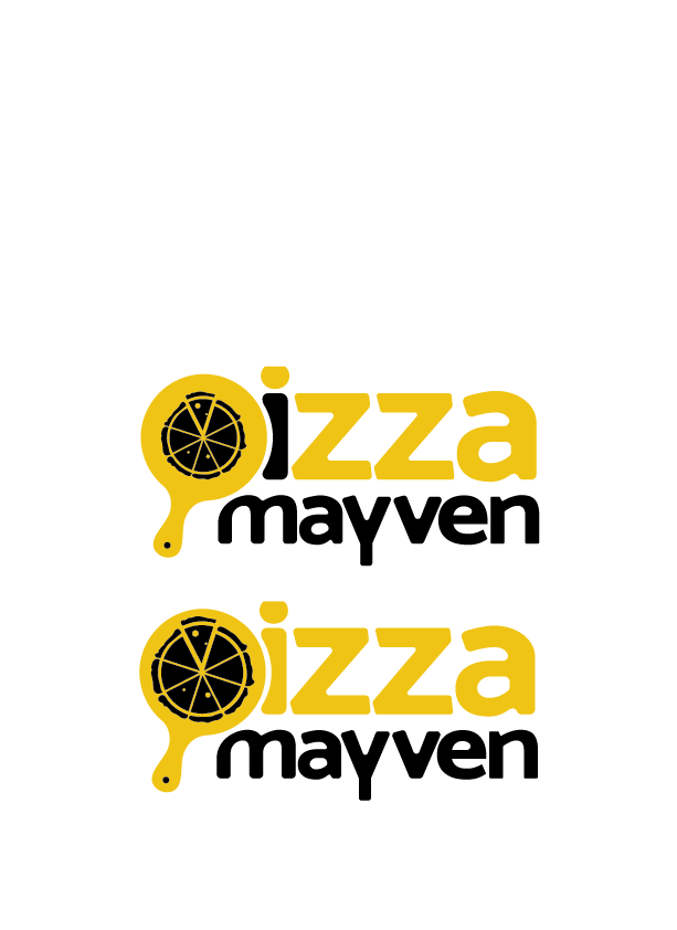
Agree about the m, and love it all in 1 color!
Looking great 
Its so nice! I love the final version!
Great job!