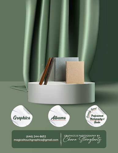
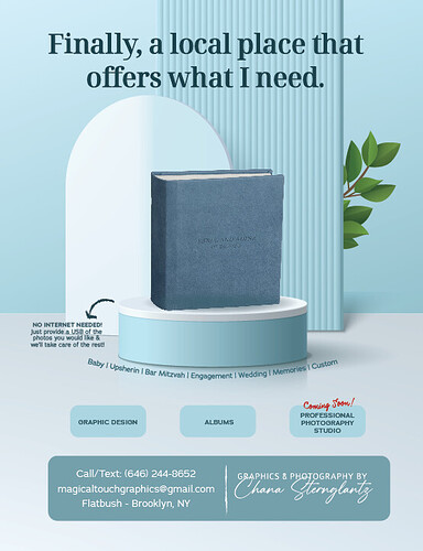
Love it. I would remove the white stickers and put a drop darker green light gradient round edged rectangle…if you get what I mean.
I get that.
I was trying to decide if the coloring is too dark and unattractive, also if it’s too busy so you don’t know where to look first?
Also, do you think I should mention more information or is this pretty clear?
Does the albums give off a look that I focus on albums, etc???
Thanks for your input!
I like the color. It looks pretty professional.
Maybe write albums on top, make the stage bigger and leave the other two in the bottom.
I like the ad, would you maybe add words or some design to the album cover/s for some more interest there?
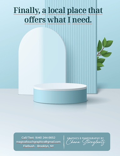
I think its really nice! Is there a way that you can add a caption to the top?
Did you make this 3d? If you did I would make the pedestal a drop shorter and the books a bit bigger for more focal point.
Agree to make the albums bigger and to add some text onto the albums. Are those albums photos that you photoshopped?
I actually took a 3d editable scene from freepik.com and then adjusted it to my liking but I couldn’t change the color.
I’d love to learn how to make these from scratch myself… if anyone wants to teach me.
I can shorten the pedestal…
Yes I got this photo from online and photoshopped it…
You can try starting with Adobe Neo. There was a tutorial on Designergy recently, it’s quite simple to use…
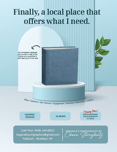
Redesigned it…
Any thoughts?
I want to add some points that I do… Graphics, Album Design and coming soon! Professional Photography Studio…
Any ideas of where or how to do it?
I’d say in a row on the bottom separated with bullet points…
Is anything going on that podium?
Also, I don’t personally like that underline so much, I’d make it thicker and use it only on the key words, sort of like they’re highlighted.
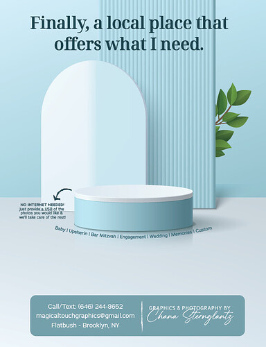
Yes there’s a blue covered album going on the podium… I updated the design a bit so see the one below…
The underline is spell check… it’s not going to be on the final document!! Sorry…
I like it… thanks for the idea!
Love it!
I’m not sure if the ‘no internet…’ needs to be over there, would you try putting it somewhere else instead? Might not look better but just thinking it might be a little distracting…
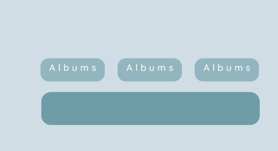
I’d also increase the font size of the text in the three shapes (maybe enlarge the shapes and align them to the sides of the big rectangle), and make your contact details a little smaller (unless it’s being printed really small)
It looks so good! One change the album is not on a good angle. It needs to be standing straighter and a drop smaller.
I took one from online and I’m having trouble fixing that…
Does anyone know where I can get another one?
I think warping it just a bit will help
