I love it!
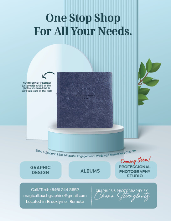
Can you nudge down the whole picture and words a drop? So that everything besides for the header is a drop lower and closer to the ‘graphic design…’ boxes?
And extend the words ‘no internet needed’ past the edge of the shape.
I love it!
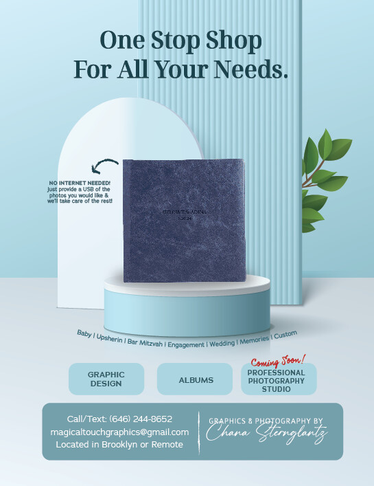
Can you nudge down the whole picture and words a drop? So that everything besides for the header is a drop lower and closer to the ‘graphic design…’ boxes?
And extend the words ‘no internet needed’ past the edge of the shape.
Can you make the 3 boxes a little smaller, I feel like the bottom half is a little to crowded.
Sure thing.
I would give the text a little more margin at the top. It’s too close to the top. Either make the text smaller or make the whole image a little smaller.
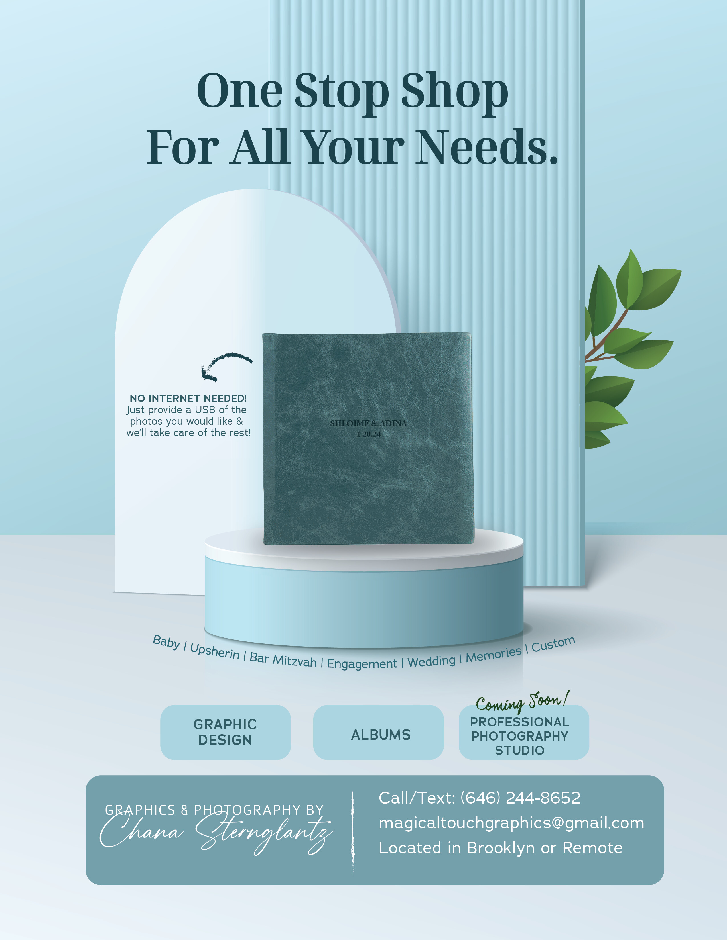
You have quite a lot of blues going on and then a pop of green and a pop of red. I would narrow down the blues so maybe make the album a more turquoise color (It’s easy to change that in photoshop). and then the coming soon could maybe be in the green. I would left align your contact information and just thinking I would swap your logo to the other side and have information on the right.
Ok…
Thanks everyone for your support!!!
Here’s the final version (unless someone thinks of something else that should be done to make it even more perfect!)
Beautiful!
its a beautiful ad! love how it turned out!
Beautiful! Love the new color of the album!