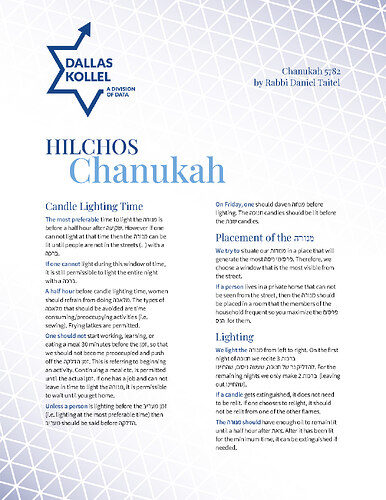
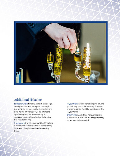
Continuing the discussion from Pricing Newsletter Template:
Thanks in advance for reading this long question ![]()
I created this design in Google Docs (which was painful to work with, @zippy ! It did have more options than I realized at first, such as something similar to paragraph styles in Indesign, but obviously WAY more limited).
I had to set it up in a way that the client can easily replace the text and image for subsequent newsletters and in a style appropriate for various times of the year.
Designing in this way was super challenging and I feel like I totally lost my sense of what looks appropriate and normal, because I am not working in a design program and I have to keep the reusability factor in mind.
I would really appreciate feedback on the appropriateness of the design for a kollel halacha newsletter, if it looks polished enough etc…
(I am aware that there are some grammatical mistakes as well as text that doesn’t line up, etc. I’m talking about the general design, style, way it sits on the page…)
I left extra space because I am assuming that they might have more text to include at another time.
Thanks in advance for your feedback!!


