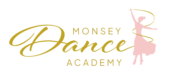
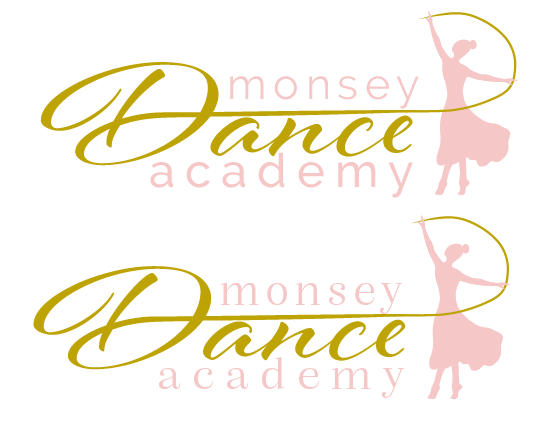
I’m having some trouble with the logo - my client likes the concept and logo but there’s something bothering me about it… Any ideas on how to make this look better? (the original was #1 the others were other things I tried…)
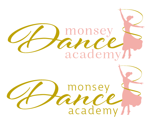
I like number 4
I like 1 4 and 5.
Would you try brightening the colours or maybe adding some colour contrast?
Do they look like a nice finished product? I feel like it’s not so finished looking…
Color wise I am adding a blue to the brand but we thought these colors gave off the right vibe… To use gold and light pink - if you know of a better gold I would be very happy to try it, the pink maybe I’ll play with the color and tone a bit…
What age is this group for?
The silhouette looks like an older woman - not for kids
Maybe take out the silhouette and put ballet shoes…
It’s for all ages for girls and women - they specifically don’t want ballet slippers…
i like 4. think u should brighten the colors
something throwing me off. maybe the font of the word Monsey and academy? maybe try all text one color and capitalize all first words- or lowercase all… but something not so clean about this…
I like 4 and 6 with the alignment as in 4. (put back the a in academy as well) try tightening the tracking in monsey and academy, and make it a tad smaller. otherwise, I love the vibe it gives off. cant wait to see it in the local papers.
this is a logo I did a while ago, (actually think it was my first one I ever did!), so not the greatest of logos but
maybe you can do this kind of dancer idea…
this dancer is pretty!!
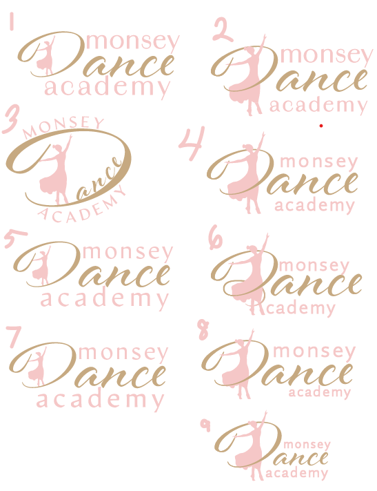
I love the placement of the dancer in 2 and 4, really looks like she’s twirling! I get what you mean about the alignment, maybe you can try having “monsey” and “dance” as it is in number 2/4, just with the feet aligning with the rest of the word dance (you might have to make it a tad smaller…) then have academy with tracking across the whole bottom of logo. wonder what it would look like…
you can also try having monsey and academy in caps, sans serif
I love the twirl of the D in 6, don’t like how the feet make the A. I don’t love the fonts though. Can you try some more modern fonts? I think you should brighten the colors or make them more contrasting.
What about this type of concept? I think it gives more movement to the logo…
I do think the ribbon does need some help to give more movement and pull it all together - i anyone has any suggestions that would be great!
I’m still deciding if I should use a brighter pink.
Thanks!
these look very good! its so pretty.
I like what you did with the first one for the D in number six.
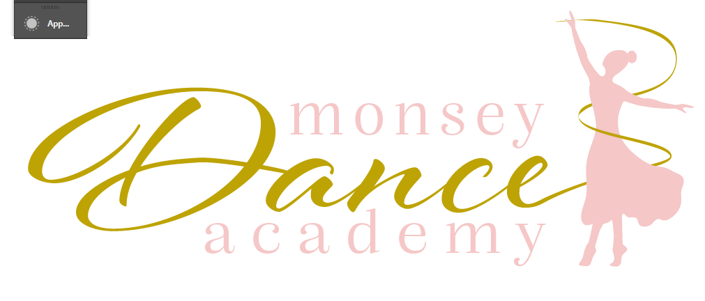
You mean the dancer to be the line for the D?
My problem with that one is that I don’t feel like the logo has enough movement for a dance school…
I like this last version but the pale pink is too light.
Also the gold swirly line doesn’t look 100% smooth by the dancer’s hand…
Could you also try to give it some breathing space - Monsey and academy doesn’t have to be super close to the word Dance…It also doesn’t have to be spaced out all the way…
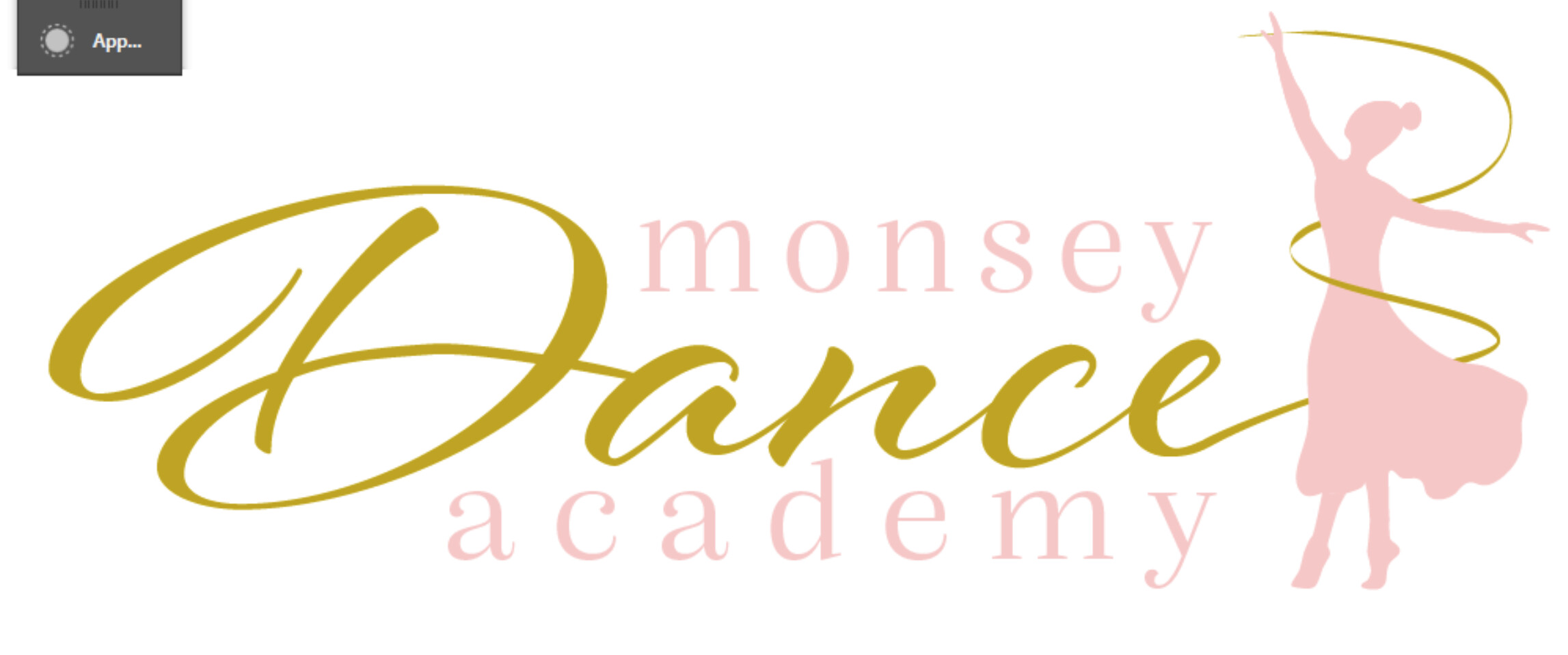
never mind what I wrote about Monsey and Academy being close to the words dance…I think what’s bothering me is that it’s tracked so much and it’s all in lowercase.
Here’s something I played around with - I feel like it’s more cohesive…but totally up to you to do what you want with this…