Hello,
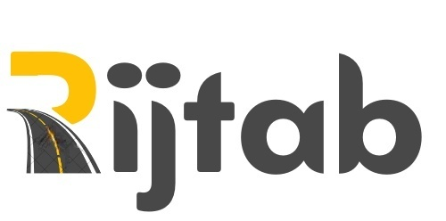
I made his logo.
Any critique and feedback would b appreciated ![]() .
.
Thanks!
Can you give more background?
Who, what when where…
Also, I can’t decide if I should read it Rijfab or Rijtab, dunno if anyone else is seeing it like that, so maybe you can clarify that?
I’d work on making that road feel like it fits more in the logo.
I like your font choice, it’s bold and interesting.
It’s someone who’s renting out tablets with the apps that are needed for learning to drive.
Rij means drive in Dutch and tab is for tablet.
I will try to work on the t - thanks for pointing that out.
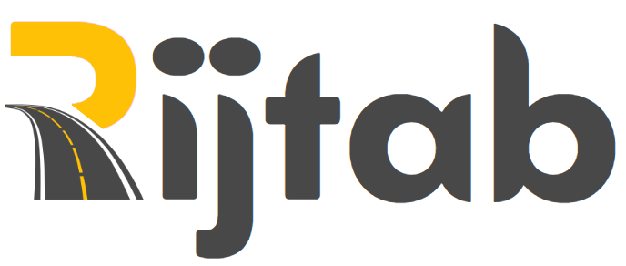
I see now the road is totally smudged cuz of the watermark attaching here the clear one.
How can i change the road?
Yeah, maybe switch the rounded corner with the sharp one…
The road is better now, I wonder how it would look without the white lines…
Love it!!
I agree with @AMiller about the ‘t’ and also what jumped out at me was too much detail in the road - so I’d try removing the white lines.
I wonder if it’d also look better if the dots of the 'i’s would be more round, less oval-shaped, similar in width to the ‘stick’.
Thanks!
Will work on it!
Love it!!
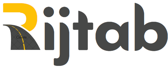
Nice! I would make the road more simple with less detail.
It looks really good. Just line up the top of the R and the road on the left side
Ok I made a few changes:
Road is with watermark…
@AMiller is it more clear that it’s a t now?
@DevorahO Thanks for pointing out, i changed it.
@RivkyH thanks for the suggestion i like it better now ![]()
The client says he isn’t crazy about the yellow.
i had made it yellow because of the road… which color would u guys recommend i use?
its clearer now, cool idea to flip it! or you can flip it horizontal also ( cuz i usually look for fonts that the “t” is rounded on the bottom
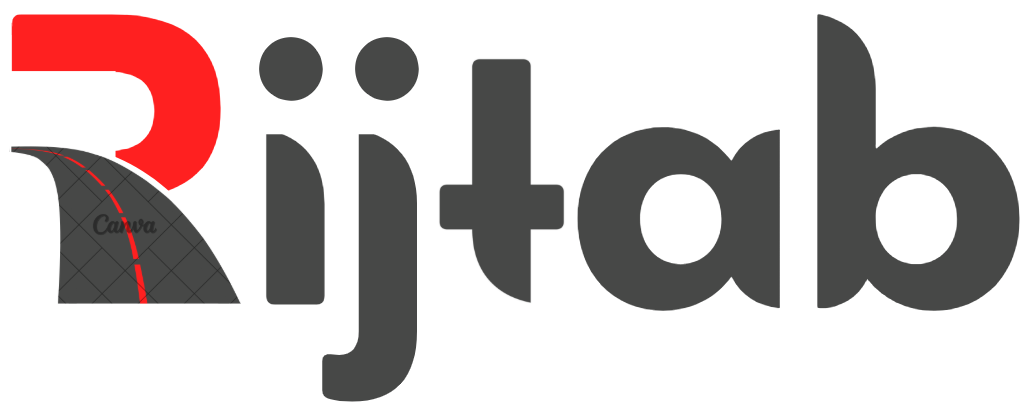
also maybe more orange-red
Much better! Like @Tzirel, I also thought the t would be rounded at the bottom.
I’d also advise you to make the markings on the road wider - imagine this logo in tiny (logos aren’t often displayed at this big size), the lines will be impossible to see.
Re colour, I’m thinking a techy colour like blue?
Or maybe a bright red that’s used in road signs
Much better!
I’d also play around with the leading to get it perfect.
I think it will definitely look beautiful tree if the horizontal bar of the t is higher, it looks a bit out of place now…
Once that’s done, you can decide if maybe the t needs to be stretched a drop lower because right now it’s giving the illusion that it’s shorter than the rest of the letters.
i agree with what @RivkyH says keep the original height and keep this bottom
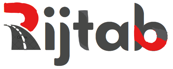
i’m just wondering if you make the lines in the road white (red isnt realistic) and maybe bring the red also to the end of the word? it just feels out of place more heavier on one side, somehow the yellow felt more balanced…
nice!
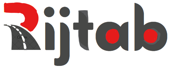
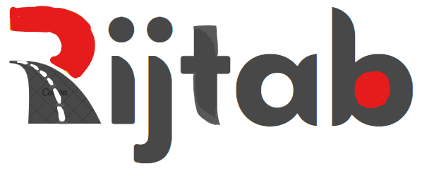
yes agree with @Tzirel about bringing in the red. maybe filling in the circle of the a and b with red?