Wow thanks so much!
I see what u mean, will work on it!
Will let you know what i did in the end!
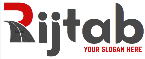
I just realised, he said he still wants some kind of slogan he will let me know what. So if i put the slogan under the letters ab in red it will be more balanced no?
Much better! yeah, it should be balanced then
i also like that you deepened the red
and one more point, like @RivkyH says maybe widen the stripesand then you dont need so many as you can see on my sample it comes out stronger that way
Looks really nice! The two dots above the i and j catch my attention. Can you combine them or somehow make them part of the logo design? Maybe just take them out… They take away from the impact of the R, which is brilliant.
@AVG i get what ur saying. how can i combine them?
i personally dont like it, they remind me of people
Agree, liked the 'i’s before, with the dots as circles above.
No, I meant to combine both dots into one ellipse. I think it would look better if you just take them out completely.

