Hi,
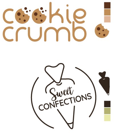
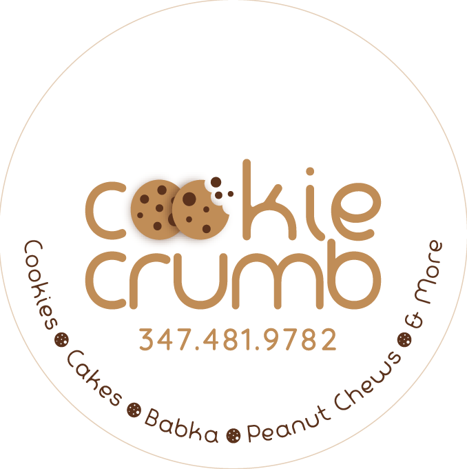
I am designing these logos for my sister’s company she is starting.
She couldn’t decide between the 2 names so I made her a logo for each.
What’s your take on the logos and names?
Thanks!!
Both name ideas are great and I like the first logo option.
Love the first name and that logo too!
Wondering if there’s anything you can do to make the cookies look less repetitive… Maybe you can have them overlapping with 1 cookie whole and 1 bitten with crumbs? Might give it more interest.
Thanks!!
Do you think the first one implies that it is only cookies? She does cakes and peanut chews too.
@goldie-mezei that sounds like such a cool thought. I’m going to try it:)
She only does cakes and peanut chews? If so, then maybe that name doesn’t match so well.
If she does cookies but other things too then I think it would be great! I was imagining a company that sells cookies, muffins etc. That’s the vibe I got from logo 1.
she does cakes, cookies, peanut chews, etc. Basically any pastry you can imagine but a homemade taste:)
So I think that works! Sounds homemade-y and yum!
Maybe ask others too though…
thanks!
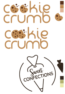
both look perfect to me!
love the cookie crumb one!
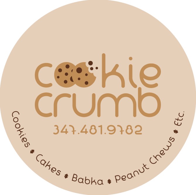
Looks great!
You should use a dif symbol for the bullet points, looks a drop like a dollar sign. Maybe try using the bitten cookie symbol in solid color as the bullet point
And write ‘and more’ or something like that instead of ‘etc.’
Is the circle not perfectly round or did you just chop off parts of it when you screenshotted it?
Looks really nice!
Im not loving how the choc chip gets cut off since you combined the O’s like this
Can you make those choc chips full ? or you’re keeping it like that to show where the second O begins?
I don’t like the font of the phone number - I assume it’s the same font as the word cookie crumb but I think it would look better with a sans serif font.
Agree about the bullet point looking like a dollar sign… you can do a plain bullet dot or as shevy suggested the bitten cookie…
Looking great! I agree with comments mentioned above.
One more point, maybe you can add a small space or shadow (by adding a small strip of a slightly darker brown… not a drop shadow look) between the 2 cookies so it clearly shows where 1 coolie ends and the next starts.
Otherwise it’s looking 
Thanks everyone!!
I will work on those corrections tomorrow and send it again for all to see:)
Hmm personally not a fan of the drop shadow look. Especially in a logo, I would stay away from it most of the time.
Did having just a white stroke so it adds a space between the cookies not work?
If not, I think I go for the previous version…
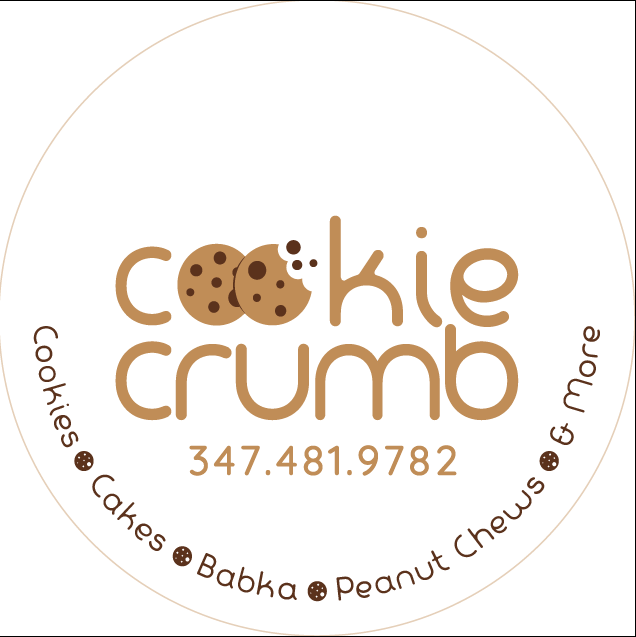
mayby try it in white, but looks much better than the shadow!
1 Like