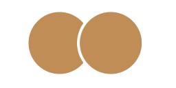
I like the cookie separation like this.
For the bullet points you should try the bitten cookie instead of the one you have now, this looks a drop like a paint pallet IMO
I agree with @hadassyf - try switching the stroke to white
love the logo!!
How about just removing those 2 chocolate chips which have it overlap and adjust the others it should look good? You can simply look at it as one cookie when placing the choc chips so you dont need a seperation.
Really nice btw
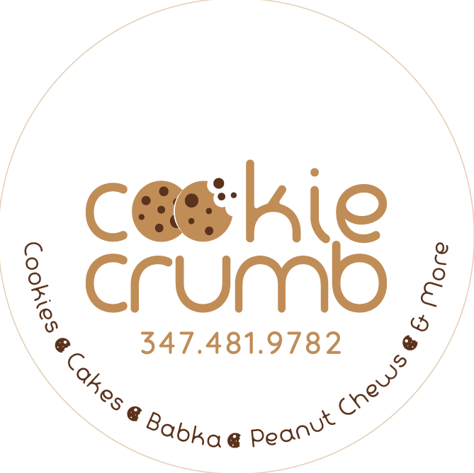
great job! i would try the stroke thicker
Just an idea - maybe try inverting the colors so that you have a brown sticker with a lighter shade brown logo and words
Does anyone think I should just use the pathfinder and split it so that if we would put it on a colored background there wouldn’t be a white line there, just a space?
–
She specifically wants a white label so that if it doesn’t print 100% perfect, it won’t look as terrible.
I have a color panel for this logo: the dark brown, tan, and a light brown that can be used as a background, etc…
yeh or you can use shape builder tool with alt to get rid of areas too - i think it’s always good to do that for a logo but save a version of it before you do it. i also think the white gap between the two cookies/O’s should be wider/more intentional - now it looks like you are trying to make it not noticeable but logos should be bold and clear esp. as your font is nice and bold

love it!
it seems the white is thicker in the middle - i’m wondering if would look cleaner if you did an even stroke of about 5 pt on the right hand cookie (or both cookies if you need to make sure circles stay same size and after use shape builder/expand so can be resized/be on transparent etc) more like this: