Hi I’m making a logo for someone that does hairstyling at home,
(I’m not getting paid for this, but I don’t mind putting in the work…)
I personally like 1a/b the best- would love to hear what you all have to say and how I can fix it up…
Thanks in advance!
There’s no attachment…
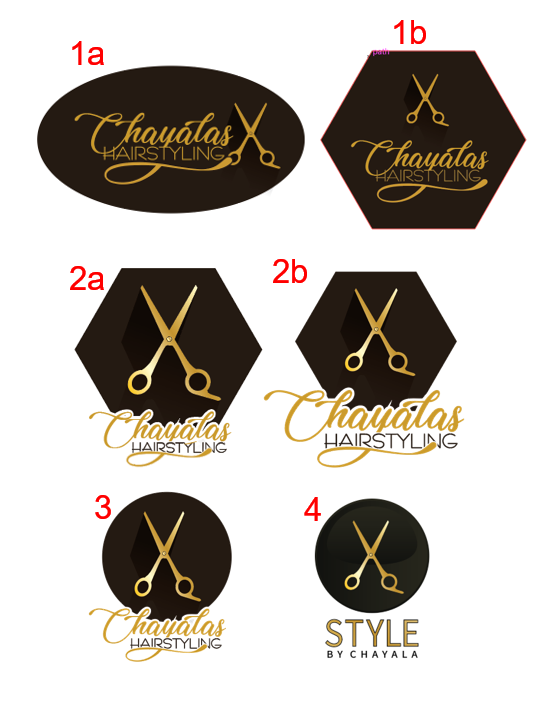
How about trying number 1 on a white background?
feel like it will give it a softer, more feminine tone…
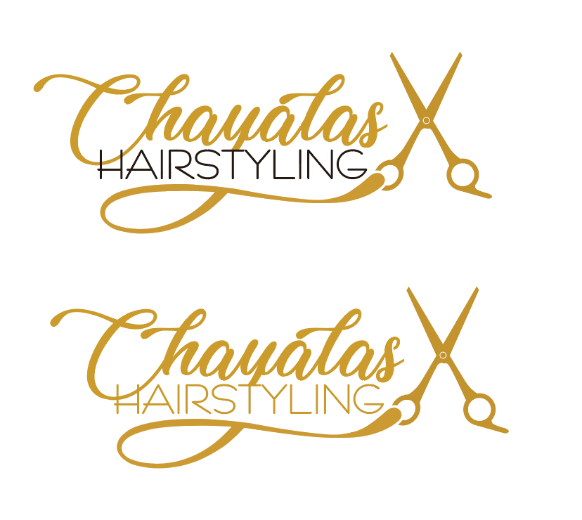
I like number 1 with no background, this way it can always go on any color background and is not tide down to a shape.
Try a softer font for the name, like
or
I like logo 4. very neat and clear, however I would remove the stroke from the word Style
1A is a winner! and i agree that the background should be removed!
Hi! thanks everyone for your input!!!
question: I don’t have to put an apostrophe for "chayala’s, right?
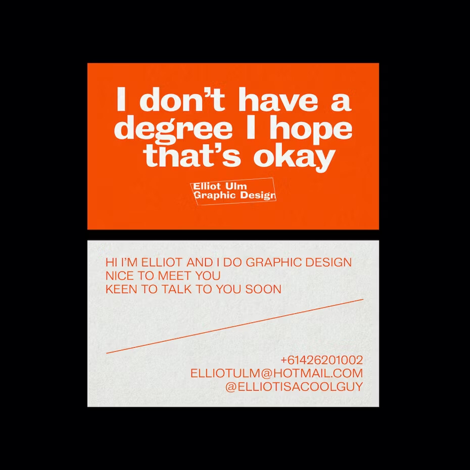
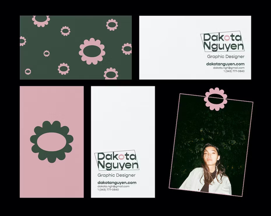
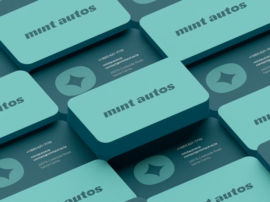
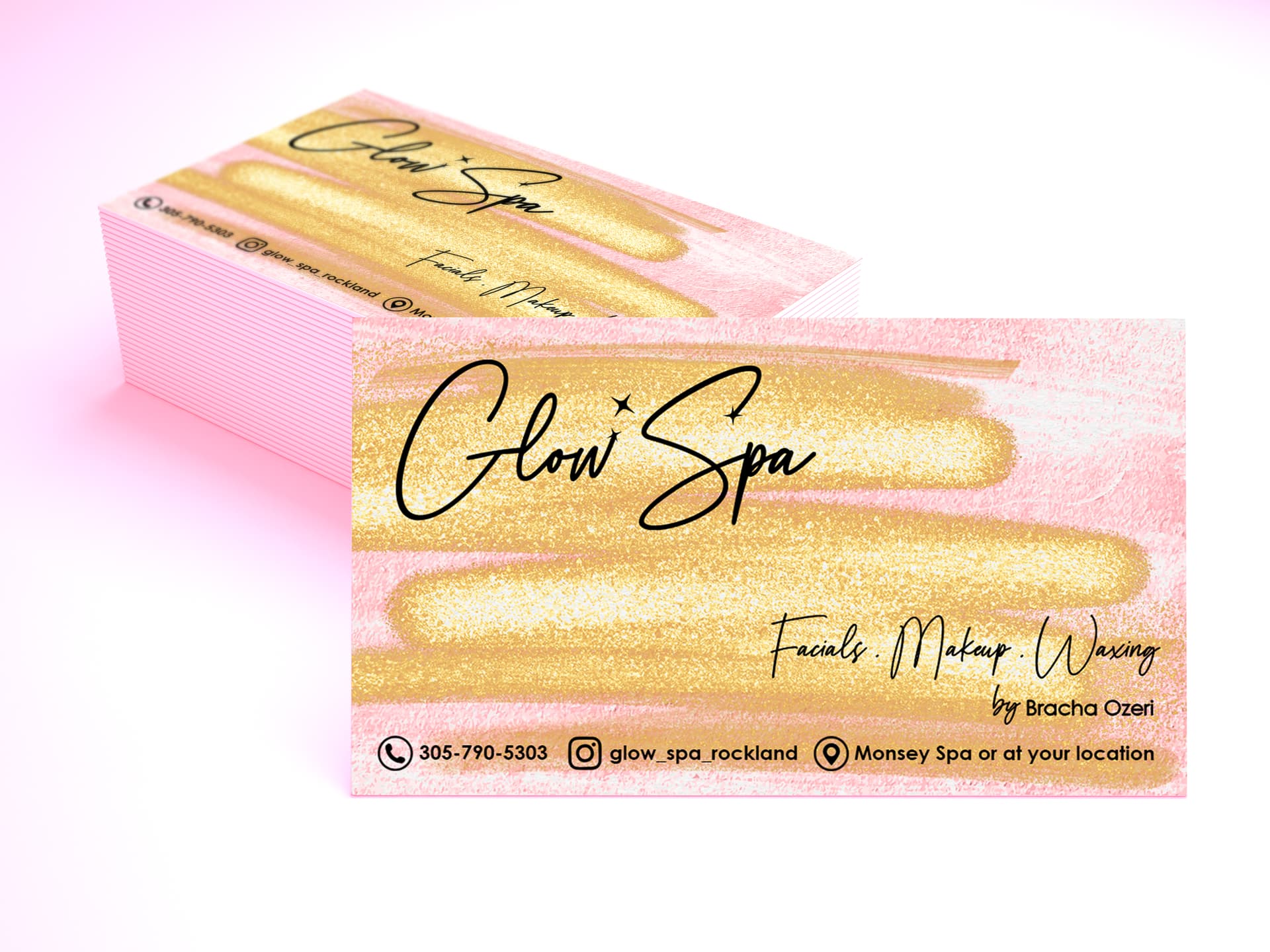
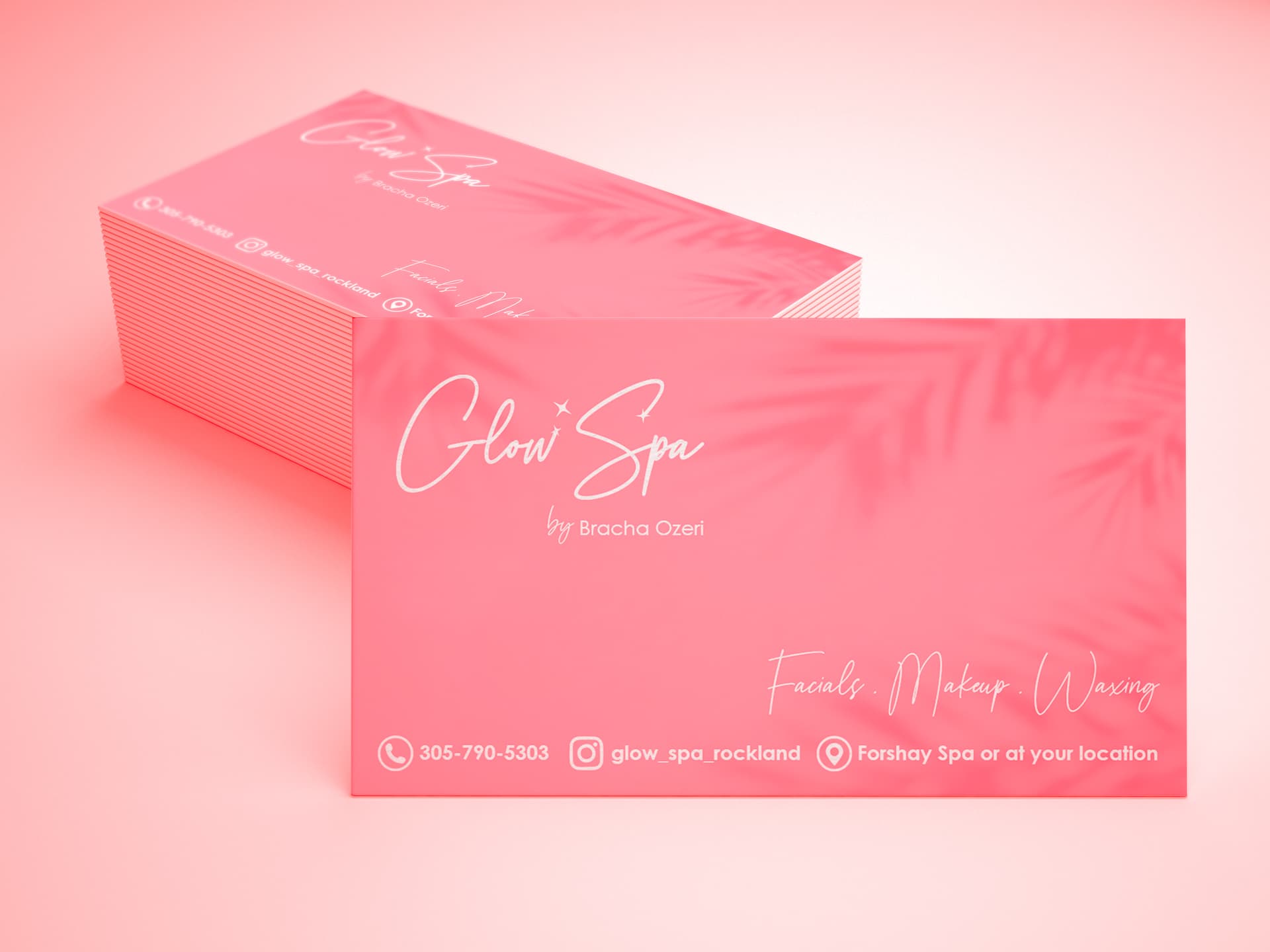
Can anybody attach some inspo for business cards?
please upload images because my filter currently blocks tons of sites…
thanks in advance 
right
thanks!
thanks for sharing!! its so helpful!
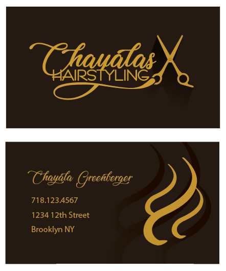
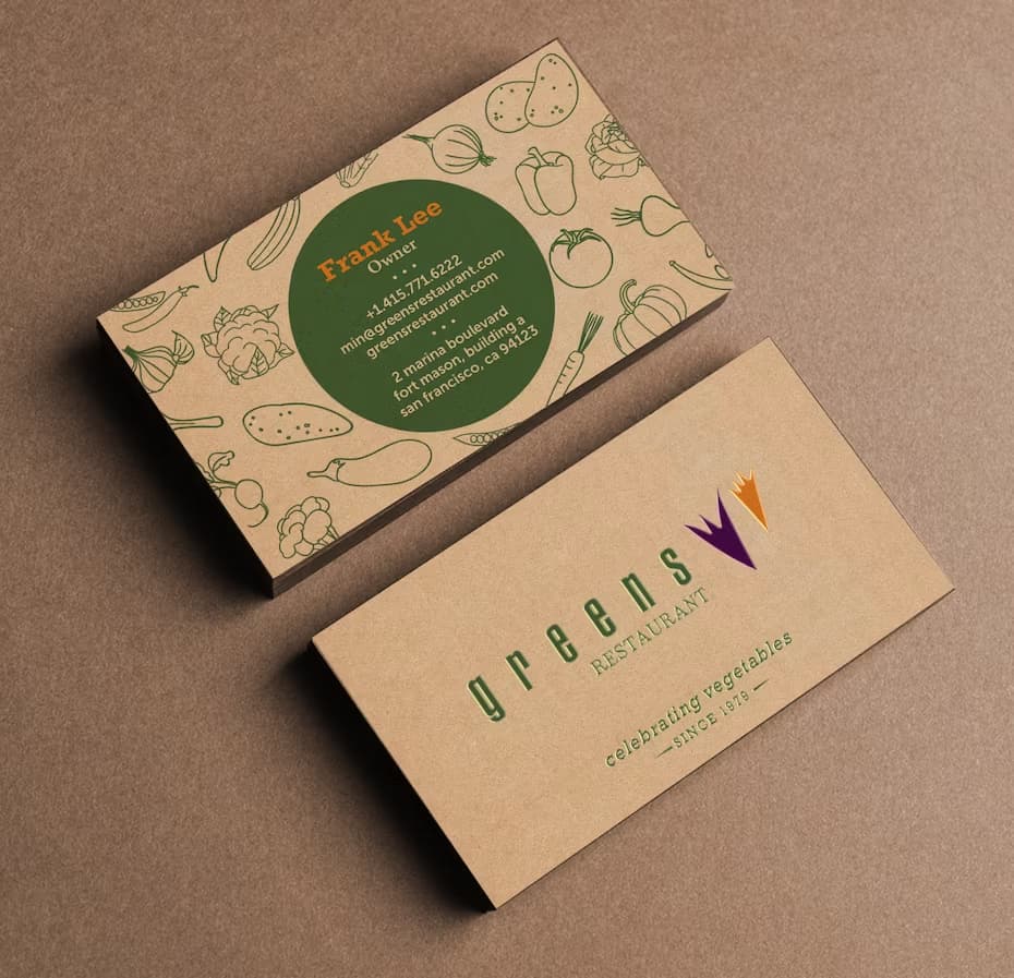
It would be cool if the black hairs in the back were printed embossed!
I am wondering if the black on the front and the back is too much…
They both look nice enough to be the front side, but I imagine that one should be grabbing more attention than the other. Am I wrong?
I would do the info side very light shade of the yellow/brown…
Its really nice!