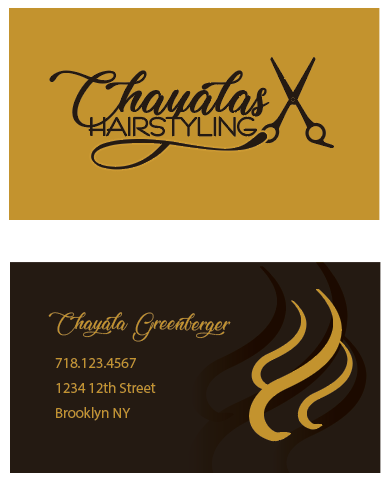
Yea I thought so too - that they both look like the front, but I couldn’t figure out how to change it…
Ill try the lighter background
thanks for your comments!
Yes, really nice! Agree with mentioned corrections. Please post the final one!
How about this? I just switched the colors…
I like the gold on black more for the front but I couldn’t change the back side - it didn’t look good
any ideas? or should I just leave it as is? ty!
i like second font better
really nice job!!!
also one thing - maybe you can try taking away the top of the ‘h’ -thats sticking up past the c. i feel like it might look neater…

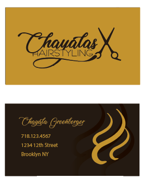
Really really nice! I like the gold and black.
Just one thing, is the logo centered on the front? I am trying to decide…
No, your right, thanks!