Hi!
I would like to create an ad for myself as a graphic designer and I’m kind of struggling with coming up with ideas and researching for inspo. Anyone done this and can send some ideas either here or to gutman.miriam@gmail.com?
Thanks!
Hi!
I would like to create an ad for myself as a graphic designer and I’m kind of struggling with coming up with ideas and researching for inspo. Anyone done this and can send some ideas either here or to gutman.miriam@gmail.com?
Thanks!
Thanks so much! Cool concept!
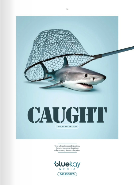
Here’s another sharp ad I came across in the balebusta once…
If you make an ad, please post it! I’d love to see… ![]()
These are great!
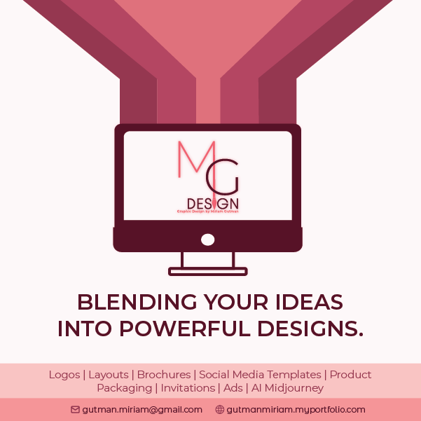
I designed this one - totally different style but would love feedback and critiques please!
It’s really hard to make an ad for myself!
I like it! I think it’s a nice bold design. I would leave a bit more space in the darker pink bar at the bottom, or just check your margins so nothing gets cut off. Hatzlacha
I like the bottom half! are you able to get more of an updated computer look, like the rounded 3d style? i also think the stripes on top are a drop intense…
hope thats helpful:)
Thanks!
I hear… What would you suggest doing with the stripes? Taking lighter tones of those colors? Lowering opcaity? Or coming up with something totally dif…?
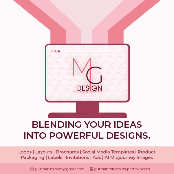
How’s this? Is this better? Should I totally change the concept? It’s so hard to create an ad for myself! ![]()
Totally agree! So hard to do for yourself…
maybe you can have the top blending together more? Colors are somewhat better now, maybe the bottom rectangle can be the dark maroon with the text in white?
It’s always hardest working on your own brand… That’s why I’ve been avoiding doing it for so long ![]()
I can never make myself an ad!!
I feel like its so much light in there, can we get the computer to be darker maroon and maybe the middle strip can be that same color? or maybe the bottom bar can be that color with white text?
Another option would be to put all your info on the bottom not in a bar.
another tip: i think the bottom bar should be that same dark pink/burgundy color… i would change the computer to a more realistic one… like a mockup of real laptop…to make it a drop more updated. i think for the top stripes- maybe make them smaller and longer
Hi
I’m also attempting to put out an ad for myself and would appreciate feedback.
As has been mentioned, it’s really hard to brand yourself!
Nechama, it’s so sharp! I love the concept and the ad looks great!
I don’t love how the bottom info just looks tacked on in that bar. Maybe look at different ads to see inspo for how they do a bottom bar and bottom info.
Also, do you specifically prefer your logo on top? I’d probably put it on the bottom like a standard ad.
Such a good concept!
I think you should put your logo on the bottom and make the next words the focal point. make the font for “looking to launch your business” more bold and sharp.
Wow thank you for the very helpful feedback! I tried a few things, I’m sending a few variations. @AMiller I had a hard time finding inspo but these are the options I managed to come up with…do any of them look better?
I agree with the logo at the bottom, just toying with the options of where exactly.
@chavi I tried to change the top font, as you’ll see in the one image, not sure if it’s too much and
I should just make the original font more bold?
Thank you again!
I like the middle option
I like the middle one - bottom half, and I do like the bolder text.