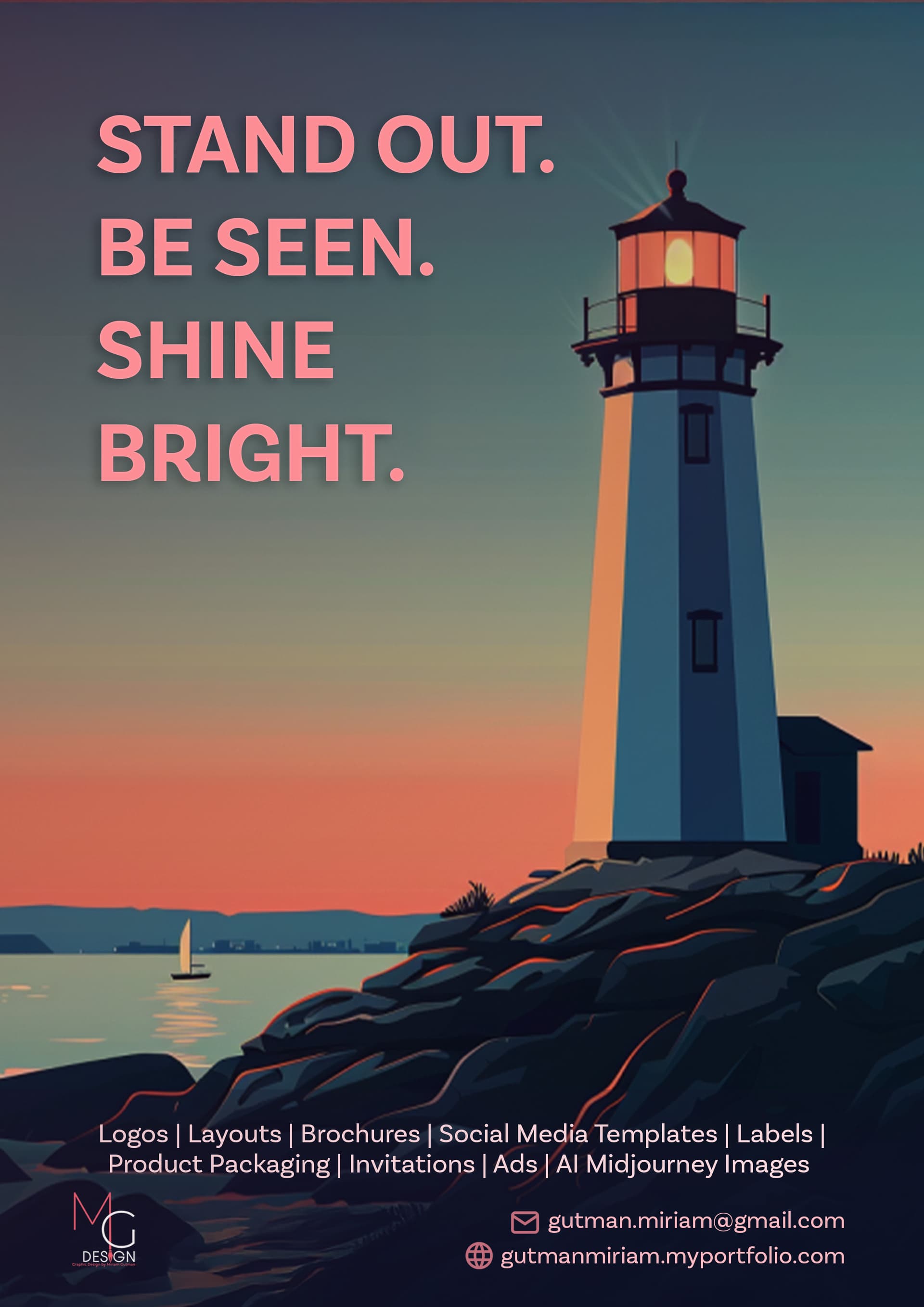
I like it! For the text in capitals, I’d use the same font as the others, just emboldened.
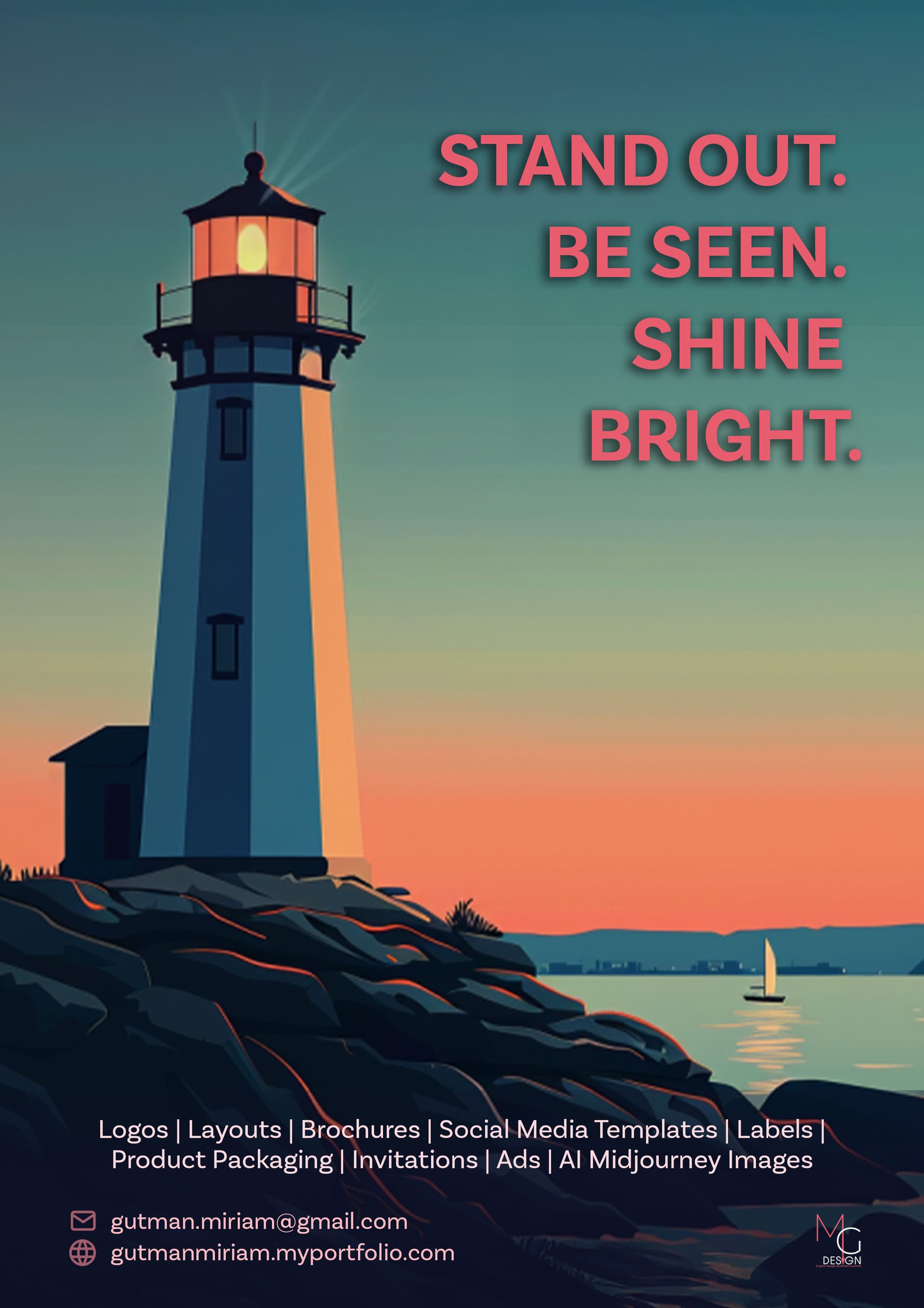
Would you maybe try another version where the text is the focus rather than the image - by making the headline really large?
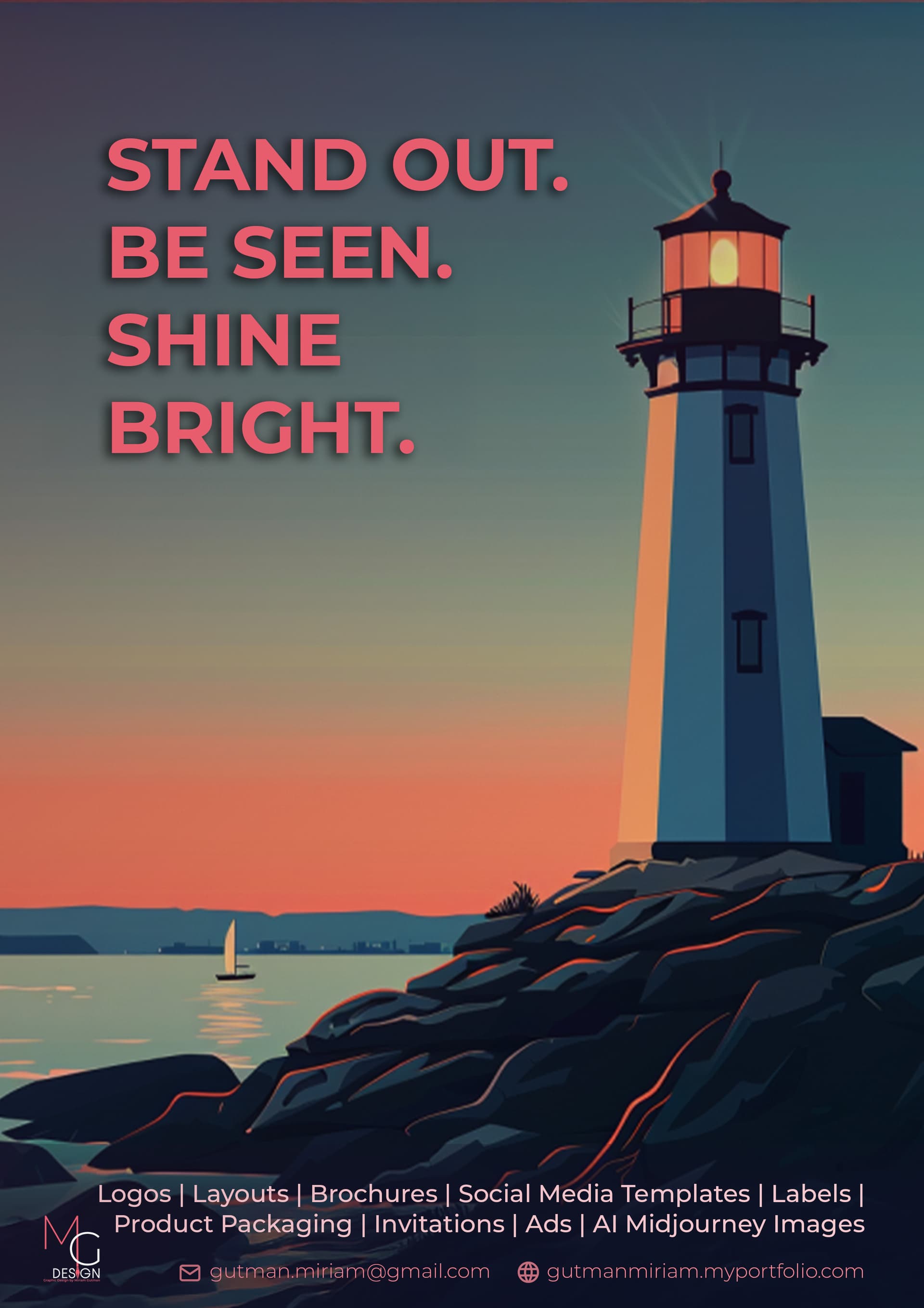
Make sure your margins are big enough.
Agree, middle option for the bottom text, give it more margin like @RivkyH said, and I’d try putting the logo centered to the rest of the text. Let me know if you’re not clear with what I mean, I can try to find an example.
I think the new font you used is overkill, but maybe a different bold font or just make the original font bolder.
I honestly don’t love the original font, is it your branding font? I’d maybe choose to rather go with a modern sans serif.
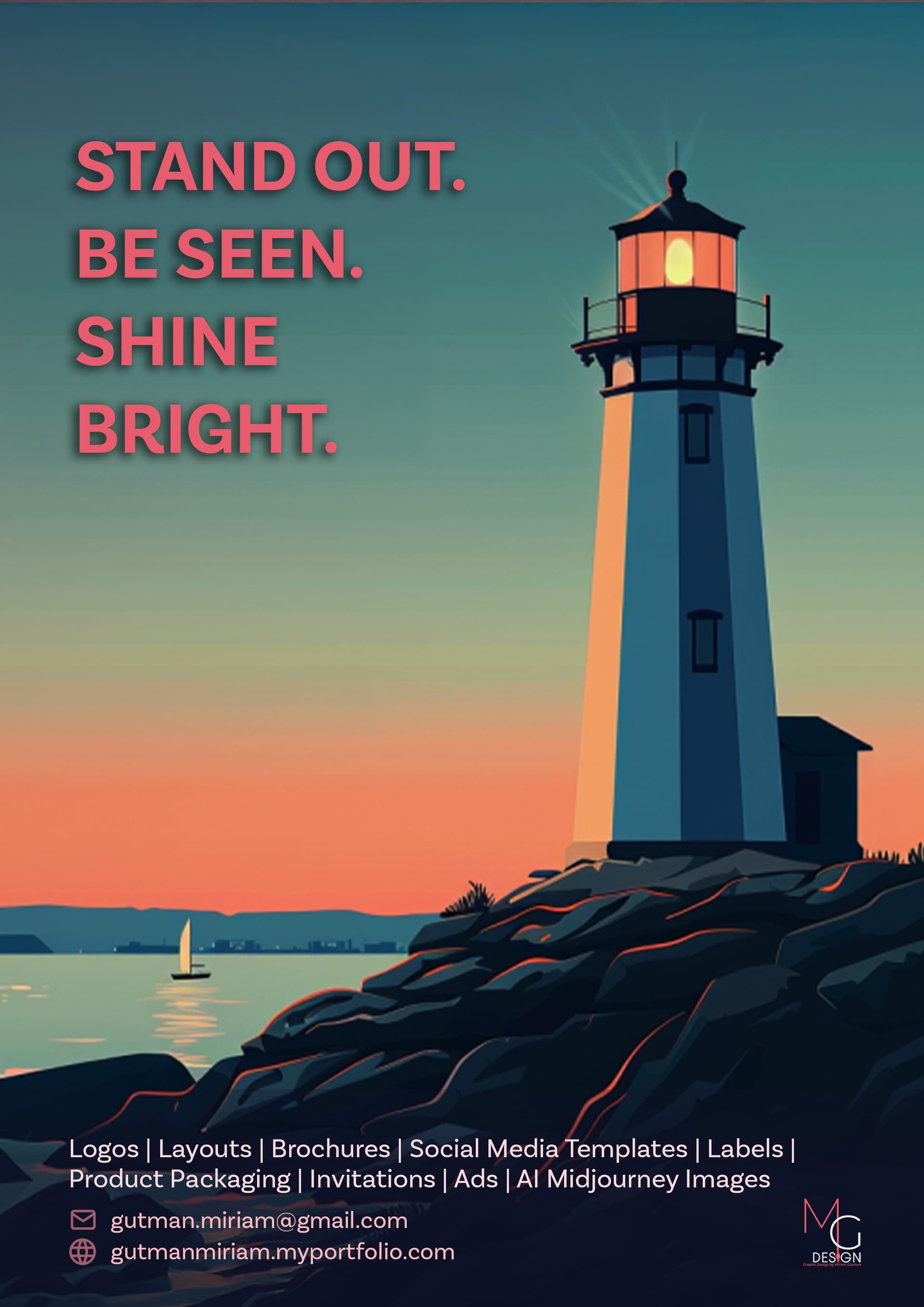
Is the image AI? I love it, it makes the whole ad so sharp!
Thank you! I really appreciate your feedback.
I will make some changes and share what I come up with
Yes it was AI but not something I generated myself
Cool, its a great image.
Hatzlacha with the ad!
Hi!
Still trying to figure this out…
How’s this ad and concept? Is it too dark?
The thing I’m not sure about is, is that I feel like it’s such a different style from my logo. What’s your opinion?
Thanks!
Love the idea! I’d suggest placing your design services a bit higher and then your info. Right now, they feel a bit too close together.
Can you make the info on the bottom the most white possible? also I think it would look better with more space under all the info. Can you make the font a drop more personal?
I love the idea!!!
2 Likes
I think it could stand out even more.
I like it! I personally prefer the headline on the left side, and I’d try changing the colour of the headline to something even brighter/lighter.
I also don’t really like using shadows, I’d make those even subtler.
Your logo can also be a bit bigger
Love it! also like text on left side better.