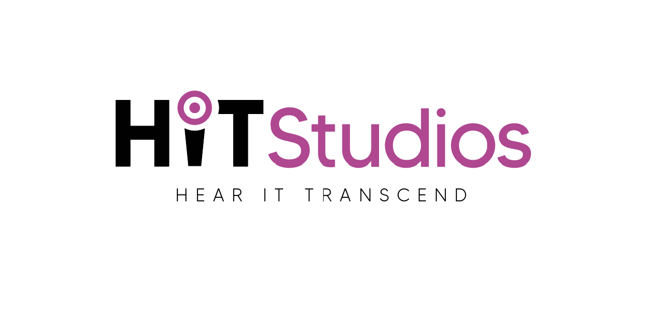
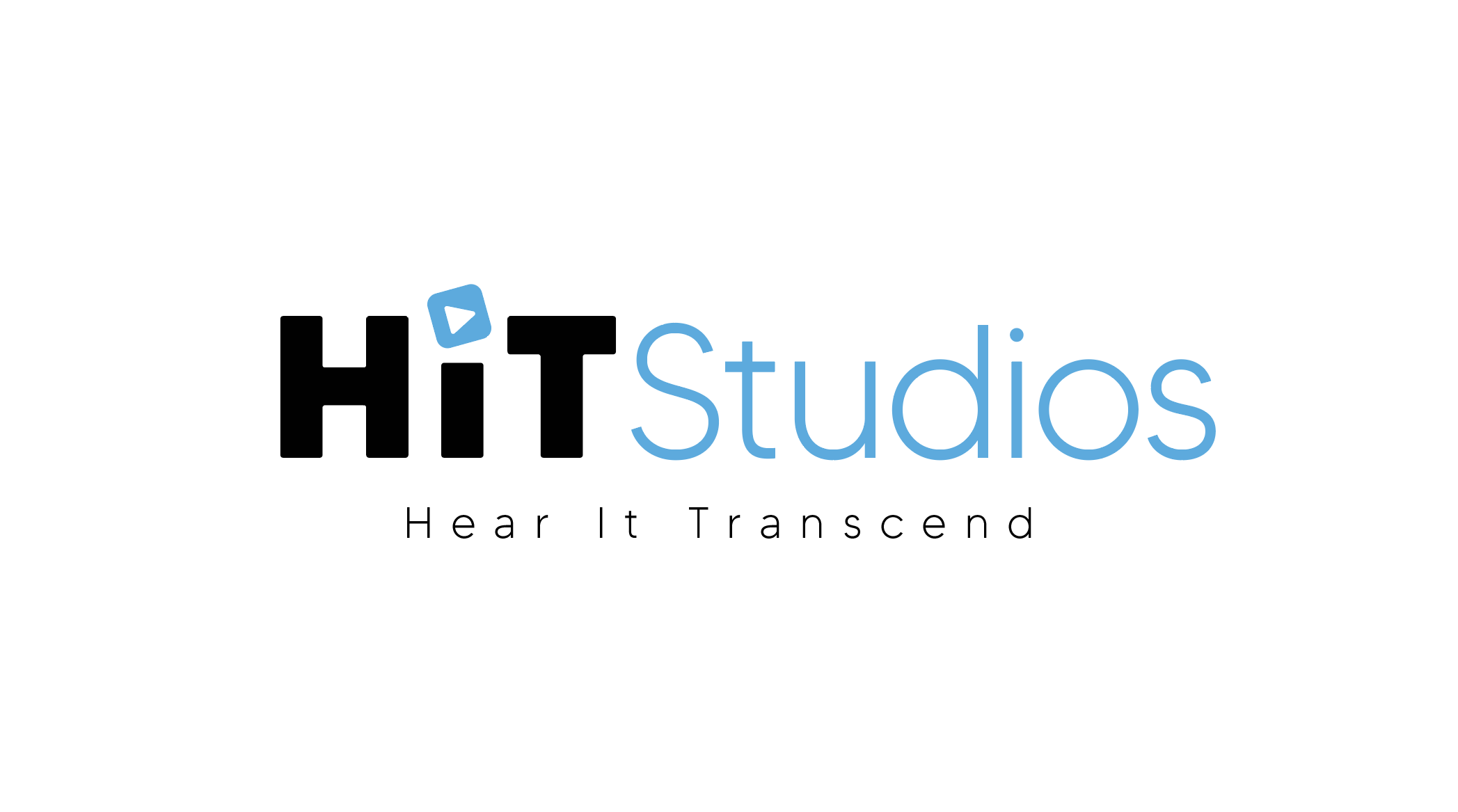
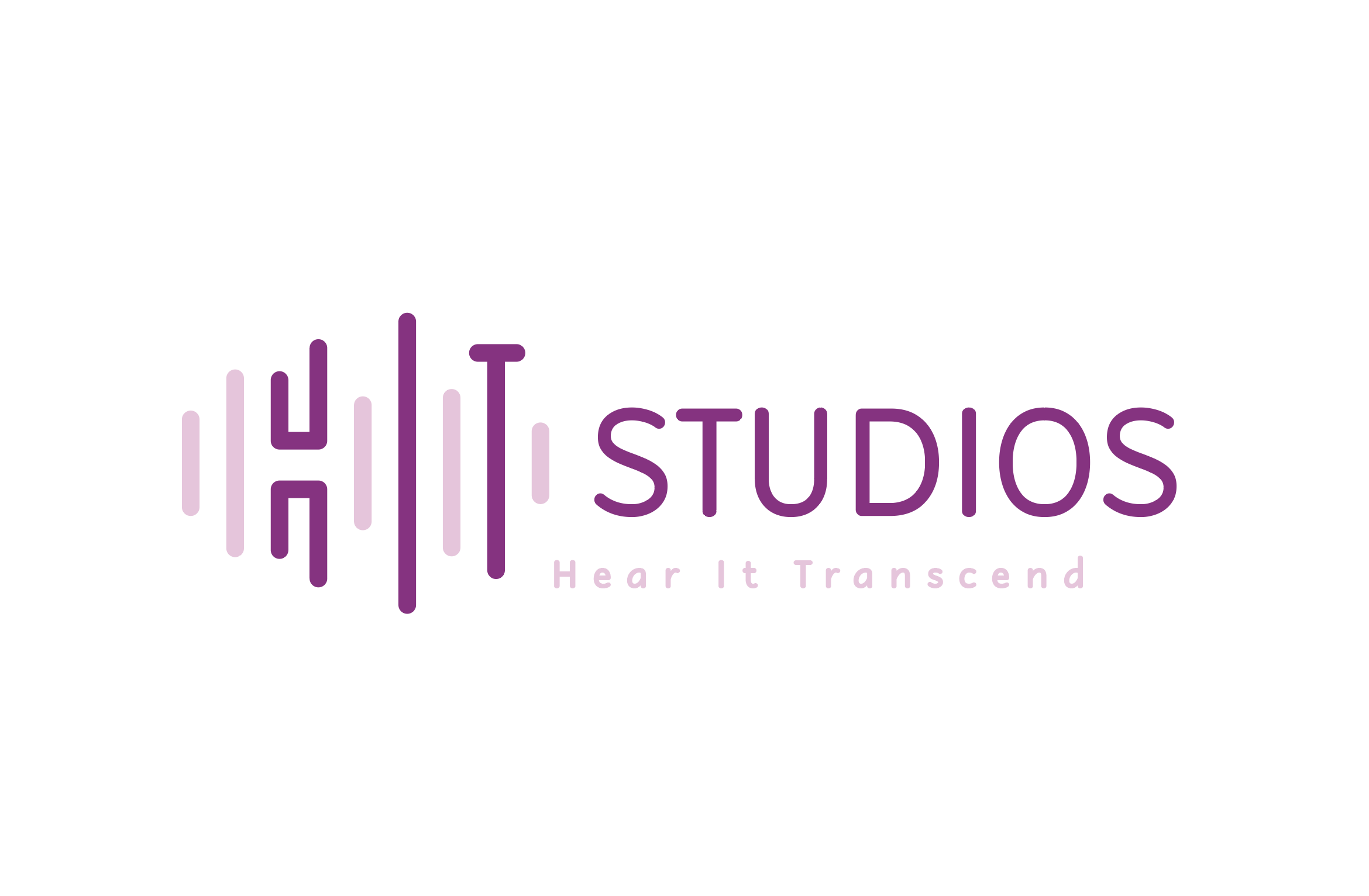
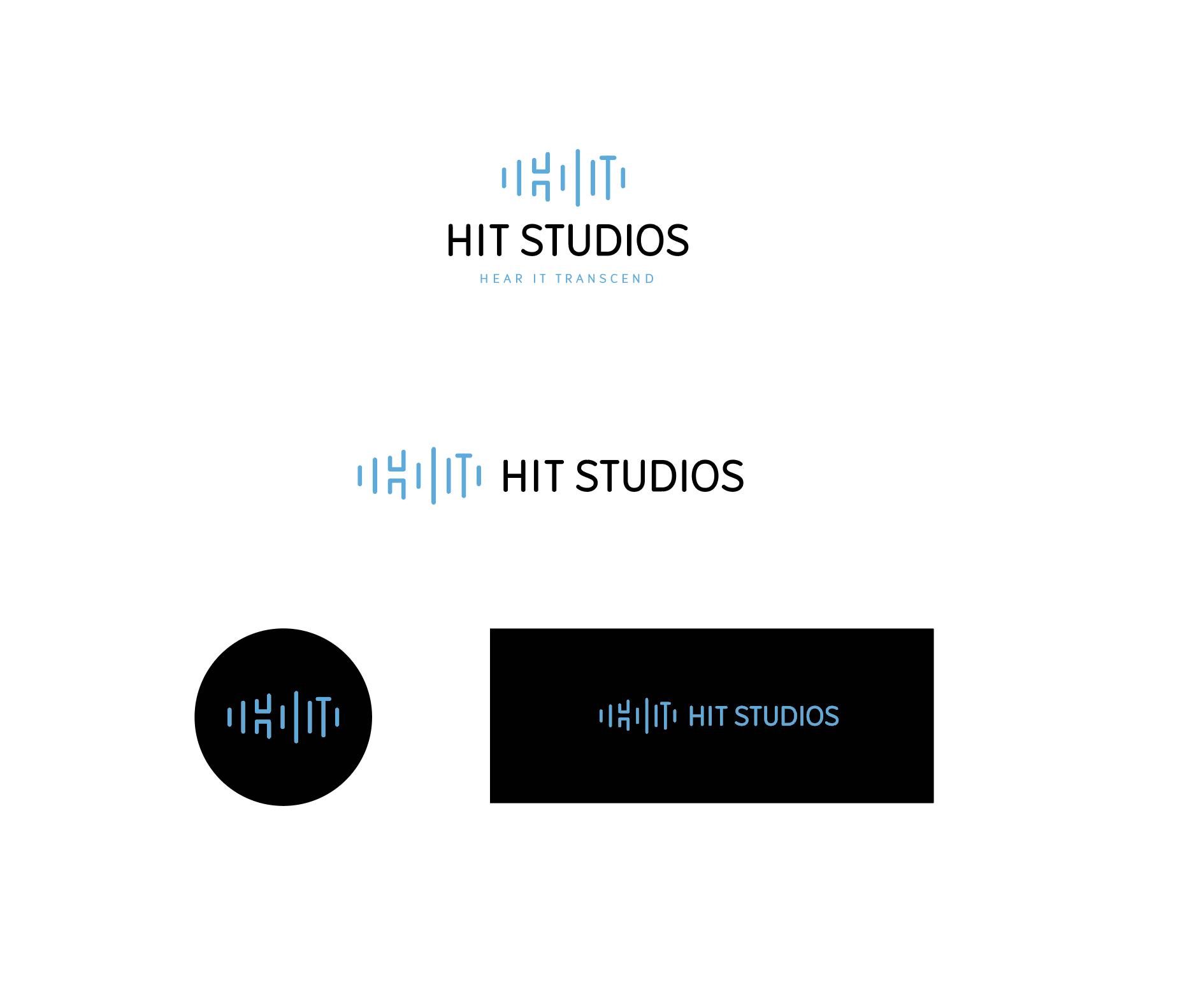
I’m designing a free logo for a cousin who is opening a recording studio and for some reason im really stuck on what to do I’m finding the composition of the logo quite difficult coz the main word is short and the secondary word is long and then there is also a tagline…
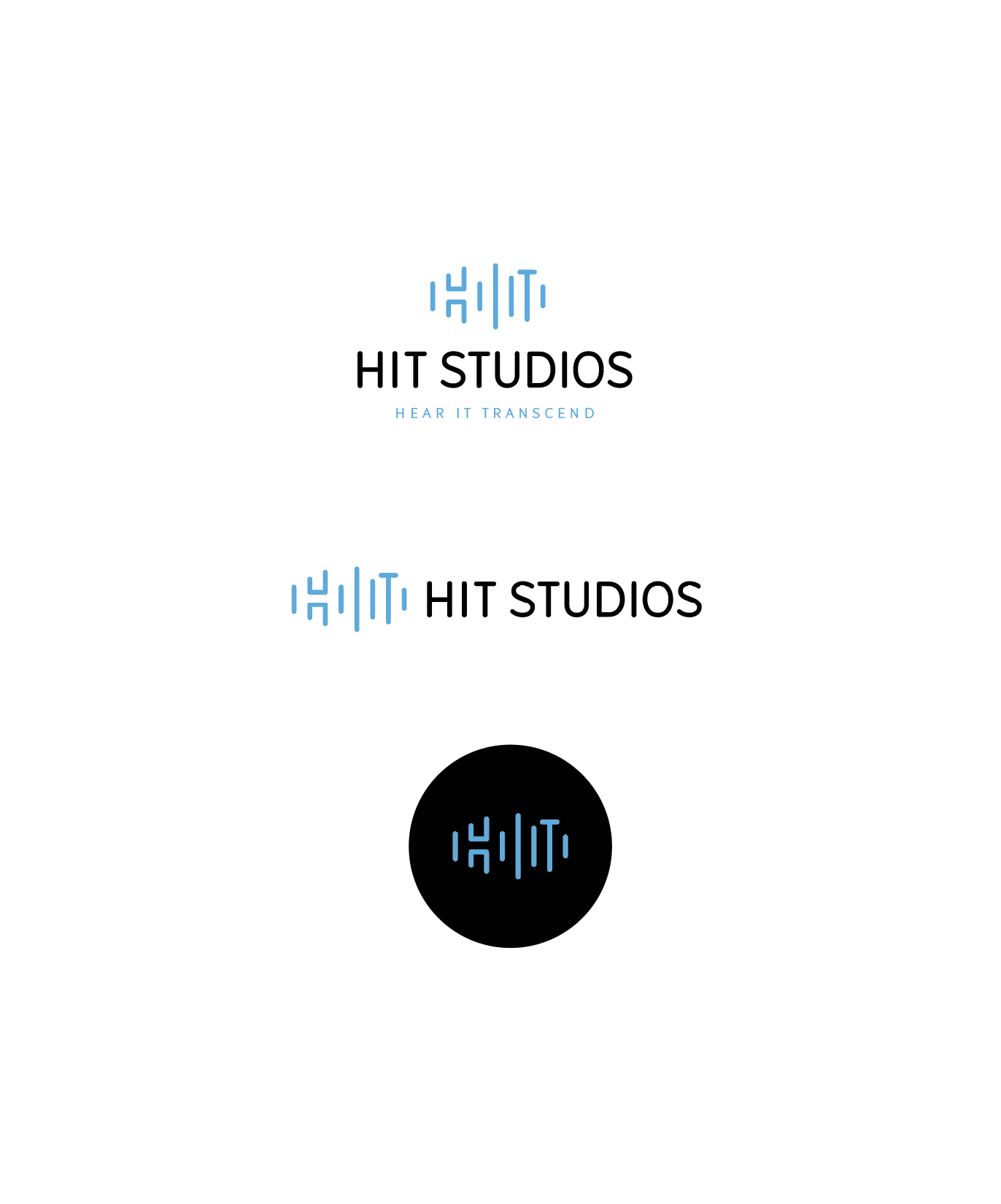
Here are a few options i made but for some reason i like them but dont love any enough to send her… I used to send 3 logo options to my clients but recently i switched to sending only 1 at a time as i found that then there was a way higher chance of the client going with an earlier option… i also present them well which I’m not doing here because i just need some constructive criticism to somehow make them look better and more professional… btw i have not worked on kerning and all that yet because it isnt for a proffesional client and i don’t think they would even notice so il do that after they choose because i need it to be good enough for my portfolio otherwise why work for free
I don’t think it’s too similar to youtube, th coloring and the layout are totally different, although it does maybe imply that she does videos. You could try a no-fill, blue stroke circle with play icon inside. Might not look as sharp but you could try to see how that looks
just to confuse the situation, i really like number 1!
I think number 2 is the wrong impression, doesn’t look like a recording studio…
the newer one is okay too but i think the first is still best!
Good luck!
If its a lady operating the studio I would tell you to go with the purple color for either logo that you do. When I see the blue logo I feel like its more geared to men.
I like the recording button idea for the first one.
The second looks too corporate maybe, but I like the font!
I love the idea of the third one! Maybe it needs some thick and thin variety like the first two options? Also, make sure that the the negative shapes are even (its making a funny shape now).
Can’t wait to see the finals!
i’m just thinking you can do the word HIT in big and studios do in vertical next to it, that will make it much shorter, not sure how it will look, just an idea