Hi I’m creating a logo for a childrens evening wear rental. Client wants something that is not specific to girls/ boys, but should be clear that it’s for both. They want something whimsical and current. All feedback/ criticism is appreciated.
Thanks!
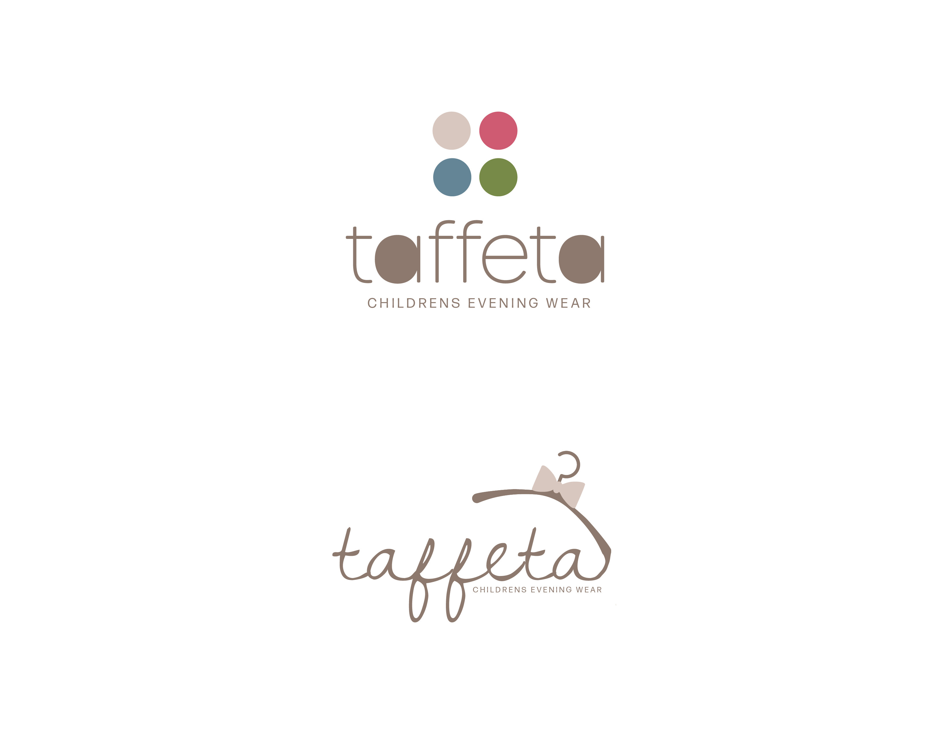
I think if your trying to get whimsical it should be softer, When I think of whimsical I think of fairytale style, look at Betsey Clark stationary.
I think the second one would work really well with fairytale style added in…
I hear you! Do you think these choices are soft and “kidsy”? I want to keep it modern and sleek at the same time
I like the second one and I think it can go really far, I just dont love the placement of the hanger.
That it’s connected to the A, or the way it’s connected?
Im not sure can you try putting it somewhere else and see how it looks?
I happen to like them both a lot. The second one to me does look very ‘girly’, I would maybe try the bow in a different color.
They are both beautiful! The first one looks more of a weekday/playwear vibe. I really like the second one but that pink bow makes it look quite girly.
1 Like
i like the second one! i would capatalize the first letter ‘T’ and maybe add somewhere a blue tie it should be approprate for boys too
I love the second one and I would change the bowtie color and make the hanger a little straighter.
I like the first one alot, I would just keep the a’s not filled in.
I like the second one.
Maybe you can make the crosses of the 't’s with 2 different color bow ties or anything else that can tell you the diff between girls and boys.
Also, bring the hanger down and in, it should be closer to the words.
Thanks everyone!
Here’s the updated versions with 2 variations for each, what do you think? I changed the bow to blue, tilted the hanger in so it’s straigher, and connected it to the F
I personally think that option 2B is overkill, what do you think?
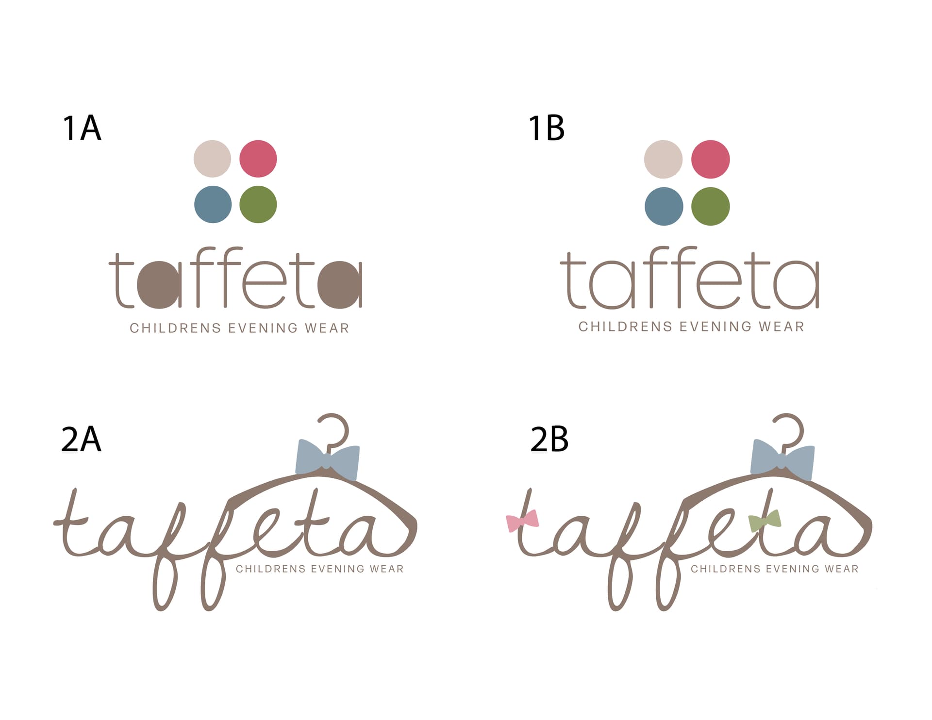
I like 1B.
For both 2, maybe make the blue bow smaller and keep the pink bow and not the green, and I also like it more when the hanger isn’t connected to the f, it needs some breathing space but not too much.
I actually like where the hanger is now better.
With 1A, what about just having it in the center above the name not touching it. Just there.
And would it be weird to have half the bow tie blue, and half pink? Curious how that would look.
About 2B, once you are sticking the bowties on the T’s, I think that you can get rid of the hanger.
I love the font choices and colors!
Is the “children’s evening wear” too small on the 2’s?
Either way, I think that you should send these both to the client. They are great!
I like 1b, it’s neat, soft with class.
Thansk for the feedback! Looks like 1 is a keeper.
Here’s 3 variations for choice 2, what do you think?
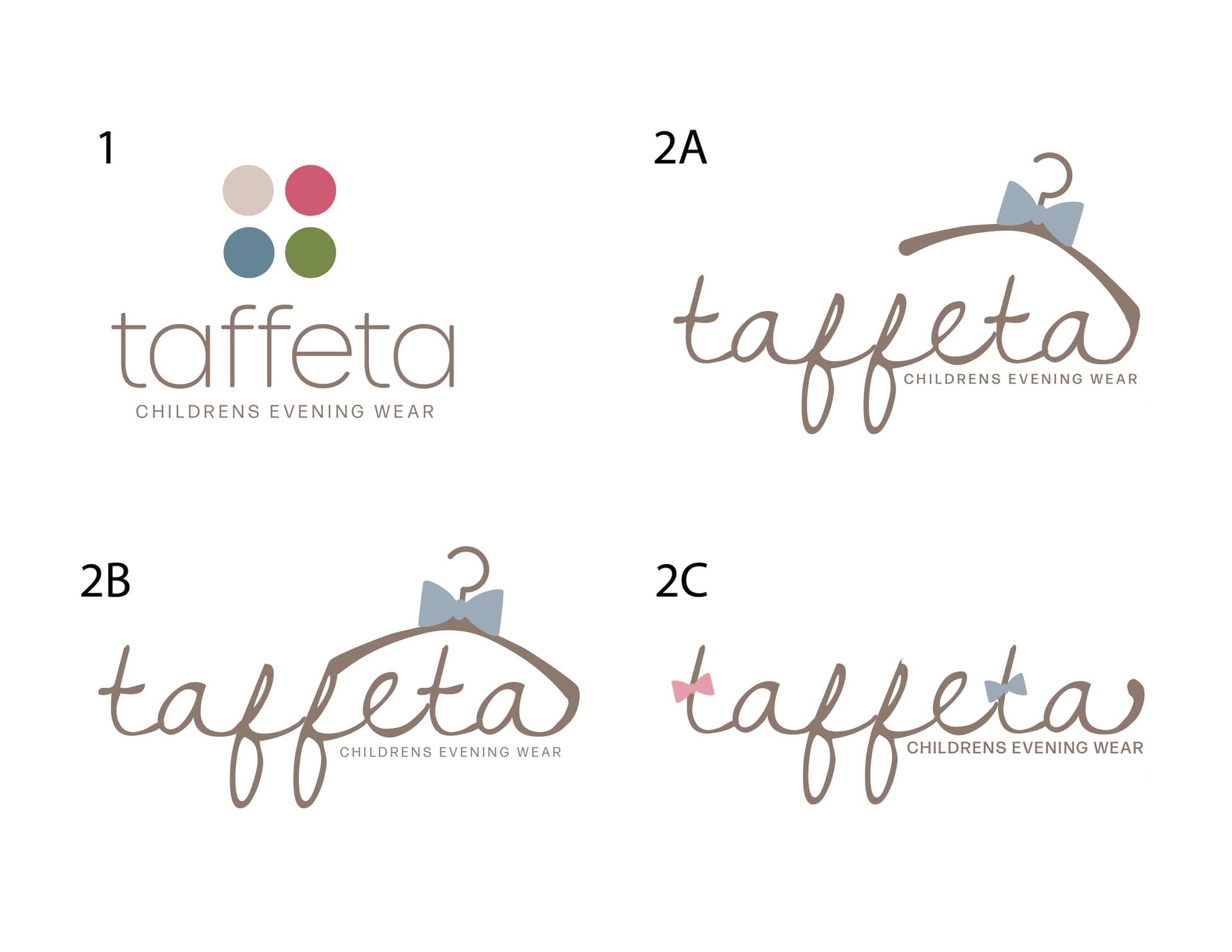
love it! Really nicely done! I like 2a and 2c best.
Thanks! Which do you prefer - 2A or 2C?
gr8 job, love it! i like 2A with the pink bow on the first t.
sorry for making it so confusing. 