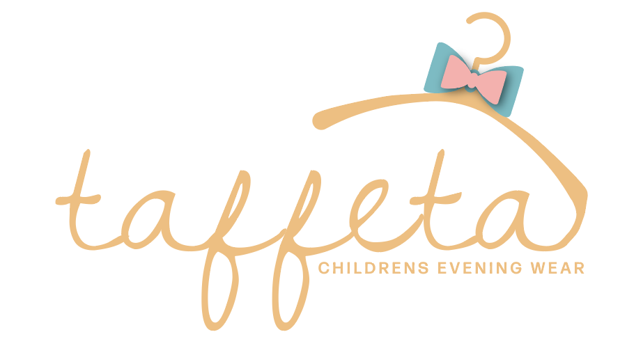
Like this?
Do you think it looks unbalanced to have the bow on one t and not the other?

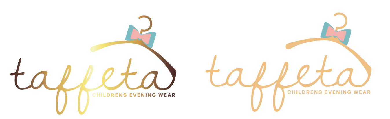
I’m leaning more towards 2c
I also like 2c the best
So funny there’s something about that hanger that I love!
I feel like 2C doesn’t have much life to it
I think 2c has that whimsical look in it!
I think they’re all really great and you can leave the final decision up to your client.
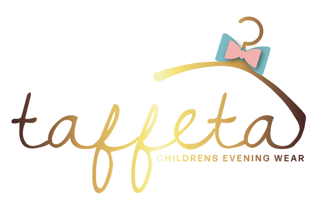
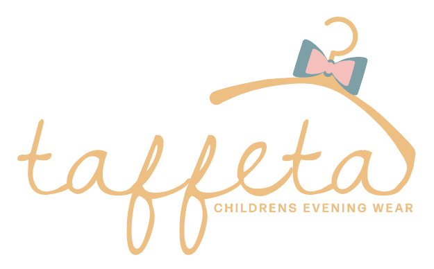
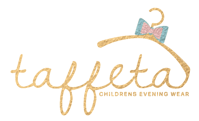
Client wants a double bow and gold base. It kind of loses the sophisticated edge now. 2 variations - one with metallic gold, for when she wants to use that (most times). I feel like it ruins the logo, and that it won’t print nicely, but that doesn’t seem to bother her.
What do you think?
I love the first one. The double bow is such a smart idea. The gold is so nice with it. Great job!! It really came far!!
Really nice, I would remove the shadow underneath the top bow as I dont love shadows in a logo
Thanks!
@miriam I hear you about the shadow, but now it’s looking a little flat. Any suggestions?
Maybe try making one of the colour darker and the other more pastel and see how that looks?
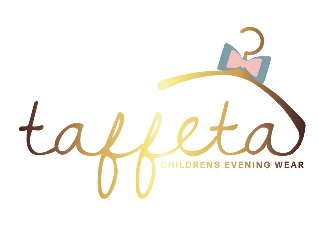
For the gradient don’t make the lihgtest color that light, the middle part is a bit hard to see. You can also lighten up the darkest shade a bit
Love it! Really nice!
Really beautiful!!
Nice!!