I know there’s a lot of text… I tried to make a focal point and the rest of the text as secondary but it’s still looking very crowded and hard to follow… any ideas/suggestions/critiques would be appreciated! TIA!

I like the vibe, but as you said there is too much going on. Different shapes of graphics, colors and text. Hearts, quotation marks, circle, stethoscope plus the gradient, gold banner and texture of the paper. The script is also a bit too hard to read. Try to keep to 2 fonts , less color and one graphic.
Hope that helps… Hatzlacha!
Too many different visual groups. On a one page flier you should aim for about four groups of info/elements. See what can be grouped together here, such as overlapping the hearts, moving the lines above and below the gold closer to it to create a group, grouping the logo with something. Also no need for boxes around the quotes as they are now, just adding to the business…
Also needs a much stronger focal point, as all elements here are basically equal in visual weight and dramatic interest. Do you want the top phrase the focal point, perhaps together with the logo and graphic? Or do you want the gold area with associated text to be the focal area? Especially since this design is mostly text, you need to create interesting and dramatic focal area and secondary focal area.
Cute repetition of the heart shape. Is there supposed to be a website or contact info?
I feel like you should move the logo down to the bottom left and possibly put it inside a heart.
You should make one focal area consisting of "Is this u? now forming… and all the text in the gold bar…move the stethoscope to the far right so you can bring up all that text. You should stick to two or three fonts at most and try to get something less condensed for the the text “For children that may require…” It’s too squishy so someone will just skip reading it…
The deadline is confusing - what day of Chanukah?
Also there is no contact info if someone would be interested in signing up.
The client wanted my to change the color scheme to the logo colors (which I did not create) so I changed the whole thing, tried to limit to 2 fonts, and tried to group it more.
Let me know if this is any better and what else I can improve, thanks!
I like the tone, but for me personally, it’s too busy. Too many shapes, splashes of colors and gradients. If you choose a busy background then tone down the design or the other way round.
I hear…
Is this any better? I made the background more transparent
Or it’s still too much going on…
the client gave a lot of text to incorporate so it is a little hard…
Yes, that really is a lot of text!!
Maybe you can figure out which is THE MOST IMPORTANT, which comes second, and so on.
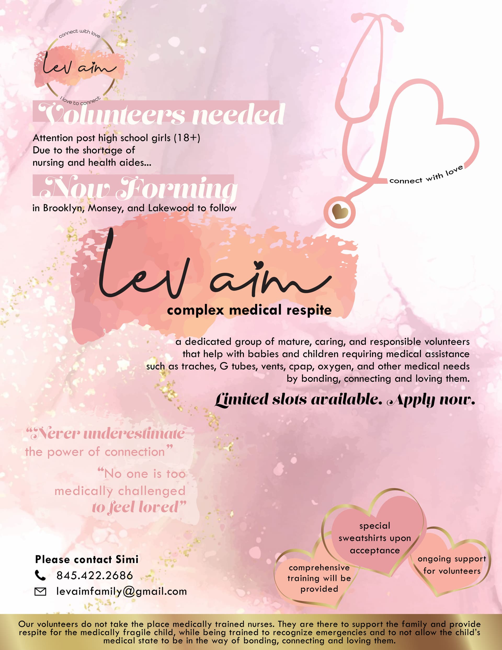
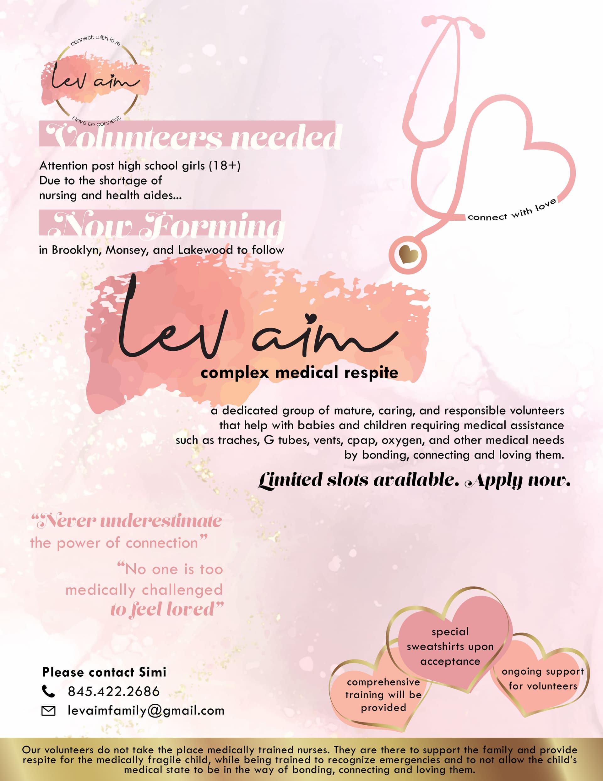
When I read it, I’m not sure what the main point is: Volunteers needed/ Now forming/ Lev Aim, complex medical respite?
Going back to what @Alyse-Bayles said, try making a stronger focal point, leave some space around it, and make it obvious that it’s the main message of the flyer.
Hope that helps!
Good luck  !
!
it’s much better that you toned down the background. Agree with Chani that it still could use some stronger hierarchy. It looks fairly easy to do… Make the top left consisting of the logo and text up until “in Brooklyn…to follow” smaller and bring it up so it doesn’t sit on top of “Lev aim…” you can make the sentence “due to the shortage of” longer by putting the next line of text “nursing and health aides” with it so it gives you more room to bring all that text up. Move the stethoscope down so it sits on the pink of the main text “Lev aim” right now it’s just another element to make the ad look busier so I think you should combine it with the main focus. Lev aim should be made bigger and the text underneath it should be moved up a drop also to sit on the pink splash. I don’t love the pull quotes that you have cuz adds to the business but if it has to be there, I guess its fine… just make sure it doesn’t compete with the main focal area. The hearts are cute!
Good Luck!
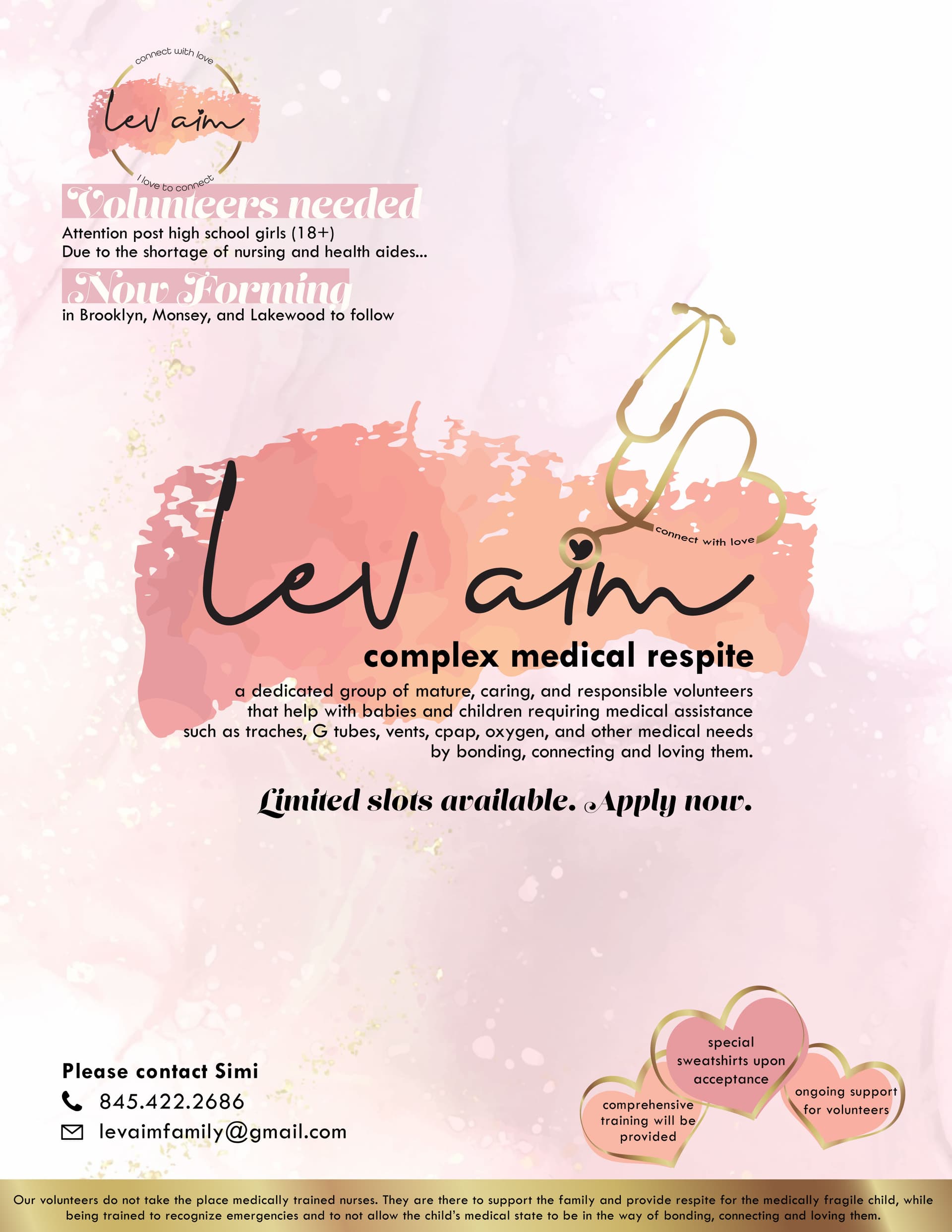
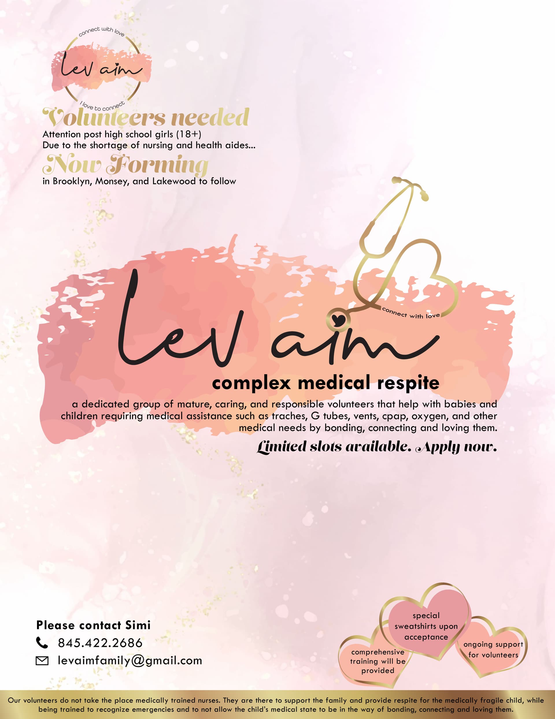
Now you have much clearer groups of info. I would say you should stretch the main pink splatter a little more to the left and right and also the text “a dedicated group of mature…” and then align “Limited slots available…” to where that text is going to end. I love how you connected the stethoscope to the dot of the i… I also think maybe you should color the “Volunteers needed and Now forming” in the gold gradient. It is a bit hard to read in that white text.
Looking really nice!!
Thanks so much for the critiques! really helpful!
is the gold gradient clear enough to be able to read “volunteers needed” and “now forming”? or should be made darker?
is the text on the bottom too small or its good?
the text “a dedicated group…” should be centred or it looks good left aligned?
yeah I think all the changes are good now.
i think its missing the word ‘of’ in the bottom by ‘not taking the place OF medically trained nurses…’
I dont know if its your department, but i would try to say the same thing with less words in the info paragraph if possible.
i like the direction you are taking now. How about expanding the middle dark pink background behind the whole middle part? Give the text more space (line height) logo a bit smaller and again give the text more room to breath
Looking great!
Really getting developed!
Maybe give the logo some space and move words underneath it down a bit.
Good luck with finishing up  !
!
It is amazing watching the design develop!!!
Great job!
Yes this design really came along nicely!
Great job!
I would put logo in bottom right corner. visually that spot gets most attention.
But really nice!