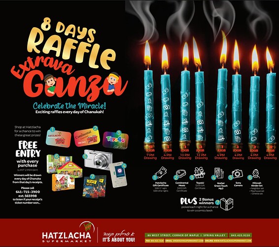
Really nice! I would make the candles a bit smaller so they are taking over the whole design.
Fun. A bit busy, too many separate visual groups without a real clear focal point or hierarchy. Can you enlarge title and slightly overlap with the candles by the end of the a in order to create a strong focal unit between the two, maybe the smoke can connect them more as a unit as well.
And then perhaps create clearly groups from the other items and organize that info more, also a bit hard to read/see some of that info. Contact info should probably go on the bottom red box, and so the smaller info is more just about the prizes.

