Hi,
I’m in the middle of making this ad for a grocery store. They want to advertise raffles that will take place each night of Chanukah. Every night they will make raffles according to what number day it is - for example, the 8th night will have 8 raffles. With that being said, There is a lot of info to show (and I still need to add bonus prizes and pictures of the prizes near the icons on top) but I feel like I don’t have a clear focus here. How can I organize this better? and is this exciting enough to attract kids? If not, what can I do to make it look cuter?
Also, I think the logo is competing a drop with the design so I will probably remove all the info on the bottom of the logo - it’s fine, right?
Thanks!
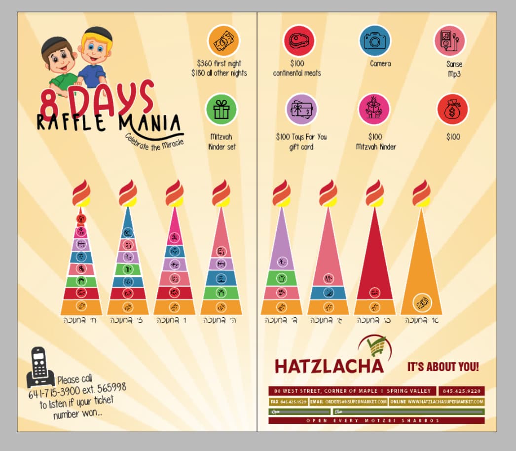
First thing I’m noticing is that I think the menorah should be going in the other direction since that’s the way we light it…
I’m also trying to think how this can be clearer, because as of now seems pretty confusing to me. I wouldn’t chap whats going on
are you sure? We light right to left… no?
Am I going crazy?! Lol! Sorry about that! I guess I got confused with the order we light like we start from the left everyday
lol 
no problem!
Can you put all the icons on 1 page? maybe more close to each other.
Otherwise, I don’t think its so confusing, but I agree that you should probably take out the whole footer of the store, maybe leave just the actual logo.
i would make the background lighter, it’s too competing with the rest.
Very cute! Very clear. I would make all of the candles a lot bigger, go up until the margin edges…
Maybe start that starburst design from the actual flames on the candles?
Won’t be competing, will be part of the main menorah design…
So this is a new take on the ad that I made a while ago (and I need desperate help with it…)
How can I organize it better and make it look like one cohesive ad…
I’d really appreciate any feedback or critique.
(the red line in the middle won’t be in the ad - it’s just a two spread ad so put it there…)
Thanks!
Also, it’s blurry because it’s using a lot of memory but if I put it on overprint view to see how it’ll look, I lose the font by the words “ganza” (see attached also) why is that and how can I fix it?
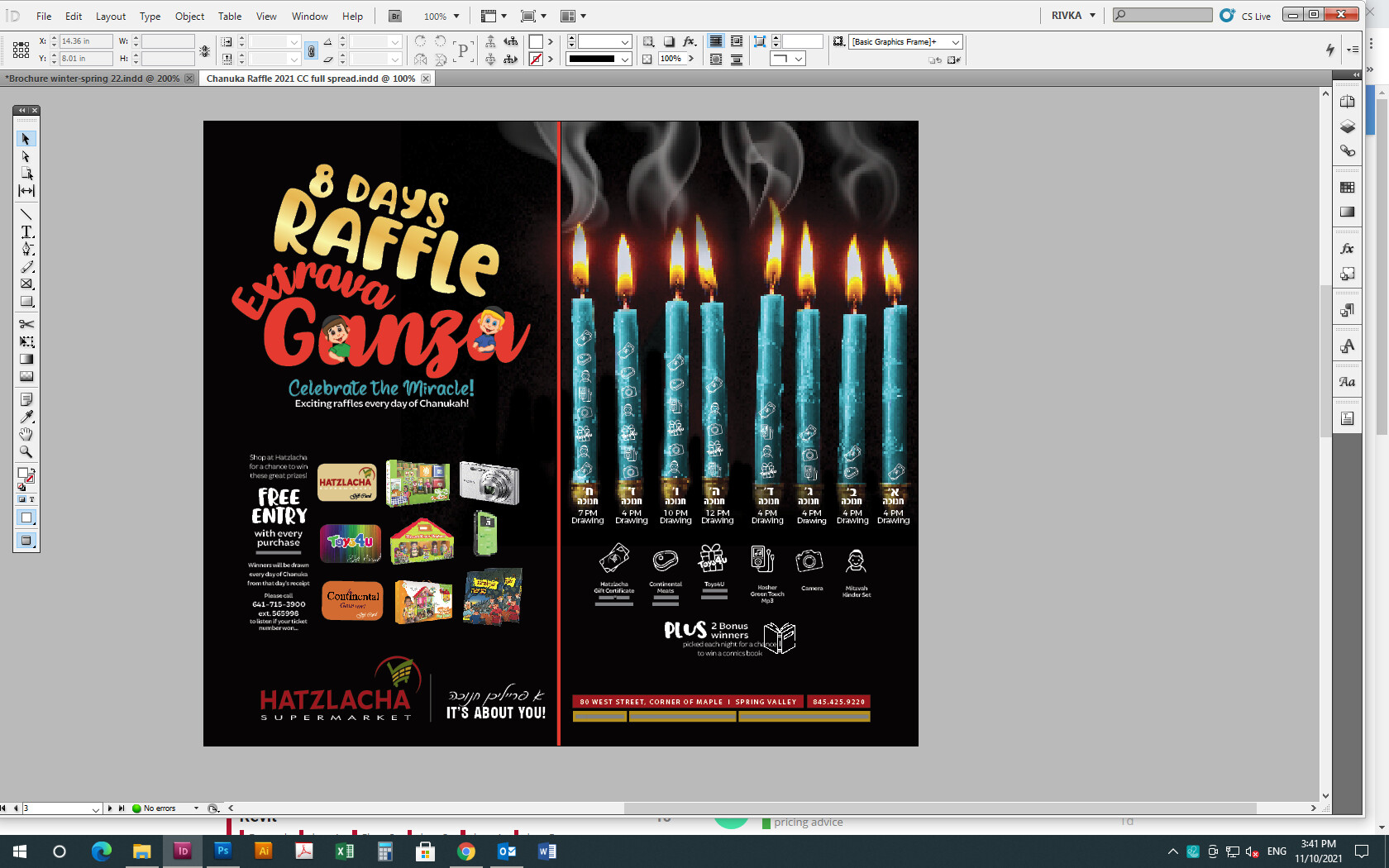
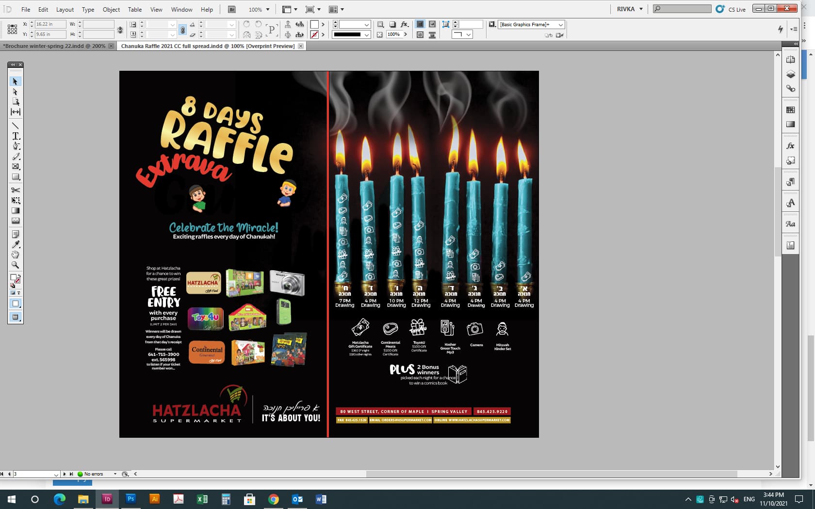
Looks very cool! I think the main reason why it doesn’t look cohesive is because one side is really mostly vector while the right side is raster. Either choose one or distribute elements to both sides.
that part doesn’t bother me… @gila-garber
I actually think that it looks really nice!
why do you say it needs desperate help? which part is bothering you?
Wow much better! Can’t compare to the 1st design!
The black bkgd on both sides hepls connect the 2 sides, but I hear that it could still use something else. Can you take a screenshot without the red line so that I can see the full spread better?
Maybe extravaganza in teal?
That’s a good idea, Chani!
Agreed
Thanks everyone!
I uploaded the pic without the red bar in the middle…
I said it needs desperate help cuz I really don’t like how it looks… its so busy and (so not my style…)
I actually tried using the teal color on the word extravaganza but it looked like too much blue…
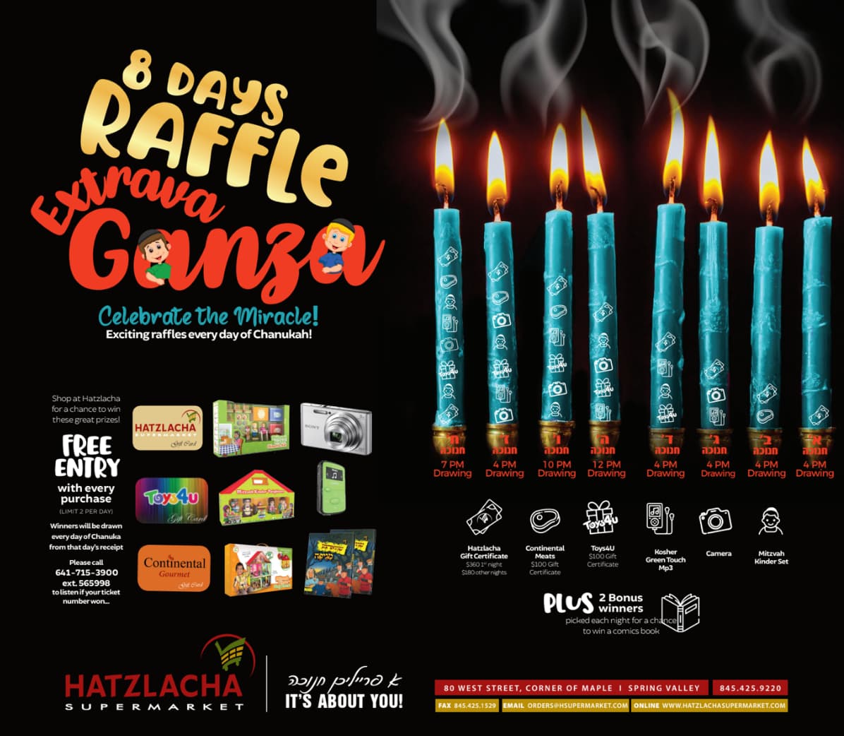
it looks really cute!!!
thanks
Yeah, I think you’re good! The reason adding the blue color is a good idea is because it’ll connect the 2 pages more… but I could hear that it would too much blue going on. Maybe make the bottom section with info on a color across both pages to bring it together