Love this! My only suggestion would be to insert a textured background in the gold letters to give it that extra pop
Thanks, @Del !! Good idea!
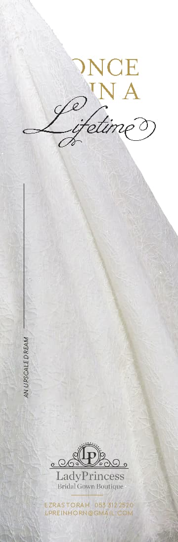
We came up with another version to make the gown pop more and to possibly make it more elegant and upscale; softer instead of sharp.
The client is very undecided between these 2 directions.
Votes, please? Would love to hear people’s impressions!
(The 3rd is a combination of the first 2 options…)
(And yes, I know, it’s time to stop fixing up this ad already ![]() )
)


1 Like
I like the first one best.
I like #2 the best
I love number 2! amazing what a difference a bit of grey can make 
First!
I like the third.
I feel like the circle isn’t ‘upscale enough’ for this ad.
Just wanted to let you know that I saw it in the Pirsumit today:)
It looks really nice!!!
 Thanks!
Saw it too in the pirsumit. Looks great!
Just curious, which one did you end up using?
Thanks @schlomithsassoon  !
!
The client chose the grey version.