Thanks everyone for your comments and suggestions!
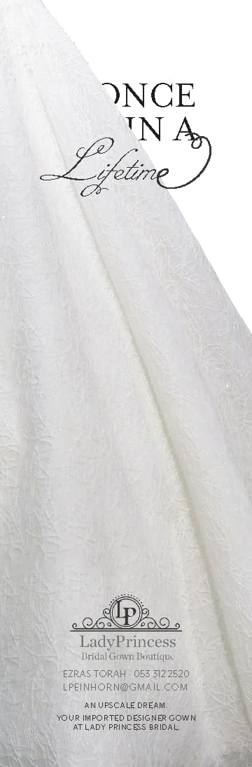
(I don’t have the real logo yet, buy it’s similar to what’s in the ad now)
Here are updates:
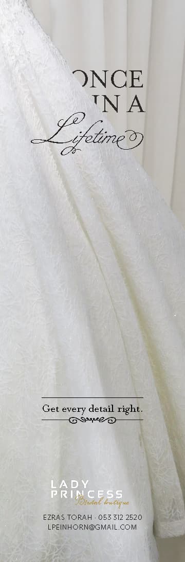
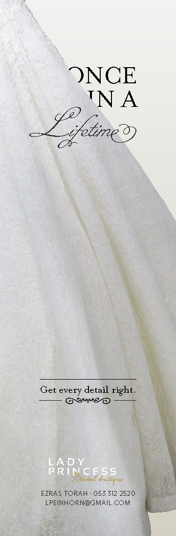
Which one is better, with background curtains or without?
Nice, original layout! I think it is better without the curtain at all, gives sharper contrast. As going to comment on the logo but you said it isn’t final, so will hold off on that!
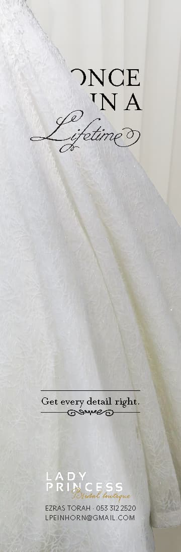
Does it bother anyone that “once in a” is being officially blocked by the gown and then suddenly “lifetime” can be on both, or am I being too literal? I would play around with the title a bit. Either put lifetime completely on to the gown or the twirl at the end should hook into something… not sure.
It looks very white now, I liked the creamy color you had.
Also, I think the gold you had added a lot.
I also happen to prefer the way you used to have the “e” - not extended, I feel like the text stood out more that way…