Thanks for your comments, @gittyklein !
Can anyone else weigh in here?
Thanks for your comments, @gittyklein !
Can anyone else weigh in here?
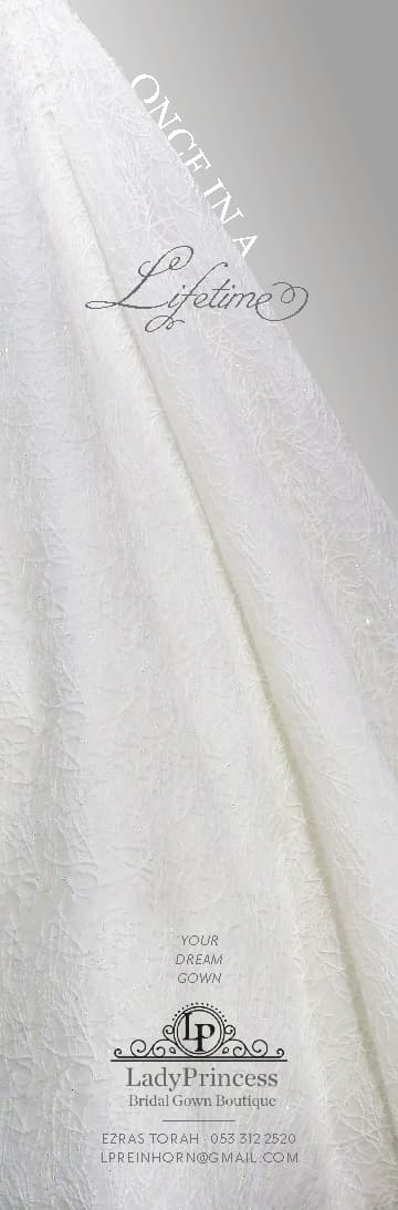
I like the ad much better way you had it before… (cream color. lifetime not connected and I think when gown is not completely to the bottom it’s more clear that it’s a gown not fancy curtain…)
Love the whiter look! Made a huge difference!
I also like the original text, not connected
I feel like that whole lump of text on the bottom makes everything one big mush and nothing stands out, maybe you can separate it more somehow?
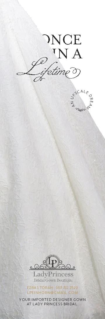
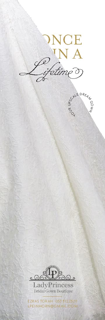
Maybe do the line ‘an upscale dream’ typed around in a circle and have it in this area overlapping gown and bkgd
I also like the white but I think it can use some color.
How about taking the gold from the previous logo and using it for the words Ezras Torah until the end of the email address…
Also agree with Goldie about taking the words “An upscale Dream” and typing it in a circle…
What about adding color to the background?
That would also make everything pop out more
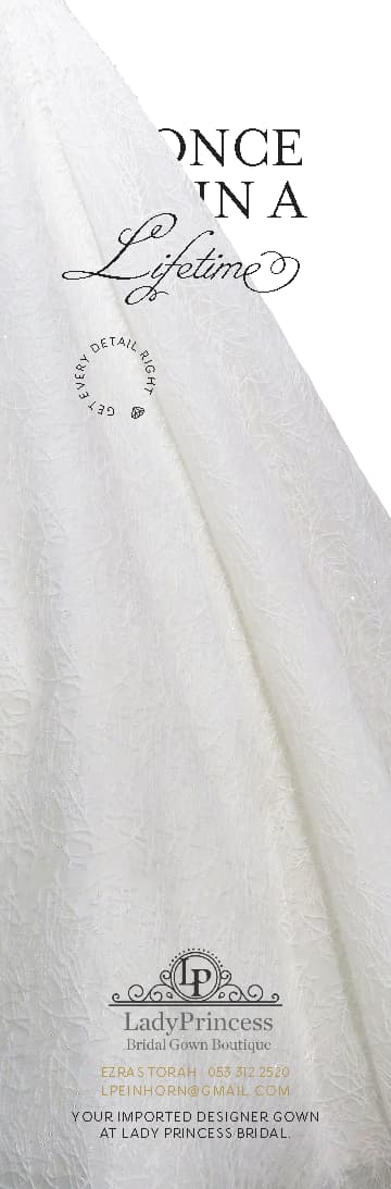
I like where you have the “upscale dream” in the first option but don’t love that squiggle in the extra space in the circle - can you use that shape you used for “get every detail right”?
I also like the positioning in the first one. I would leave out the squiggle completely
Thanks everyone for your amazing suggestions and feedback!!!
I really appreciate all of your help.
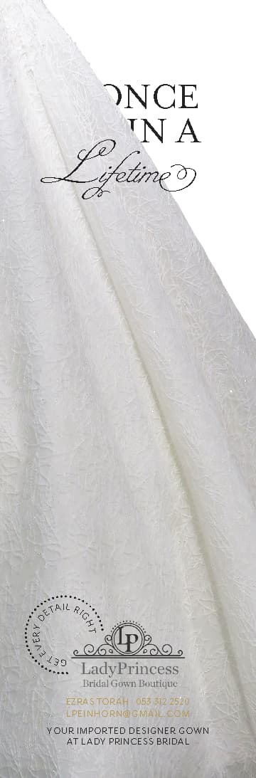
Here is the final version based on client’s preferences:
Love how it came out!!!
Great job!
Beautiful job! That line in pink actually makes a big difference
Really nice!!
Beautiful!
Thanks everyone!
I apologize for posting about this ad again ![]() Thanks for your patience!
Thanks for your patience!
I am touching it up to put into my portfolio
Any suggestions?
Playing around for creativity’s sake ![]() , wondering if the grey background brings out the gown more (like @al1 mentioned)
, wondering if the grey background brings out the gown more (like @al1 mentioned)
I’m not sure… the grey doesn’t add much.
I was actually thinking more of a blush type of color. What do you think?
The once in a definitely looks better the original way you had it.
Actually, in my opinion the final ad you had is perfect to go into your portfolio as is! 
Agree, I would leave the final one the client went with for your portfolio
Thanks everyone for having SO MUCH PATIENCE  !!!
!!!
The client is actually back to the drawing board and is going with this latest gold + circle version.
Thanks again for all of your help!!!