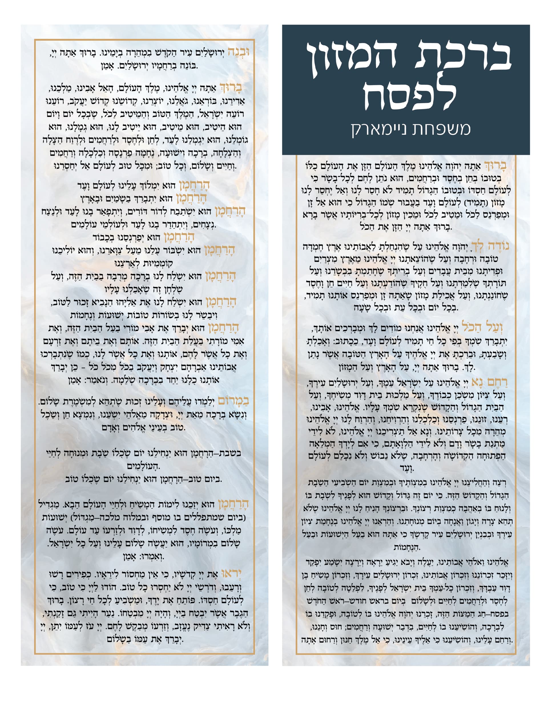
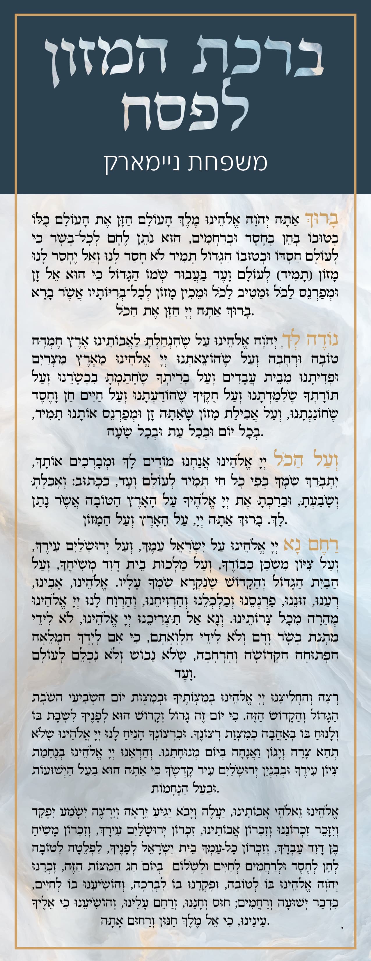
Hi! Taking any and all comments and critique on this bencher…I;m thinking if I should maybe switch the main font of the text to something lighter…but I wouldn’t want it to not show up against the background…
First of all, I know this is hard to manage but the periods are all on the English side.
Can you incorporate the gold into the green box on top to tie everything together - either make the words gold or continue the box into the top… another idea to pull the design more together is to take the background and clip it into the words Birchas Limazon LPesach…
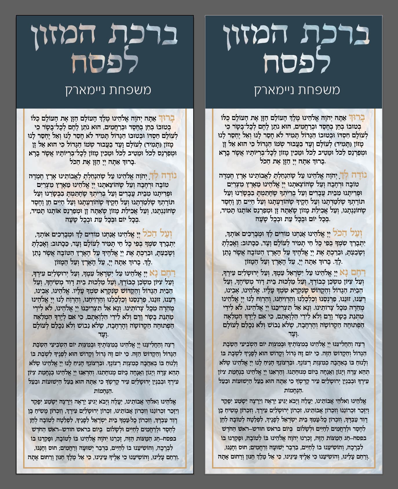
Make sure all the first words highlighted in gold are the same size - the first Boruch looks smaller than the rest of the other ones… it could be an illusion though…
I think its legible enough even with the background behind it… not sure if a lighter font will look so good.
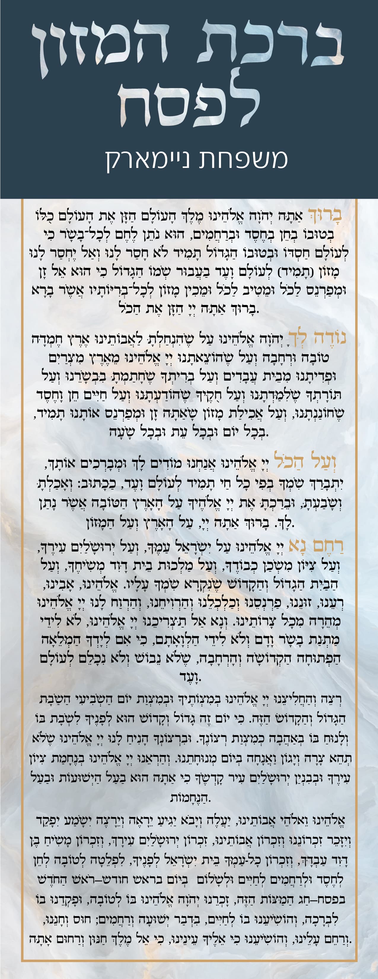
thanks @Breindy-S going to work on those other things, but this is with a lighter font…
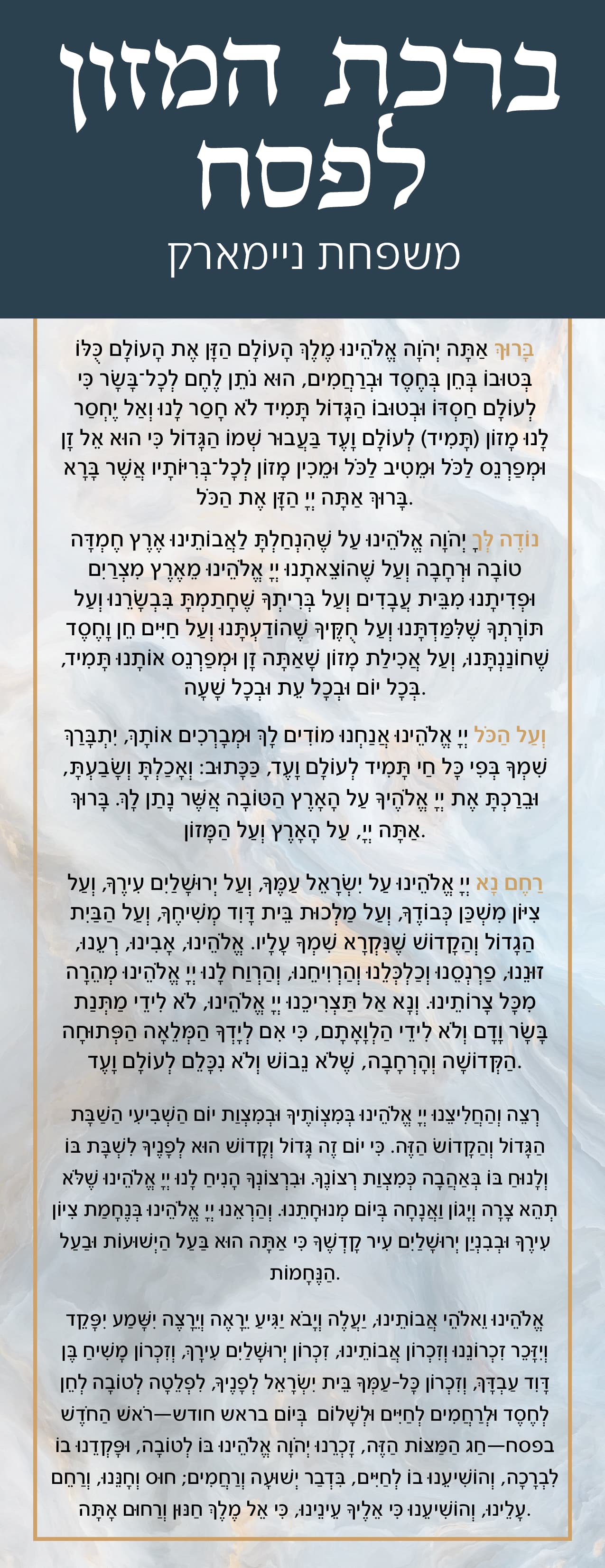
I think both fonts are good - personally I liked the first one better
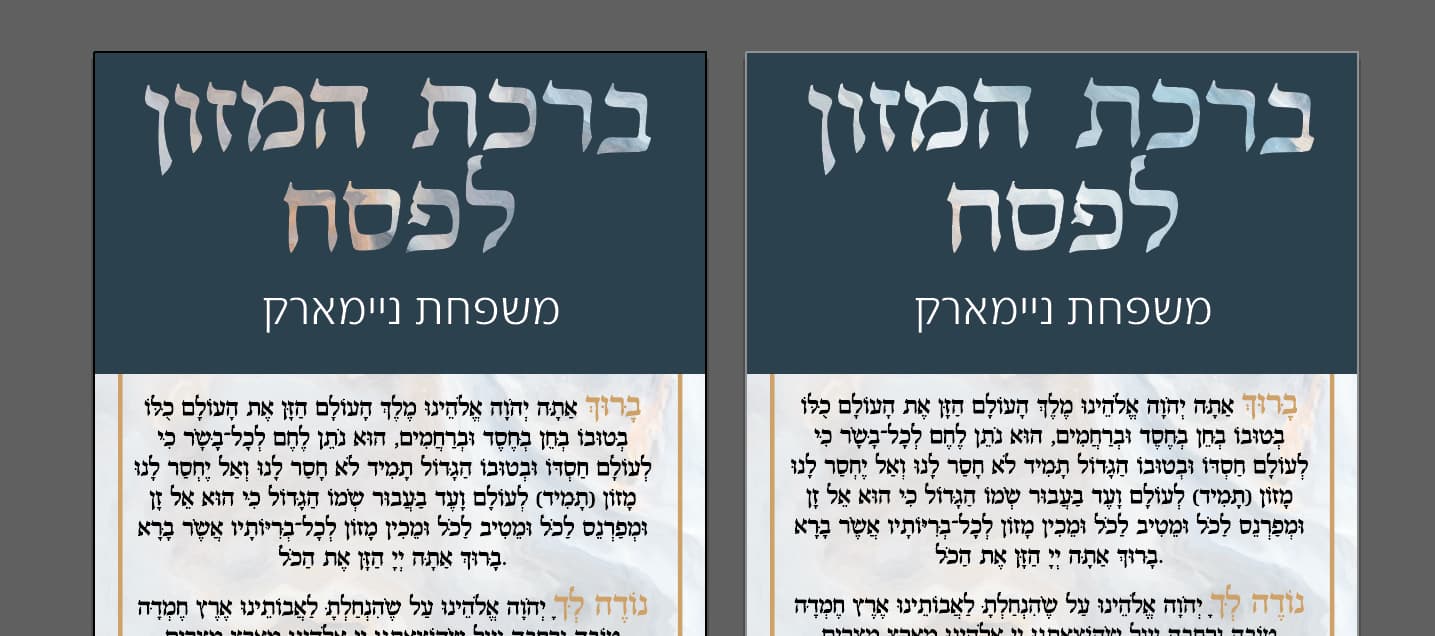
Can you tell from the “title text” that they were each clipped at a different point on the background. I yes, which one looks better?
To change the punctuation you just need to select the left to right text P in the paragraph panel
I like the first clip better.
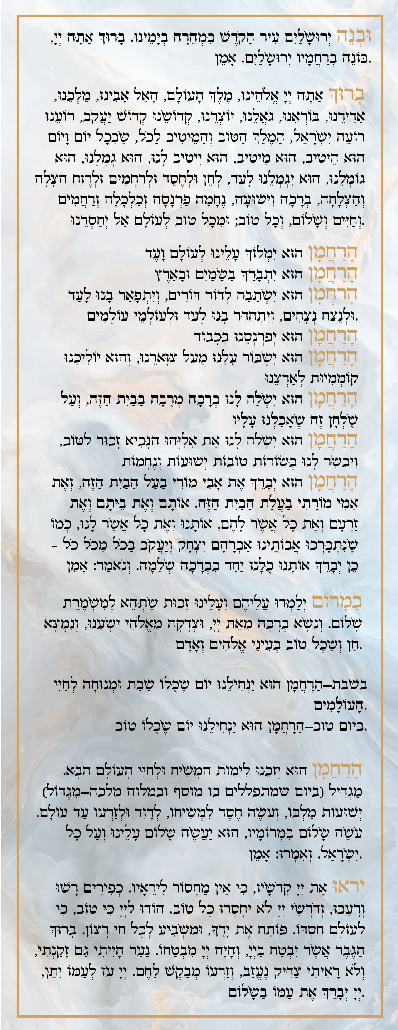
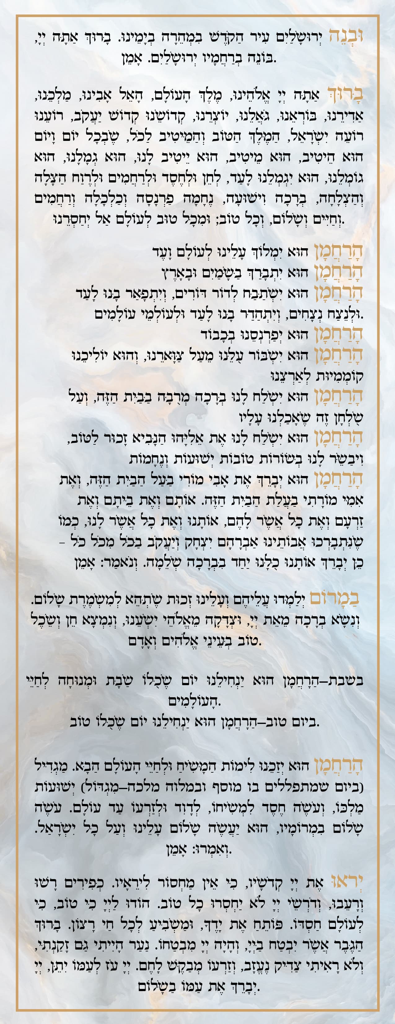
I would align-justify all the text and the horachamons align to the right.
Once that’s done make sure there is a nice space between the words and the gold border
@miriam do you mean the one on the right (less orange/gold) or the one on the left (more gold/orange)?
The one to the right
i also like the one on the right better.
just a suggestion - maybe make the gold border go over the blue box on top (bring it up a layer), and make the text a little smaller. the blue box looks like its sorting of cutting off the design… would love to see how that looks!
thanks everyone for all your help! what do people think of this? I right aligned the text, do people think it looks better like this or centered?
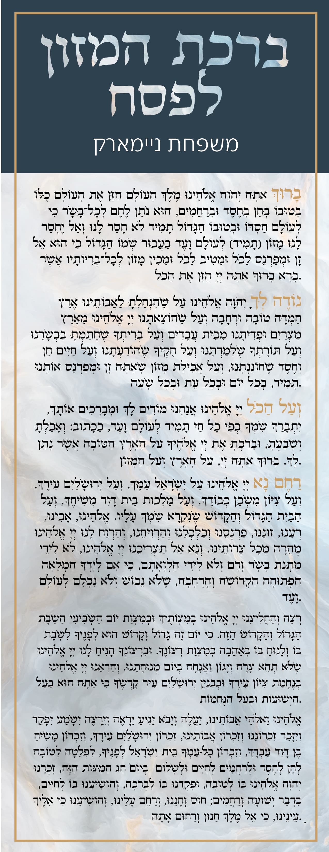
I would justify it to the right so that there are no jagged edges.
Your punctuations are still going the wrong direction
Let me know if you didnt understand how to switch it
is is equal empty spacing above the Bircas Hamazon and the bottom text?
@adinacahn thank you! can you explain more though? I can’t figure it out…though its for my family so I’m really okay with the punctuations going the wrong way if I can’t figure it out…
watch here- this will work if you are on CC Loom | Free Screen & Video Recording Software | Loom
@adinacahn thank you so much, but it didnt work…I did both things that you said…I still don’t see that option…
we discussed it in this thread