I made this logo for someone offering their service for people coming to visit, she now wants an advert to it to let people know of her services and ask for anyone wanting to rent out their flat.
I’m out of ideas… any opinions? this is what i’ve got…
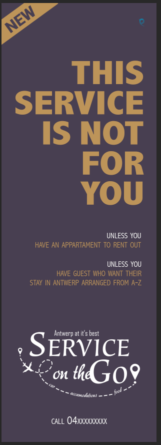
I feel like you need to liven it up a little bit. Something should pop. Maybe the background color can be more purple. (I did notice its the color of the original logo, but I think you can change it)
Is it for print? Maybe you can do gold metalic or spot uv if its for print.
Maybe make the font for new a drop more exciting.
Hope this isnt to confusing 
It’s not confusing, just dont know where to start…
i cant use spot uv or any of these, because its only going in the weekly newspaper
Maybe, just brighten the background, or use a richer purple and change the font for new and see how that looks.
I am not a copywriter and could be I am totally wrong, but I would put the Unless in big as well.
‘This service is not for you, unless…’ you… you…
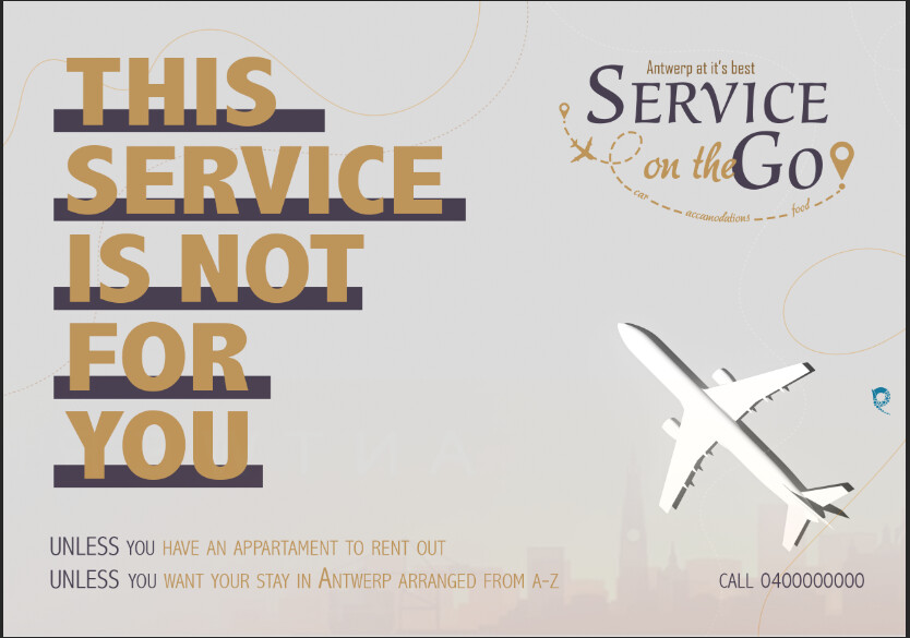
Being that it is an advert for helping visitors in Antwerp I would try putting in the background very low opacity a landmark…
I feel like the copy needs to end with a smiley face  .
.
but not an actual one. i just feel like it needs that vibe…
but i think that they are both very nice. the size changer? or you can do either one?
Copy is quite strong
I would say instead : THIS SERVICE IS FOR YOU IF
Or if you want to leave the word NOT in, put it in a different color…
Another thing that you could do… At the moment, the plane has a drop shadow which makes it look like its sitting on the paper instead of flying… Maybe reposition and do the other kind of shadow…
is this better?
the airplane is a picture so i cant change the shadow
i think you forgot to attach it
Is the plane part of the background image?
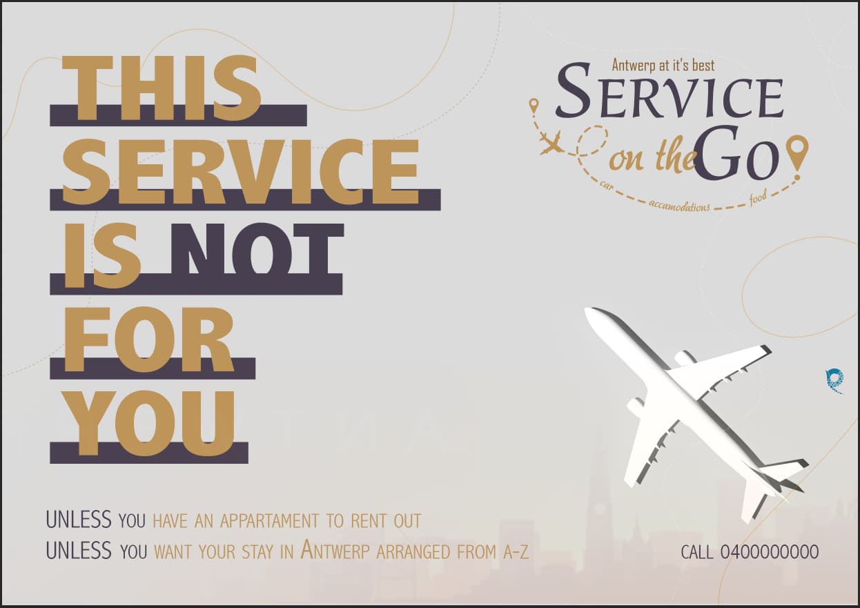
I put it together,
the plane is on the grey background, then I added the lines and then I added the landmark.
I can actually remove the airplane and bring in a png
I like the first option you made the best actually
I also prefer the first option.
Maybe you can add the plane on the first one at the top faded out a little
Also the word apartment isn’t spelled correctly.
Otherwise looks great!
i really like the middle one…
thanks for noticing the spelling mistake