I would combine both styles now. Use the tall look with words how it is, however maybe take some design elements from this second one your working on. I feel like you would have the perfect look then.
Totally agree.
Definitely take background from middle and put it on first.
Also see how the first one looks with right aligned.
(hope Im not being to annoying with my ideas)
they just called me that they wanna go with a diff idea 
PLEASE charge them for the work you have done till now!! if they gave you the copy and now they wanna change then it’s really not fair… Unless you did the copy?
I did it, but I asked them before I started designing if they liked the copy, they told me to go ahead with it… they even wanted me to send it to print before seeing it
hmm idk what you can do for this client but please be clear in the future with clients that copy cannot be changed after you started designing because we all know the design really depends on the copy…
I think you can say sure Im happy to change it for you, However its going to take time so I will have to charge more. I do that.

Wow, it’s really coming together nicely! I like this new look!
A few technical things:
- There should be a space between car service
- Apartment is spelled wrong (unless it’s spelled like that in Antwerp)
- Having Guests is missing a v in having
- I don’t think there should be such a big space after Call
I would suggest using a sans serif font for the text since there isn’t such great contrast with the darkish background and the thin modern font you used.
thanks!! will make the necessary adjustments
Looking good! Also please capitalise the beginning of every sentence!
The design is really good!
Also, change the it’s to its.
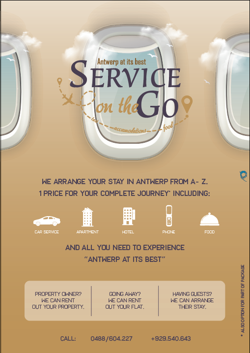
looking amazing now! i don’t think it needs the rectangles there. i would put the drop shadow back on the logo to make it more legible!
well done, looking amazing!
Wow, I really love it now!
ooohhh I love those windows!!
Something about the numbers on the bottom I would fix. Maybe move them closer and put a line between them to finish it off…