
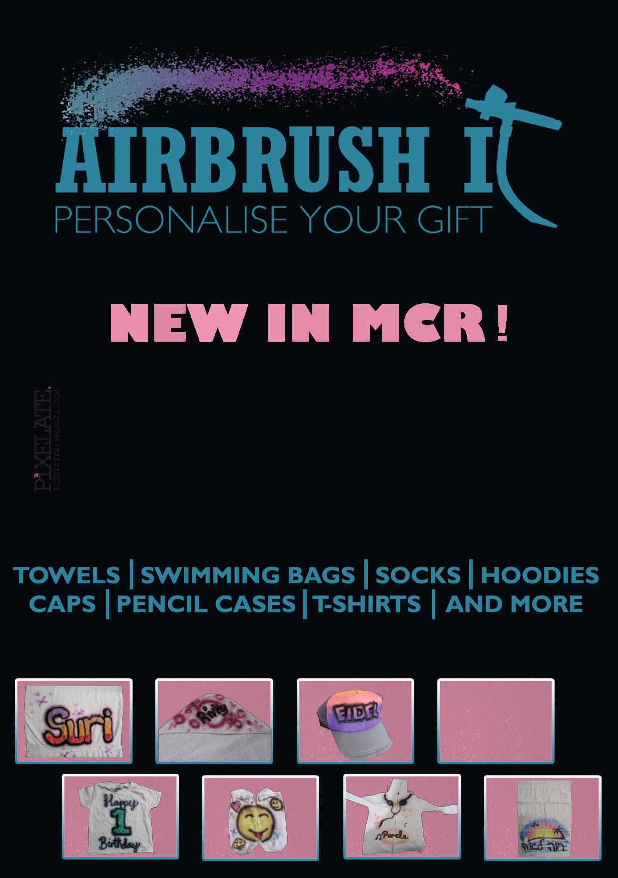
Hi, Im in middle of designing an ad for a freind (she still gonna send more pics to put in rest of boxes)
It looks kinda plain to me, any suggestions to liven it up a bit?
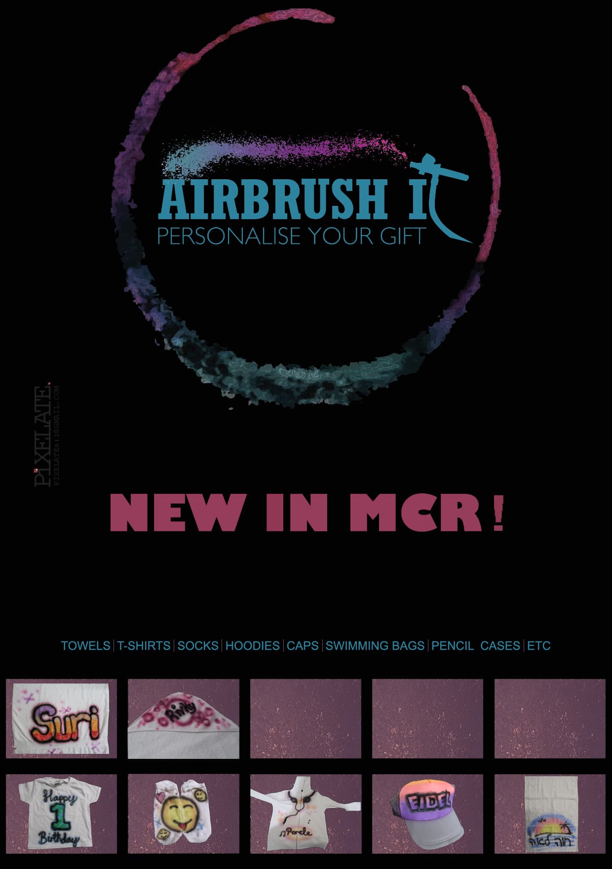
Colors are very muted. I would go more for lighter bold colors. Also, the images at the bottom look squeezed in. I would give it margin and put only 4 in a row to give it more “breathing space”
yes i was gonna also say about the colors to make brighter
the lighter blue thin letters getting lost on the black so maybe also need to be a slightly heavier font
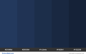
i also think colours should be brighter, also the black background isn’t siting well with me , how about one of these colours?
also, you should make your margins thicker, you don’t want the logo touching the edge of page. (it can also get cut during printing)
Thanks. My freind specifically requested black background, but will try with one of these colours too and see if she likes it…
Try staggering the pics on bottom

Make the itemized list into 2 lines so you can space out the words more and make them bigger font size to be clearer
and maybe write something like ‘and more!’ instead of ‘etc’ to sound more exciting
Nice start!
I feel like the hierarchy isn’t so “strong”
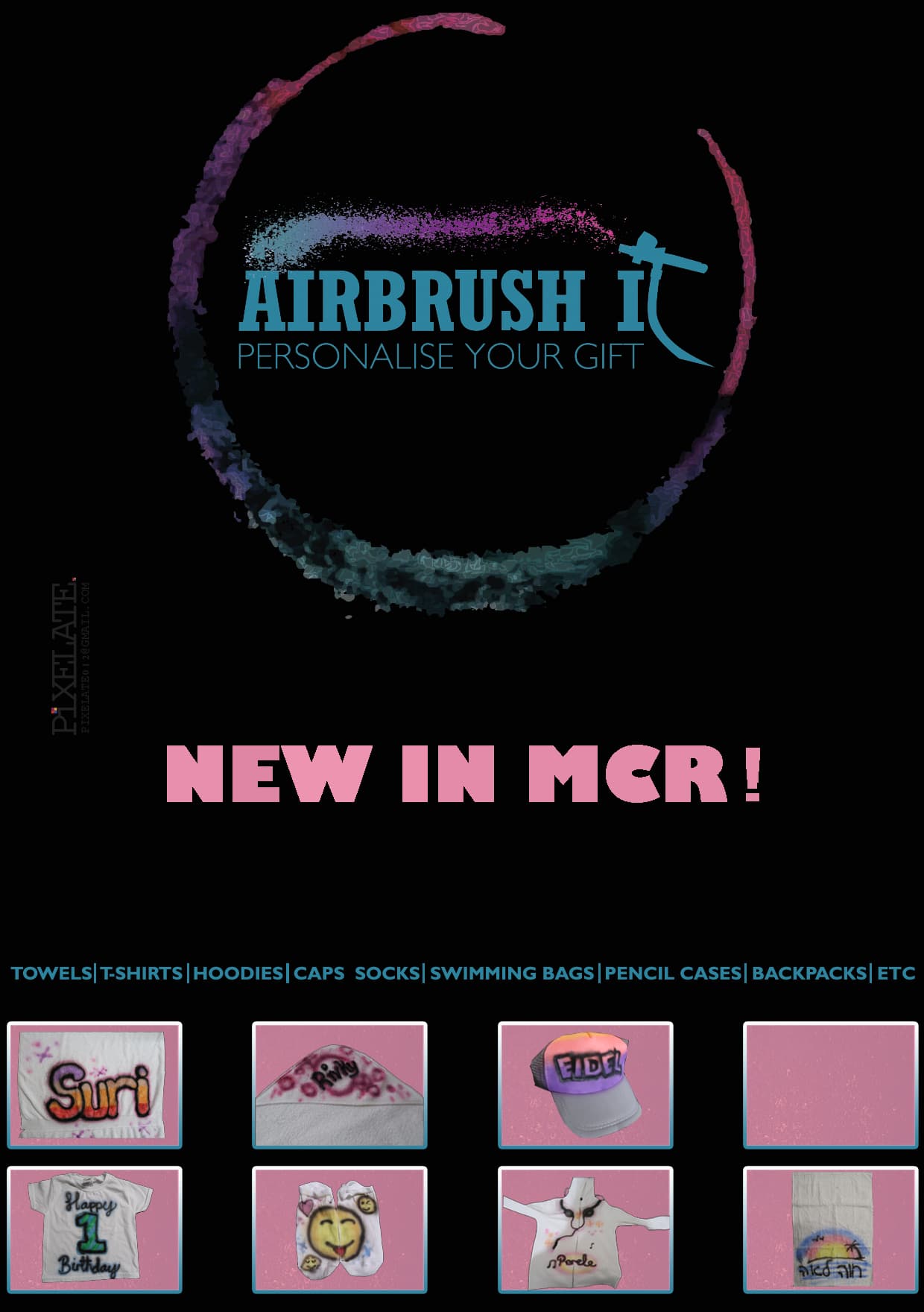
Here’s something I played around with to give you an idea of how you can make the ad pop a little more…
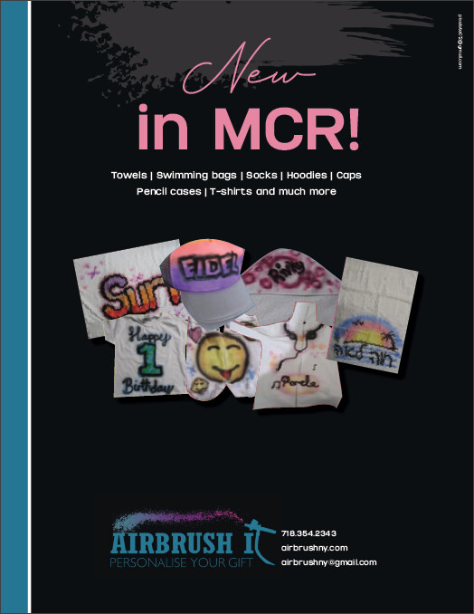
To break down what I did:
- moved the logo down and made it much smaller. added contact information that was missing (for right now it is made up but you should put in the right info)
- Moved up the text “New in MCR” and added what she does under it so its a group
- took the items out of the boxes and made a collage - didn’t do a perfect job masking Bec I did it quickly but you get the idea (also they look pixelated because I used a screenshot of your ad)
- made a blue and white line on the side just to give it some additional color and added a white splash on the top with little opacity to give it some more visual interest…
- made your email address much smaller - it should be about 5-6 points and moved it up to the top right
Hope this is helpful!  Good Luck!
Can’t wait to see the final version
3 Likes
btw what does MCR stand for?!
Manchester
oh lol I had no idea
the contact info that I made up said ny 
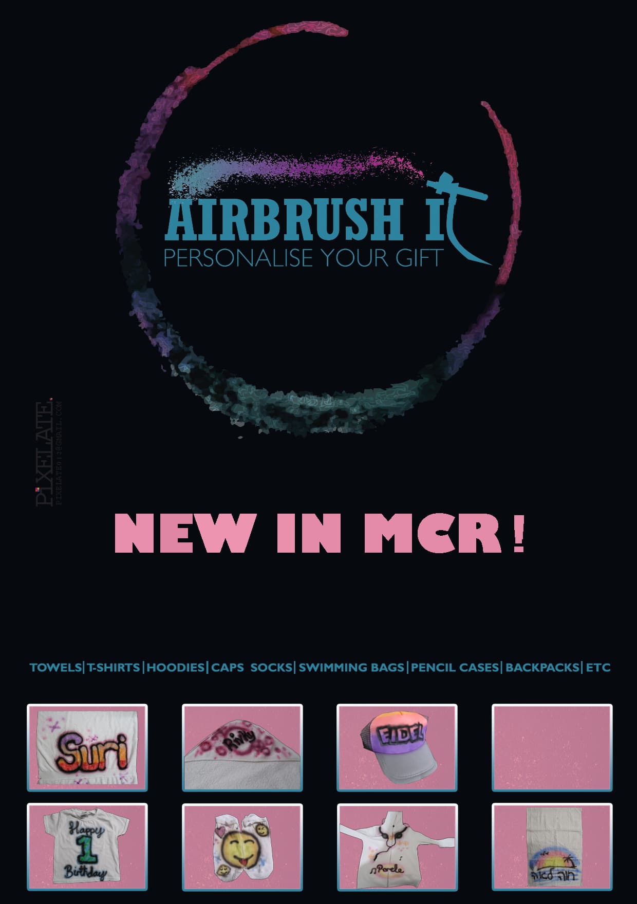
I like this sort of look better, the could you get better quality pictures from them?
still think it shouldn’t have a black background
If you do go with the black background, the logo doesn’t have enough contrast with it… If you made the whole logo pink or even white it would stand out a lot more…
Thanks so much!!! Still in mid of learning, not covered hierarchy yet…
Will post it when im done
1 Like
Hierarchy is tricky, I still struggle even after 3 years
Me too!! It depends on how much text there is and what you want to make prominent that can make it hard at times…
1 Like