Hi everyone,
I’m making my own ad and I cant think anymore what do you all think of this?
5 Likes
This is so cool! I absolutely love it!
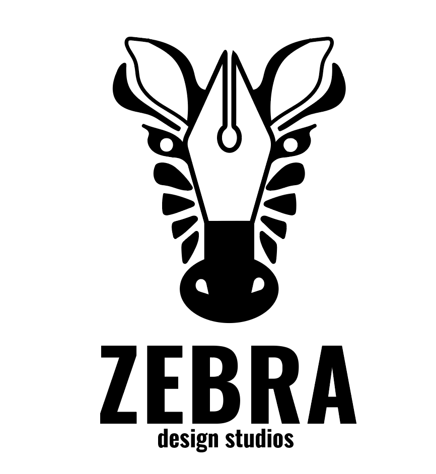
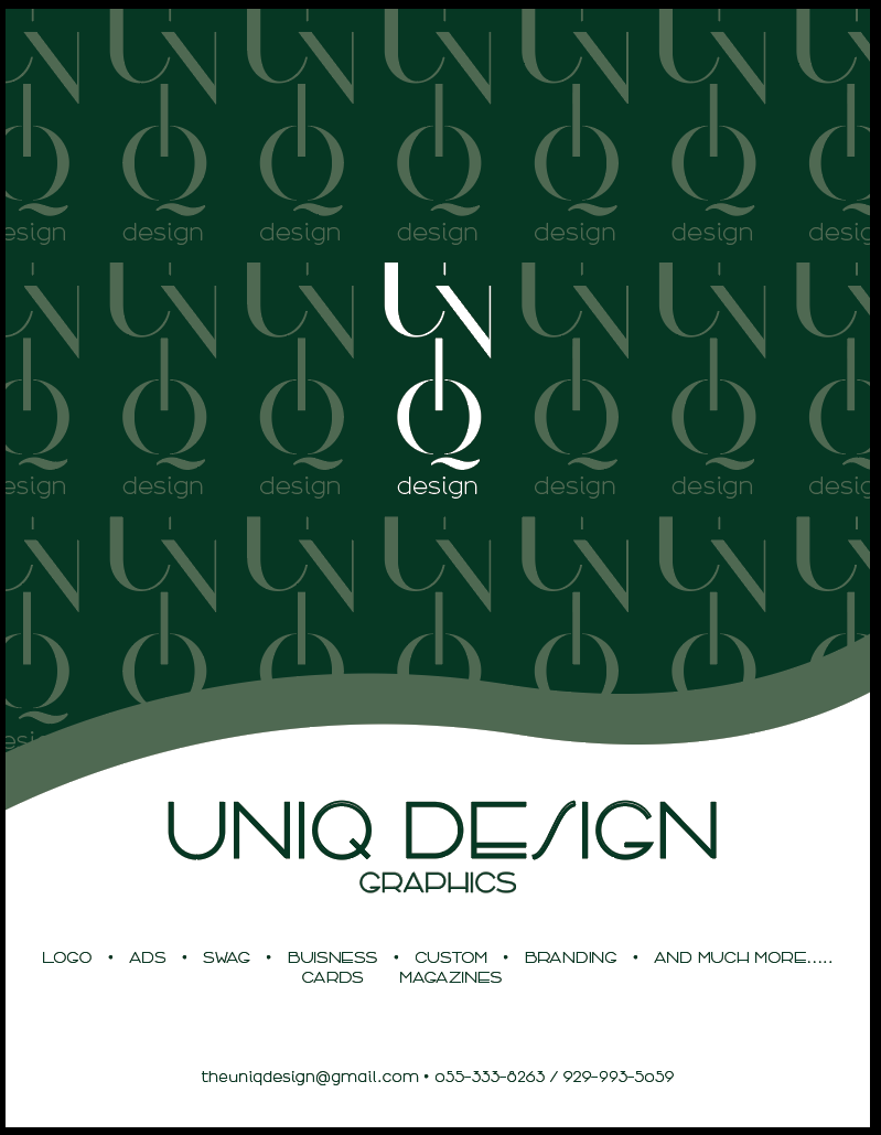
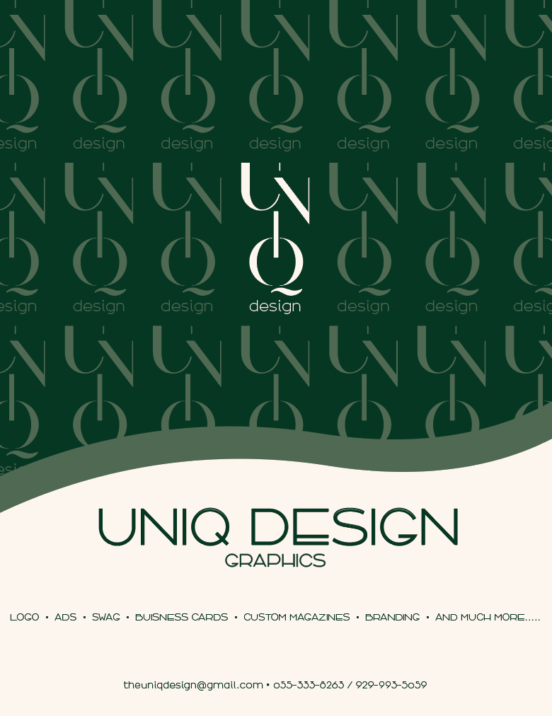
Wow, I really like your logo! Wouldn’t you consider using the same font as the pattern logo for the one at the bottom? What I don’t like in the bottom logo is the ‘s’ from ‘design.’
For the services you provide, I would suggest putting everything on one line.
Maybe, instead of white, you can use a soft ivory that complements the green. Good luck on your ad! I hope you attract a lot of clients! (And please post the final version!)
Wow! I absolutely love it!
I may sound like a parrot, but I absolutely love it!!!
Just be careful of the margins though. It looks like the line with your services is too close to the edge.
Is the I and Q in your logo supposed to look like a power button?
Looks amazing!
Really nice!
I liked it better with the white (vs the ivory), though maybe a lighter shade of ivory/cream/light cool gray would be good (it could be i just don’t like the ivory color against the white computer background but it’ll look nicer in print
I think you should try putting the list of services back into 2 lines. Make the lines equally long and have ‘and much more’ be the last thing on the bottom line
THE LOGO IS JUST AMAZING!! it gives off such a nice look.
looks great! i prefer first one with the interesting ‘s’… especially if you are calling yourself uniq(ue)…hatzlacha!
Looks amazing!
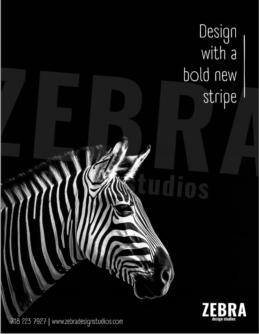
I prefer the second s…
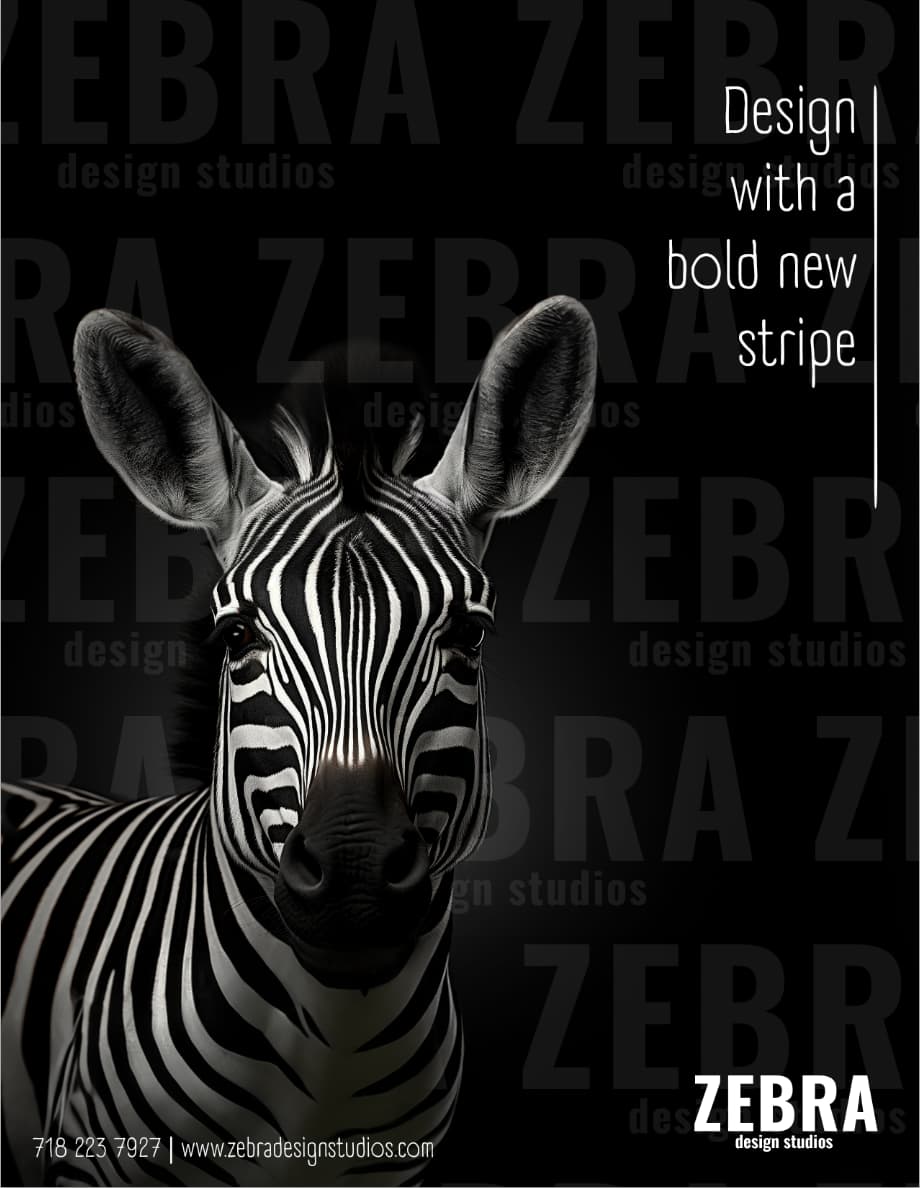
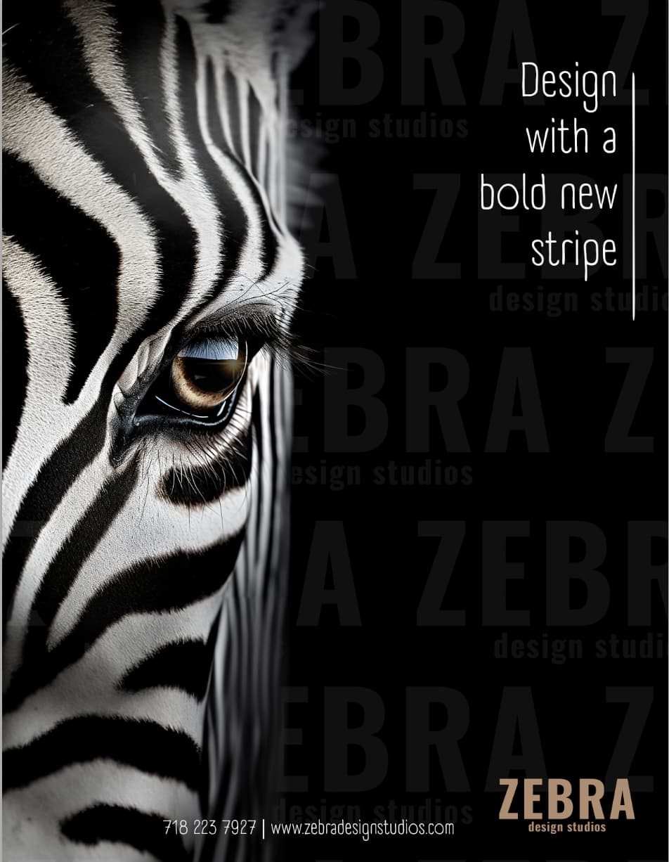
I am also trying to design an ad for myself. I’d love any critique. I’m mainly trying to figure out the contact info on the bottom. something about is not working out.
also, I want to make it a little more obvious that it is graphic design; just not sure where to add it.
TIA!!
3 Likes
I like the first one the best. what do you think of making one of the stripes on the zebra a bold color and stick that color in your logo.
could you shorten the line to end at the word stripe.
Its very hard to see your contact info at the bottom, the font is to small and to thin.
The first one, if you’ll notice, the head of the zebra at the top separates. Instead of being one single zebra, it looks like it was duplicated and repeated… is there a way to make the head stay one? Like, it looks like the zebra went to a hairstylist and got a specific hairdo, which most zebras don’t get. I guess thats why it’s bold, in that this zebra is different. But I think, naturally speaking, zebras only have one hairstyle, don’t you?
Unless thats how a zebras hairstyle typically looks?
lol I think that’s how zebra’s hair typically looks
I also like the first one best
No, I meant the separation of skin also
i love the second one. It portrays bold designs. Your name is really cool!