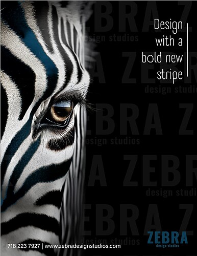
yes that part was made with generative fill so makes sense. Im going to try to fix, thanks for pointing it out
You can add another color as a pop/accent color, and use it for the logo also instead of making the logo white.
I like the second one best for the zebra. It’s so striking.
The font for Design… is very thin, and doesn’t completely match the bold look you’re going for. You might want to find a bolder font.
My pleasure. I’m glad i did! 
looks great! Love the touch of color.
I would maybe make the bottom right corner slightly bluer to show some contrast and make it stand out a little more
Love it!
It’s not standing out enough. Can you make the blue lighter?
It looks amazing!
But I would do a different color to blue - you want it to stand out if its bold designs.
