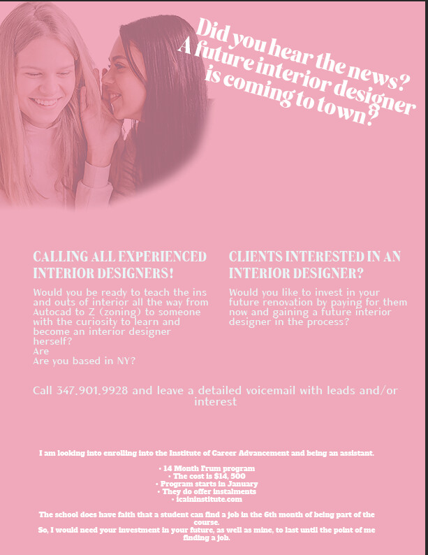
There is alot of text going on here and nothing really drawing the eye. The white on pink is also hard to read.
Use color blocks to divide up the titles and add visual interest
I would have the image go across the whole top, you can use photoshop generative ai to extend the image-- we did a recording of that a while back on the designergy-- let me know if you need me to find it.
Use color to separate the bottom division of text as well
I just checked the website listed on this ad - why don’t you use their logo and brand colors? Ex. image on top, yellow dividing line, white text on a navy background, with logo and contact info on bottom? Or is this not from ICA?
Also, you have the word are twice by are you based in NY, and installments should be spelled with 2 ll’s. (They do offer instalments)
It’s a great start! I agree with all the above, also maybe it should have a bit more high end lux style for an interior design ad (not light pink- more warm neutrals/ light or stark bold warm colors etc. People should know immediately when looking at the ad that’s it’s design related- maybe add some sort of design element- a layout, a vase of flowers, a sofa and rug…? Anything to make people recognize that it’s design related. Also the tag line on a slant is a bit dizzying, maybe try to make it straight (doesn’t have to be centered it can be flush left too.) Lastly, maybe it’s just me but I’m very confused what this is about… who is paying for who? I don’t know who “them” is in “pay for them now” is that referring to paying for the schooling of an aspiring interior designer? Maybe try to use chat gpt to make the copy more clear and concise. Best of luck!
I see they’re also asking how to let the audience of this ad know that the client of this ad is either looking for a mentor or looking into becoming a student. Hmmm… I’m curious how I’d show that.
I’ll be honest the problem with this ad is that the text isnt that good… if you would have better copy would be easier to design… It’s really confusing to understand. Once you have decent copy you can start working on contrast and hierarchy… another thing why in the world would an interior designer be interested in giving away free time to teach someone??
My client is looking to enroll in this school and wants to either work with an experienced interior designer as an assistant while learning some things from her or get clients to hire her so that she is able to cover the money for her schooling. Them using her now would mean a discount for some of the time. (Hope this is clear).
I agree about the text so I’m trying to see what I can do to make it less and then I may end up redesigning, I was kind of just going with her image of the ad in the beginning.
Also, for some reason my computer autocorrected instalments to have one ‘l’.
This was another idea they had for the ad:
Maybe let’s focus on the CURRENT INTERIOR DESIGNERS and FUTURE CLIENTS thing and leave the rest up to the audiences imagination and curiosity. Interested to hear more? Please call 347-901-9928 and leave a detailed message. Employees need not apply (basically trying to say this isn’t a job).
This is much better. The copy can be clearer.
Un-hyphenate the text.
The image idea is great!
The text is too small. I would zoom in a lot.
Maybe just do picture frames on a wall instead of a whole room? That way the text is much more legible.
You want the viewer to see the text right away. You kind of want it to be in their face
The truth is that the whole idea of the ad isn’t sitting with me well.
I feel like this something that should be done through word of mouth.
If I were a trained interior designer, I wouldn’t call…
And I am still not 100% clear- is she looking to intern in exchange of having a mentor?