Most ads will be viewed vertical- which this is landscape- horizontal
Something is wrong with the leading spacing- too spaced out
there needs to be more contrast and calling out to you
What would make such an add contrast and calling out to the audience, would you say, @adinacahn?
Use color block behind the text, use different size fonts or a header and body font etc
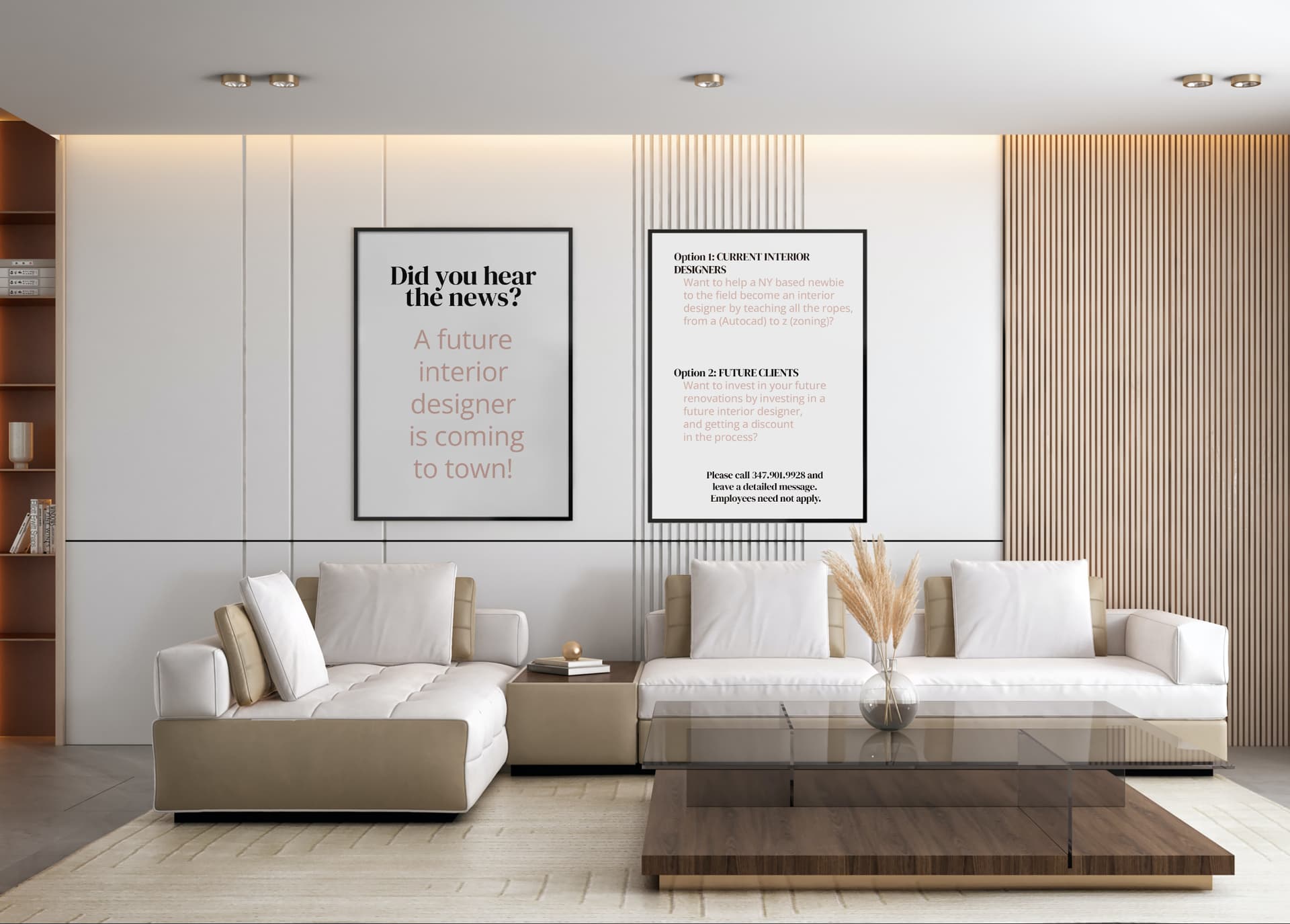
Whoops! I thought I knew the words that are spelled diff - ex. colours, centre… but I see there are others!
If I were the “current interior designer”, I wouldn’t necessarily offer my (free) teaching services to her. What is the incentive being given, by teaching her the ropes?
Also, is this not something the client has to call up experienced designers for? - to ask to be an apprentice?
And for the future clients - why should they invest money in someone who is not even an interior designer yet! - as in their incentive should also be super clear!
Sorry I’m pulling it to pieces 
I agree with @al1 that you should zoom in on the image. She means to crop it to just around the frames so that you can read the text without zooming in… and if it’s a portrait ad, you can still keep some of the couches underneath to retain the feel of the image.
Yes. That is what I meant.
Thanks Tali!