Hi,
someone my husband and I are close with, is trying to open a non-typical yeshiva. He wants a logo that the words Gal (hebrew) is in the shape of a mountain and Einay (hebrew) somewhere like the valley or the shape of an eye.
I took many tries at this logo and I’m sort of stuck.
If anyone can give me some guidance I would really appreciate it.
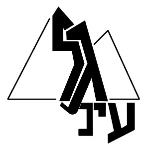
I tired playing around with some ideas… (sorry couldn’t figure out how to make the words gal into a mountain)
thanks @Breindy-S. Just wondering what font you used?
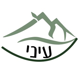
I used this font: BN Madregot Thin
thanks a million!!
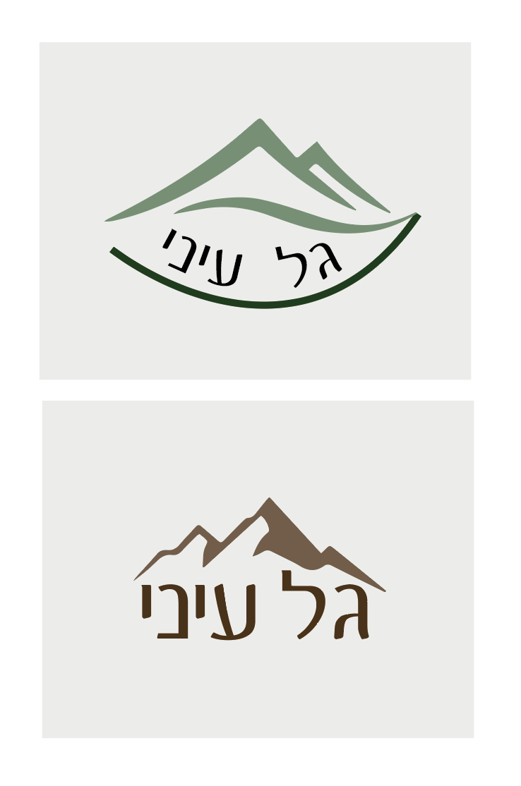
I love the concept. Made many adjustments in it as per his style request but definately gave my inspiration more of a boost.
Can you post what you’ve compiled so far? curious to see!
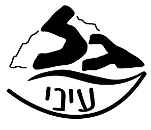
nice! I would suggest making the stroke outline thicker to match the words
cool! middle one it’s hard to see ‘gal’ coz of the stroke being so much lighter than einei - maybe the word einei and gal should be same color or at least same lightness of tone so one doesnt stand out against the other. in the other two you do read ‘gal einei’ straight away’…
Thanks everyone for your help!
Let me see what he says to them!