Hi, I need help on this flyer! I feel that it’s very busy, but not sure what to do about it…I know I also need to change the colors, I’m working on it…
Any advice is appreciated greatly!!
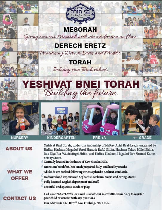
I feel like the top is very heavy, can you put the 4 biggest pictures on the bottom half of the flyer, also there is to many colors, maybe do the turquoise the same color as the text…
Hope this helps. G’Luck.
Thanks! By now I already changed all the colors to be maroon, and the pale blue geometric to be gray on bottom. But I think I need a brighter color, they want a fresh look- yet it still needs to be legible…Any ideas on this as well?

I think you did a good job making a busy flier feel organized! It is a bit top heavy, but perhaps just a strip of solid color along the bottom would help anchor it.
The about us text appears to be in a different font size than the other text, would suggest making it all the same. It is also confusing what category the top two checked bullets go with. How would it look to right align the bold subheads, and line the top of the subhead with the top of the text it belongs to, even though the spacing between the subheads wouldn’t end up even, but not sure it matters.
The actual contact info such as phone and website should be more prominent if possible. Maybe if you took the Please call line and put that on the bottom in white in a dark strip as mentioned above, as a “final thought”, that would make the contact info more noticeable since there would be fewer words up there, and the icons could be in burgundy like the bullets.
Lastly, the pink cars is a cute image but really breaks the color scheme and stands out a bit too much, becomes a strong focal point that I don’t think you want.

i think the text on the bottom can use bigger margins on the 2 sides.
What we offer- 4th checkbox make the sentence into 2 lines.
Maybe make the subtitles on the bottom a little smaller
Thanks so much! The only thing is I don’t have that much space to play around with…can’t really make bigger margins or move text to another line…
maybe make the four middle pics smaller
I would move the abt us, what we offer and contact us to the middle of each paragraph instead of it being at the top of each paragraph so it will look better spaced. Does this make sense to you?
Also ,( just my opinion,) maybe switch the font you use for the small purple wording on top to a cleaner font like Lato light…
I know my suggestion is going to “block” some pictures but I think I would like it better with one box on the top (instead of how it is now - going out and in) You can make all that top text smaller - it’ll still be a focus since it’ll be in the white box above the pictures…
I also think you can put all the contact info on one line - that will give it some breathing space on the bottom…
and agree with Chavi about the lato font - I like sans serif fonts better than serif, but thats my personal opinion.