hi I’m working on a yearbook now and as this is my first real project I’m still very unsure of myself and feel that the pages are still missing something to bring it all together. I’d love to hear any suggestions and critique. Thanks!!
I made the pics transparent on this one for privacy so just imagine it clear
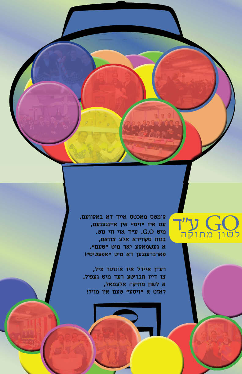
if you would have a header or footer like a thin color strip maybe with some logo on…then that could help tie it together. for the first image above I would center align the txt as it is a poen and will look better…
i just hit subscribe on the top left… to test if i am going to receive these posts…
Agree with Zippy that if you want to tie all the pages together, but also keep the layouts extremely different, a header or footer would unify it more. Currently, you have two layouts with very different colors and somewhat different styles.
when i worked in a school, the students didnt want anything extra on the pages. i tried making spreads to go over both pages. you can also just do same color background, for features ( and pages like your bound to have pages that dont match.) look in most yearbooks they are not unified.
try to work on your fonts
I find typography makes a big difference
There are some good free hebrew fonts on https://fonts.google.com/
try extrim, heebo, rubik
correction: extrim is not a google font
Try more of a consistent color scheme throughout, possibly varying which color is dominant in each section or page.
Try more dramatic headings on each page, in a consistent font and style.