Hi all,
I’d love critique for these logos.
Thanks in advance!

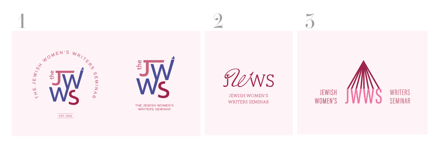
I really like both number 1 options!!
great job
I also like both #1s
if you do the second of those I would prob move the words closer to the logo and maybe even a drop bigger cuz it’s hard to read
I also like both #2 options, the second one has a even sharper look to it
I like the first from the 1’s and like the icon from 3 but don’t like how the text look there. if you would use the semi circle from the first 1 I would like it.
I also don’t love the colors so much… but not sure what colors I would like…
I like #3! So creative how you brought in the pencil and the logo is really different and cool.
What would it look like if the JWWS would be the same color as the pencil tip lines?
1 is also very nice if you decide to go with that one. I happen to yes like the colors which you used for 1 and it looks really good against this light pink background, so if you design a business card you can bring the light pink in there.
Keep us posted, good luck!
love 1!
Thanks everyone for your feedback!!!
Good idea for 3, @Breindy-S , and I’d love to hear color suggestions!
Playing around with colors, trying to balance femininity & creativity with professionalism.
Opinions?
And how’s 3 with round tagline? (Btw I made that icon thinking it’ll look like an open book, upside-down, but a pencil works, too🤣)
Looking good!
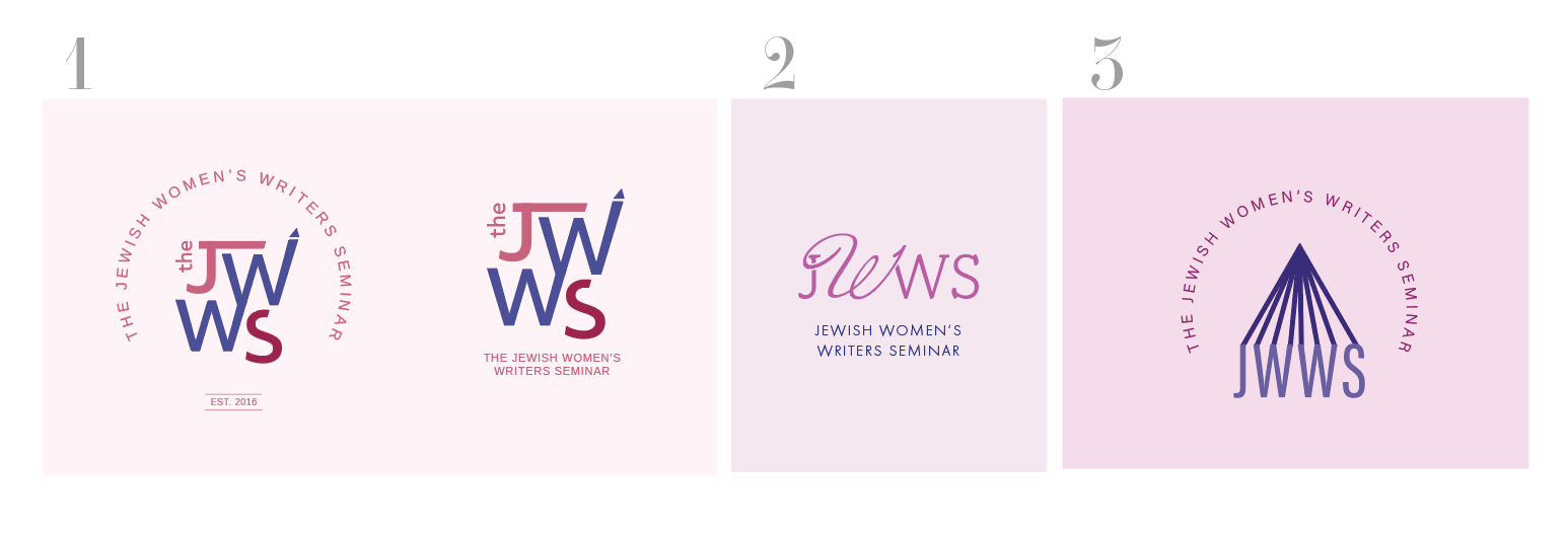
I think you need to center the icon in #1 with the semi circle around it - there’s more space by the left side…
#3 looks much better with the semi circle. Can you try another version of 3 where the colors are switched. I’m thinking maybe the blue looks too cold… in the other version, I didn’t mind the pink icon, just the whole thing was pink…
and lol about the open book, I also thought it was a pencil…  - the logo happens to be for a writers seminar so it makes sense to look like a pencil or an open book… actually pretty cool that it could have a “double meaning”
Its looking a lot better now with the added color, but agree that you should try switching around the colors in option three so the pink is more prominent.
Just thinking, if you want it to look more like a book maybe make the two end lines slightly thicker than the rest ( i also didn’t realise it was a book…) not sure how it would look but might be worth a try.
And maybe make more of a spine, though it won’t look much like a pencil anymore if you do that.
Lol 
Thanks for all of your comments!
Those are great ideas for making it look more like a book, but I think I’m okay with this undefined look, as it’s clean-looking.
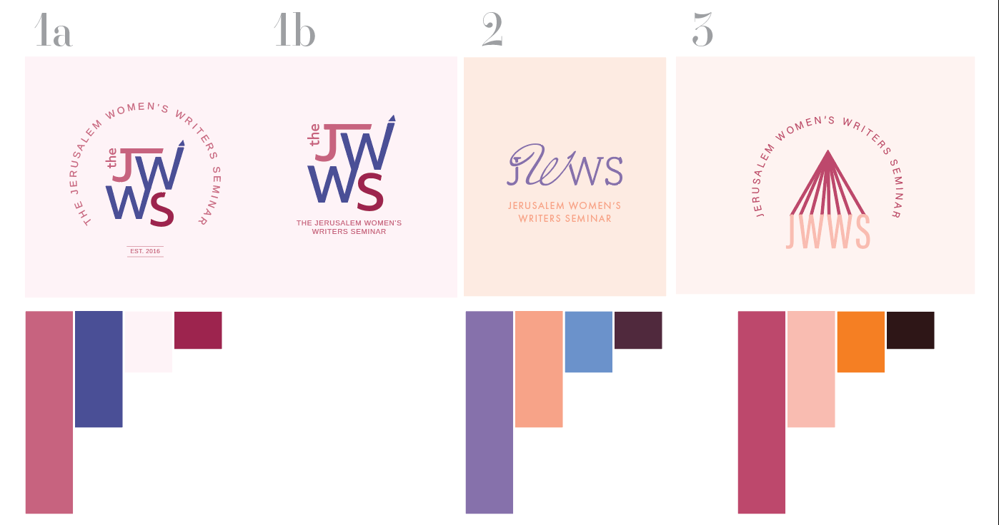
Here are some new color schemes for the branding.
I changed to some warmer colors to show more of the community feel & inclusiveness.
Also 2 versions of the S in logo 1, which looks better?
Thanks so much for all your opinions and advice!
I like how the S looks in logo 1b but I prefer the semi circle around it like 1a.
I also think you should keep the book / pencil in 3 as is…
I like best the color scheme of 2 and then 1
Beautiful options!
I like the S in 1a
Really nice and professional. I also like the S in the 1a, even though i like the 1b overall better. It’s even sharper looking than 1a
Love 1a!
I would align the end of the S to match the edge of the W, I think that would look sharp
really like 1A
i’m liking 1A the best too - nice and feminine, clear, unique/memorable… got your pencil element…
i keep reading no. 2 as ‘news’ - i dont know if anyone else sees that!
the 3rd one to me feels more masculine… i preferred it in the purples