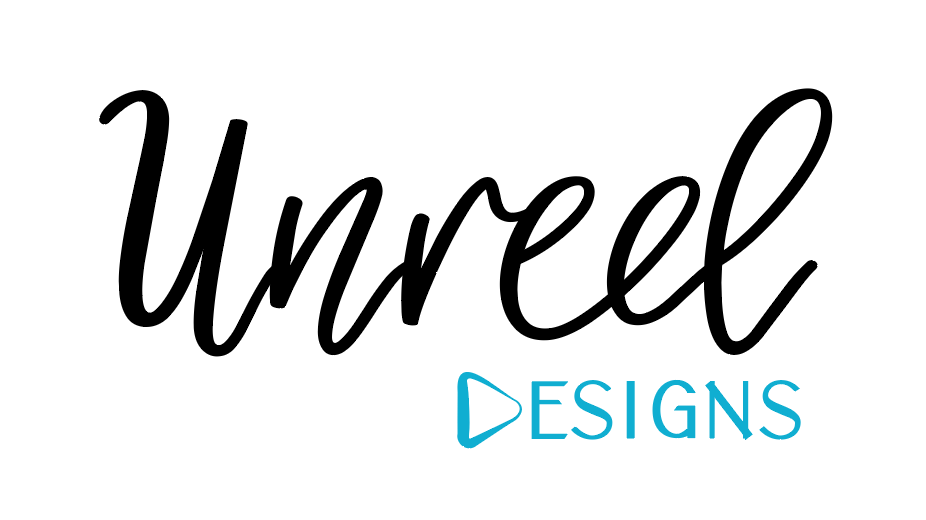
Hi
This is a logo I’m making for myself. I do both regular and motion graphics…
I’d love to know your opinion on which one you like best, and also any critique.
Thanks!

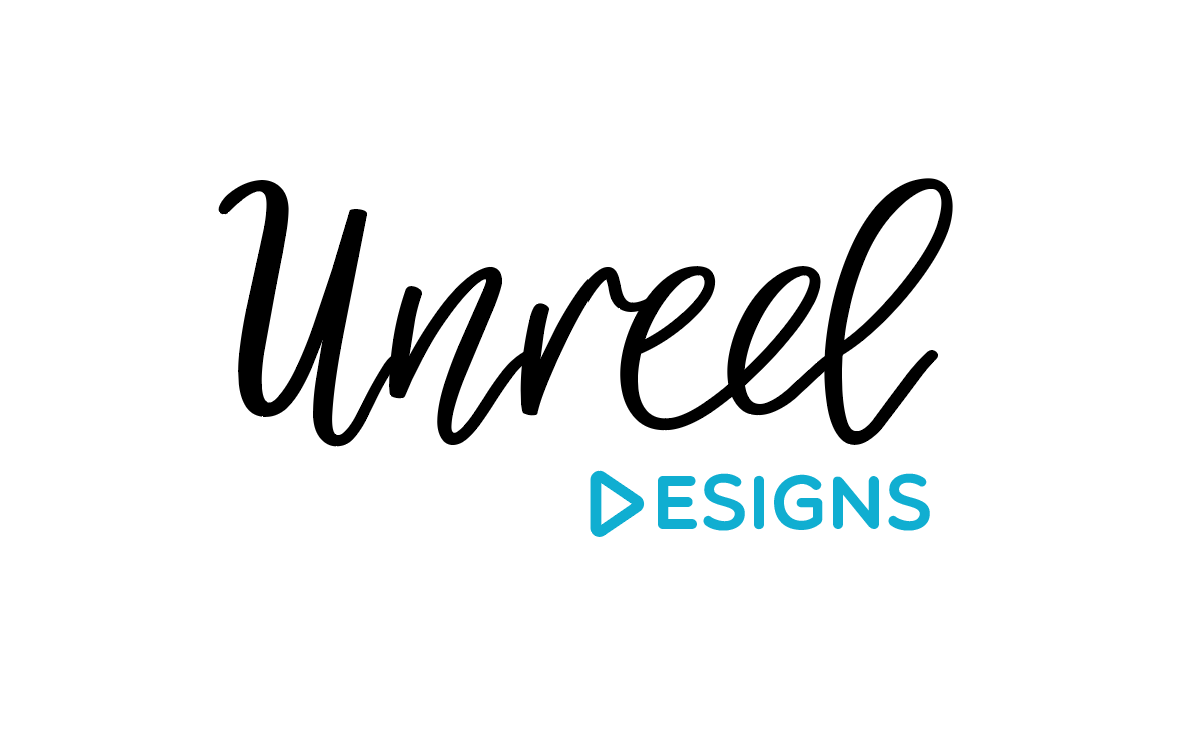
Hi
This is a logo I’m making for myself. I do both regular and motion graphics…
I’d love to know your opinion on which one you like best, and also any critique.
Thanks!
I like the first, The “N” needs fixing it looks like 3 lines put together.
I like the second but I think the word “unreel” needs to be smaller - it doesn’t look proportionate - like if you were to reduce this logo, the word design would be tiny
I also like the pink color better for the word “design” (and I think the whole word should be one color)
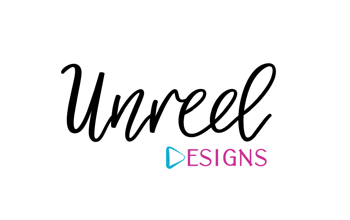
Nice job!
#3 is my favorite. I agree with Breindy on the sizing and coloring.
thanks for all your advice everyone!! 
here’s the new version
for regular logo I would keep this:
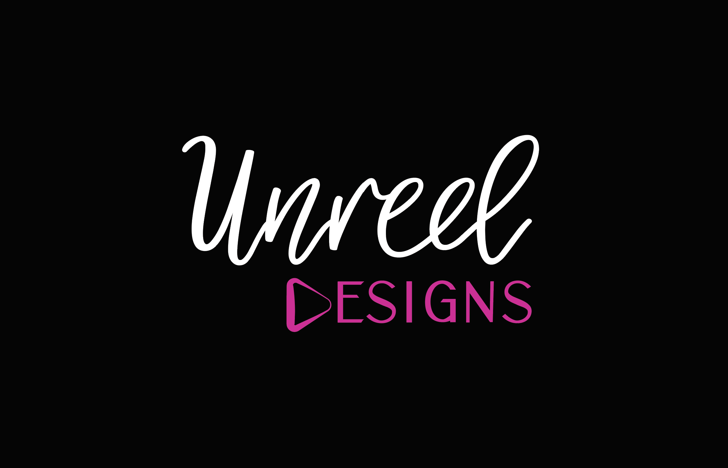
and for motion/web i would put it as white words on black bkgrnd cuz i think it looks sharper like that…
Wow! I love this! And on black it looks really sharp!
Its great! looking forward to seeing it animated hte D (play arrow) should maybe be raised a drop- or the middle of the E should drop down a bit
yea I was noticing that
I’ll fix it
K thanks!
Love this!!
thanks
I love this logo! Was wondering what font the script is?
thanks!
the script font is called Misty Morning
I like 2!
really nice! and I love the name
thanks!
thanks