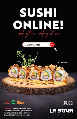
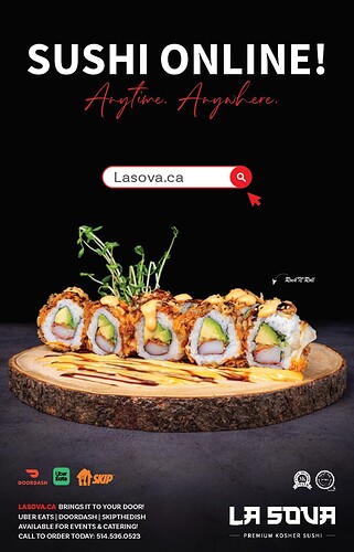
Which ad do you prefer, A or B? Could you help me in making a decision? Any feedback is also highly appreciated.
I like the 1st better
I like the first better. I feel like the sushi picture is competing with the words on which is the focal point though. The search bar is a little distracting and seems like it doesn’t fit in right there. I’m not sure that you need it twice on the ad but you might want to make the one at the bottom more noticeable. For all the bottom text it seems a little close to the edge so maybe pull it in and up, or make it a little smaller. And please post the final version, I love seeing them!
I like the first better
First definitely has more presence!
I’m wondering if the anytime anywhere could go in white or even orange to show up better…
and then you could make it a bit bigger and maybe remove the search bear
Love it! I also prefer the first one.
1st one!
I like A! has more of a presence
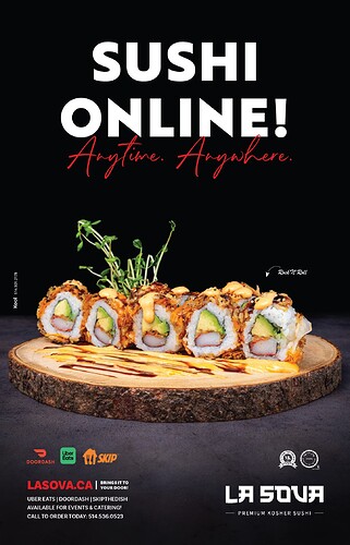
Thanks to all of you for your comments and feedback! Here is the final version of the ad.
The tricky part about this advertisement is that the owner of this business happens to be… MY HUSBAND! 
 We’re so meshed into it that seeing from an outside perspective is a bit challenging…
love it!!
Looks great!! Good luck with the business!
Wow! it’s so sharp and striking!
Love it! Can I have some…??? 
Sure! Let me know when you’re in Montreal; we’ll meet up for sushi 
shev, i love it ! I iove your new logo…and your sushi :yum. Thanks for all your graphics inspiration and encouragement!!!


