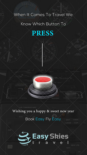
Any thoughts on this before I send it out to the client.
It looks great!! I feel like the font for press doesn’t go well with the rest
One more question: When you send work to a client, do you send as is above or do you always purchase the images before (I am asking because I think it would be a waste to purchase before in case he does not like it but it does look very disturbing with the marks on it)
I would also love to hear hour thoughts on how I could touch this up
Thank you so much
I dont I leave the watermark on
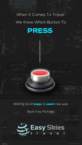
Add a coma after travel. Enter the We to the next line.
I usually edit it to remove the watermark, and tell them that I’ll purchase the image once they approve.
Thank you so so much. Will post on in a few minutes the changes. What about the design - can you tell that the background is a cockpit or is it not so clear?
Very compelling!
I would make the background not as faded; it’s not obvious at first glance that it’s a cockpit.
I would decrease line spacing between the top 2 lines, it’s not looking cohesive atm.
Could you add a box around book easy, fly easy? Or something?
Make it a CTA? It doesn’t look so designed.
looks great!!
Great start!
Agree with everything Tali said
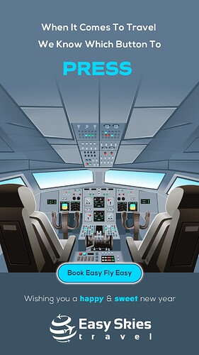
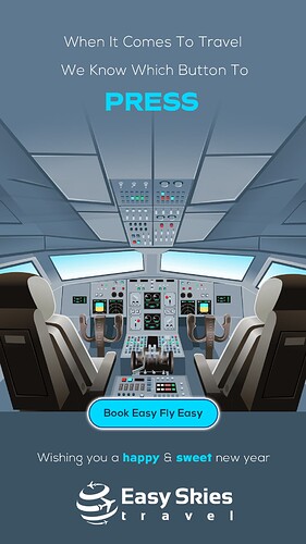
Here is a total new look (client loved the prev one but said really had a totally different look in mind and he would like to compare his idea to what I created)
Before sending I would like to hear critique and how I can bring it up to more professional level
I would also love to hear which one (this or prev) is a better look
I liked the first one more.
I agree I feel like the press doesn’t make as much of a statement now
I also like the first one better. It draws you in whereas this background you’re not sure what’s the attraction… But I like how you’ve done the blue button.
(I would still decrease the line spacing between the top 2 lines.)


