I made this ad- it’s a meat store
Is it obvious what I’m trying to sell? Or is it too busy?
Anything I should change?
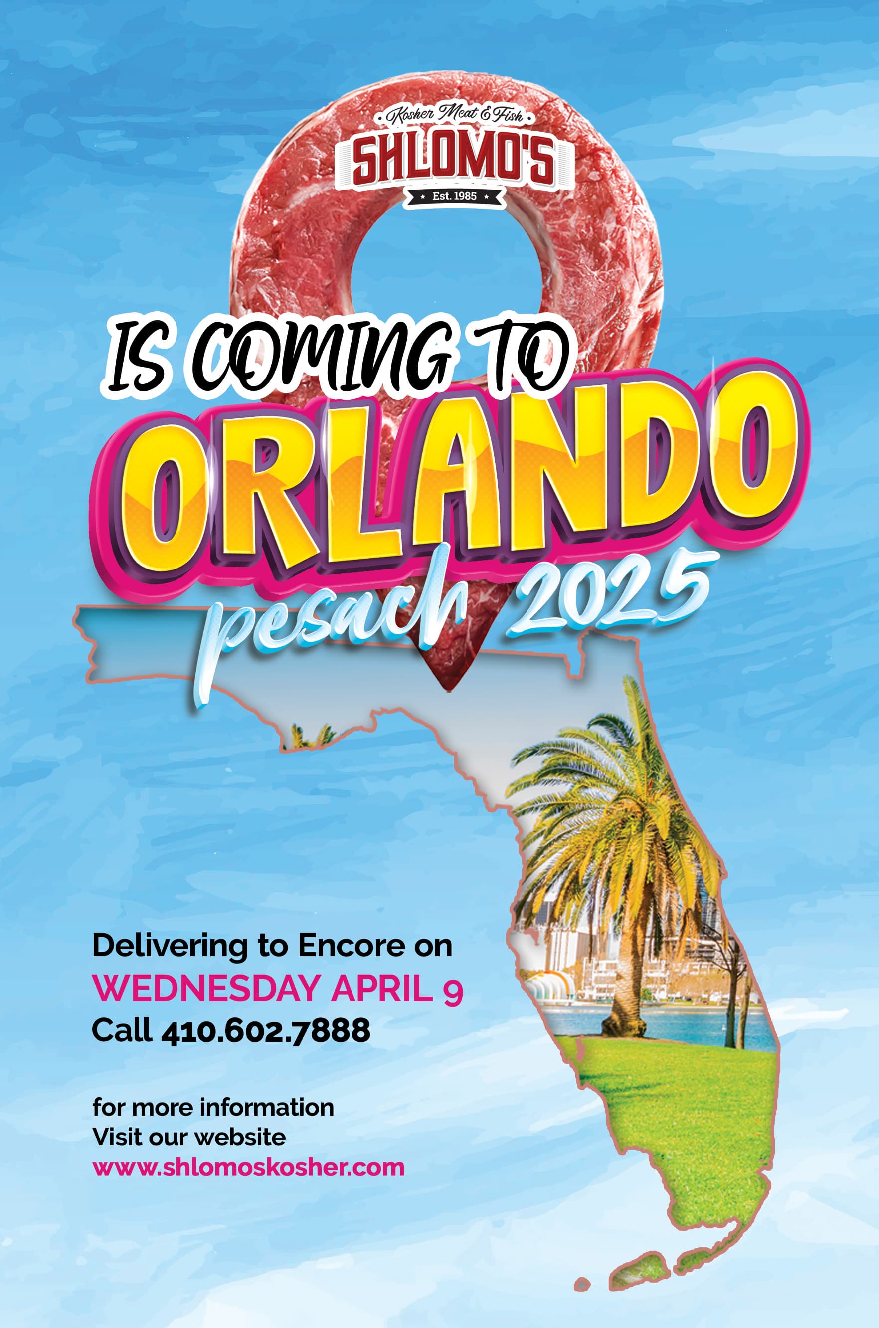
I’m seeing first an Orlando vacation, and then as a by the way some meat…
same
Same here, though I like the idea ![]()
it took me a few looks to see that the meat was a location pin i thought it was a circle! I think its so cool but you cant see that so clearly
How would it look if you take away the pink stroke?
Also side point-would it look better if the logo was just on the pin not off it?
pink stroke on the map? or on the lettering?
lettering by orlando
I love the fun Orlando look but I personally don’t like when meat is displayed in shapes.
i would take it away and maybe add like a tall stack of packs of meat.
I like the meat!
Maybe you can emphasize on that as your main visual thereby giving it a more meat vibe and not like a vacation.
maybe change the background so that it looks more like a meat ad then a vacay… nice job!
Maybe change the text to ‘We are coming to Orlando’ because at first glance the logo is not read before the main text so it is looks a little funny to start with ‘Is’…
Also dont love the meat in a shape… Looks a litle too busy with all the coloured text and strokes on top
Not sure if this was mentioned but would be interested to see the shlomo’s meat logo larger and the ‘is coming to orlando’ a bit smaller.
Love the changes!
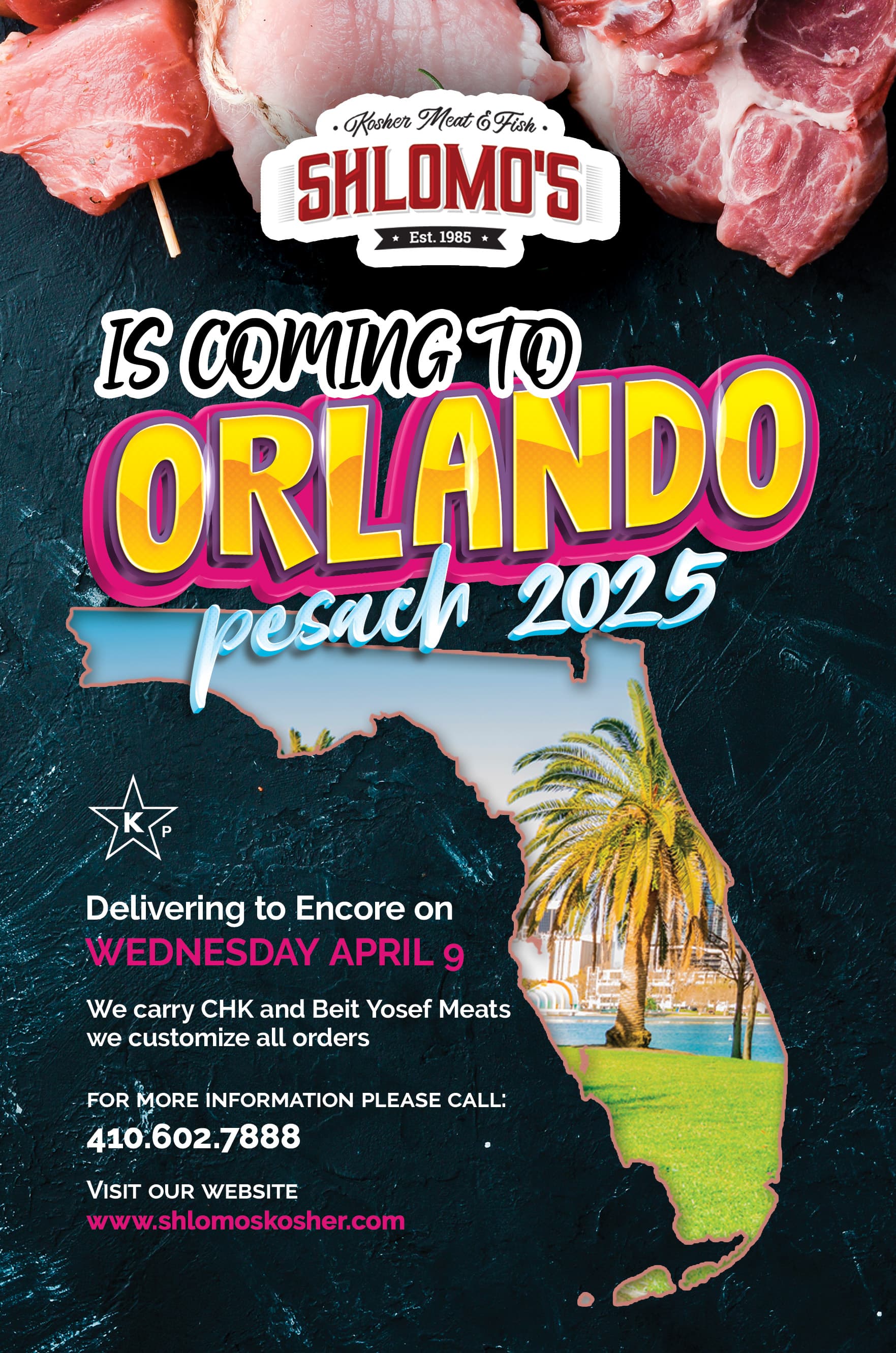
I would change the orlando coloring and the pink color on the bottom to more serious maybe.
But overall it is looking way better! Love the clipped florida pic in the map!
thanks!
I really like it now. Agree with above points…
I would maybe try all the pink in more maroon (something like the logo)
Its really looking good!