Hi,
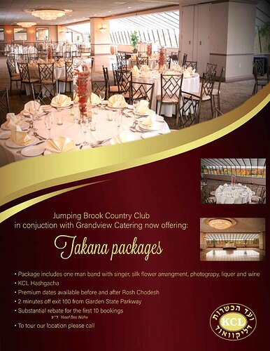
I am making this ad for a wedding hall. I am pretty new at this. Any thoughts?
Wow! Really nice for a newbie!!
I would recommend taking out the 2 smaller pictures and then working on the text on the bottom.
I would also make takanos packages bigger-and then work on the bullet text-you can even try 2 or 3 columns?
Just a thought…
Would love to see an update!
HATZLACHA!!!
I agree with Ahuva take out the 2 smaller pictures and that will help by making the text on bottom easier to see!
I really really like the layout. Well done!
Looks nice! Agreed about taking out the two images, you could put a strip of small images along the bottom, for example, 4-5 small images touching each other to create a strip that would sit on the bottom, if you have the space. Those images could each show a “great” detail-zoomed in-of the place. Main text line should be bigger/more dramatic. You can look at inspiration fliers for more interesting ways to set up the bullet area. Your main image is a very important part of the ad…nothing specifically wrong with this one, but the better that image is, the more effective the ad will be. Not seeing a web or phone number, should it be included?
It’s definitely coming along!
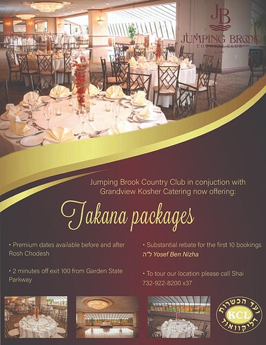
Why does this coloring look so dull? - the first one is much sharper looking…
The logo is barely visible - maybe a drop shadow behind it would work or you have to reposition it somewhere else.
The three pictures on the bottom don’t have equal spacing between pics and why did you repeat the main pic (unless its not a copy but very similar) I personally think you should remove the pics on the bottom - make the bulleted text a little more interesting and make the focus pop more. I also think the hechsher could be made smaller.
Maybe do the logo in white?
When you save the file if you export it as jpeg it will come out brighter.
I’m not sure why but the wording takana packages is throwing me off a bit with the t. can you try another scripy font? Also you cant see the logo much.
Can you try to make the bullets closer together and than youll be able to move the takana packages down a little and the wording ontop of that you can then center over takana packages. I think that would help. Its really looking elegant!
Definitely better! Would capitalize the P of packages in the main title. I think it was mentioned, but looks pretty washed out, shoudl have more contrast. Image placement looks much better.
Can logo show up better on the top?


