Hi,
I designed this ad. I feel like it needs pulling together still…
Can you help please?
Thanks in advance!

This is really cute!!
A few things:
align the top of the envelope with the top of the header
the description text could have tighter leading
im not loving the virtual assistant line cuz there are to many sizes going on there!
Cant wait to see an update! Great Job!
Really nice!! Clean, professional look.
Maybe make the computer image a bit smaller and headline bigger?
An idea if you want to keep diff sizes for Virtual Assisstant… bec its the logo, can put on 2 separate lines - continue is here… on next line
Well done!
I would put the line- virtual assistant centered with the contact info.
Also maybe try aligning Need a PA… with the email box .
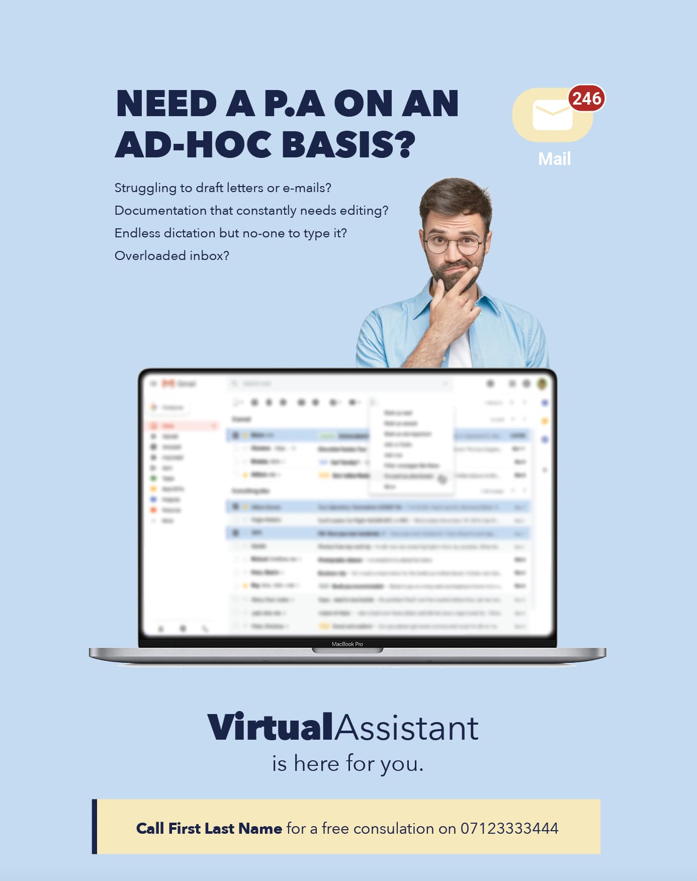
Much better! I would still make the computer slightly smaller and the description text a bit lower. I’m also not loving the colour of the box behind the mail and ‘call first last name’.
Also to make the computer look better try adding a shadow underneath it

I like the dark blue. I think it works better.
Looks much better!
Love it!
really sharp